Ep37 production report: style
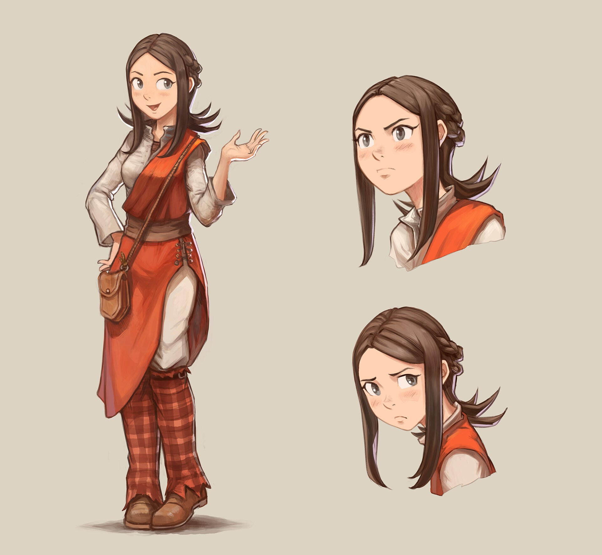
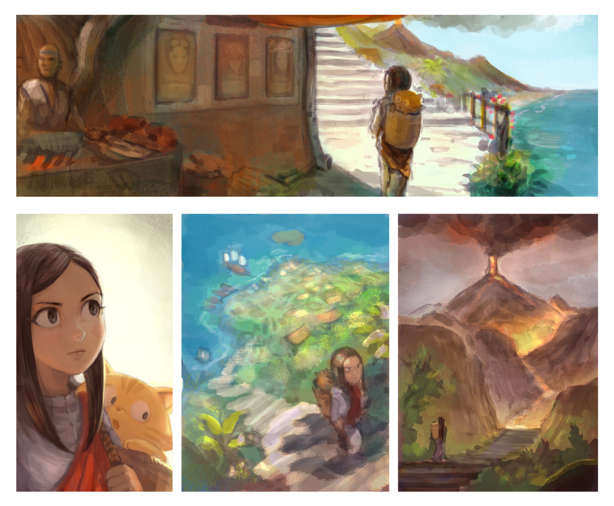
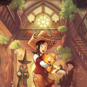
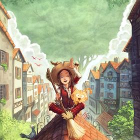
Here is a stylisation research for "Pepper the traveler in incognito mode" for episode 37. But why a stylisation research now?
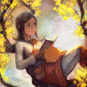
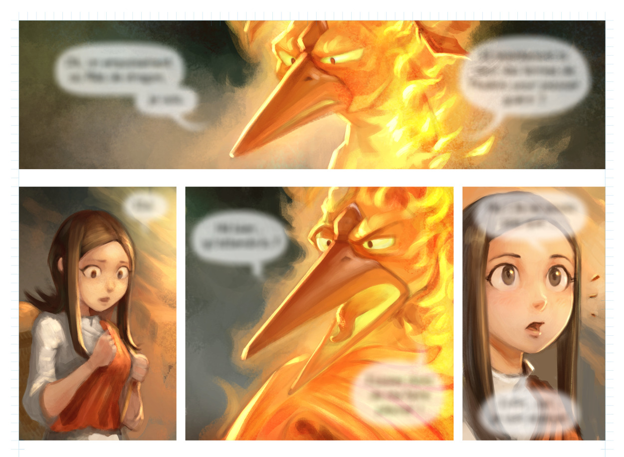
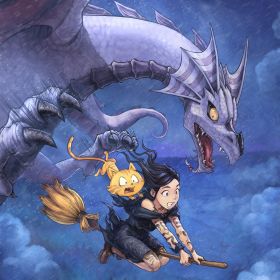
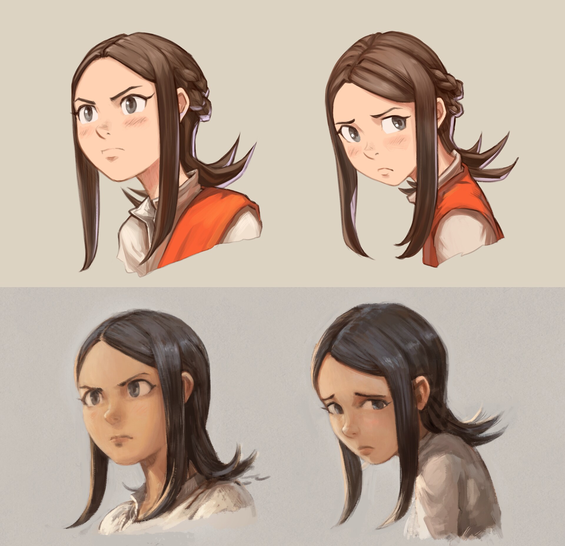
Recently, I was really into bringing more realism and advanced shading to my painting technique. You probably saw it already, but here is a reminder. (click to enlarge)
Problem: I started episode 37 production this way and...well... I disliked the early WIP result: bad and static facial expression and tons of slow paint-over process in prevision to fix all of that.
So, after a (long) review on what made Pepper&Carrot joyful, expressive and fun, I decided to discontinue realism and I came back to stylisation: simplier shapes, line-art, less advanced shading. I painted this concept-art as a first proof of concept:
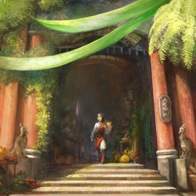
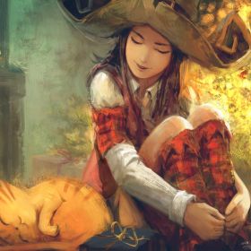
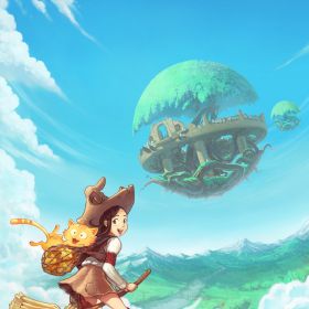
After comparison with the 36 episodes and 250 pages, the result was close to the style I achieve on the covers for the books of the series. I then decided to make that my art-direction goal for the future comic style and rendering as well (click to enlarge).
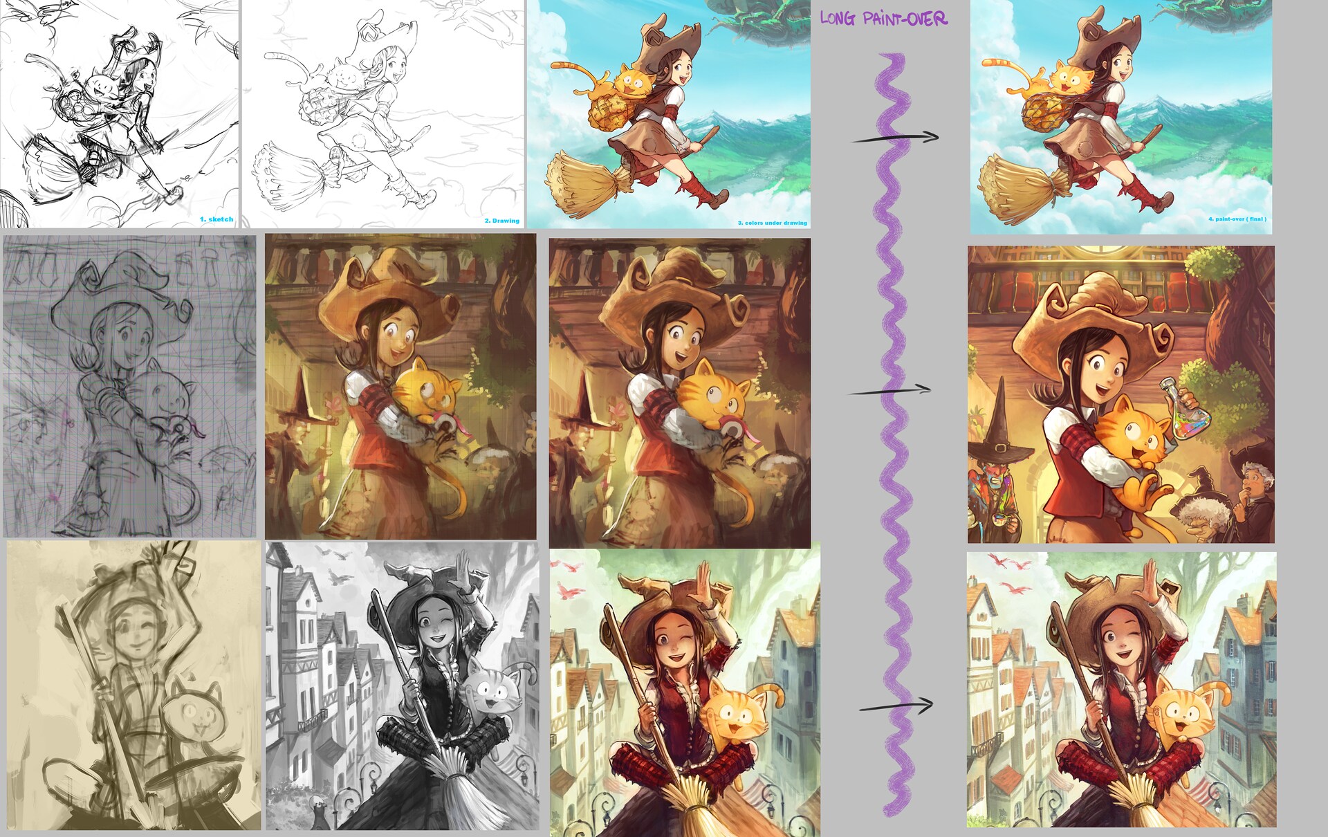
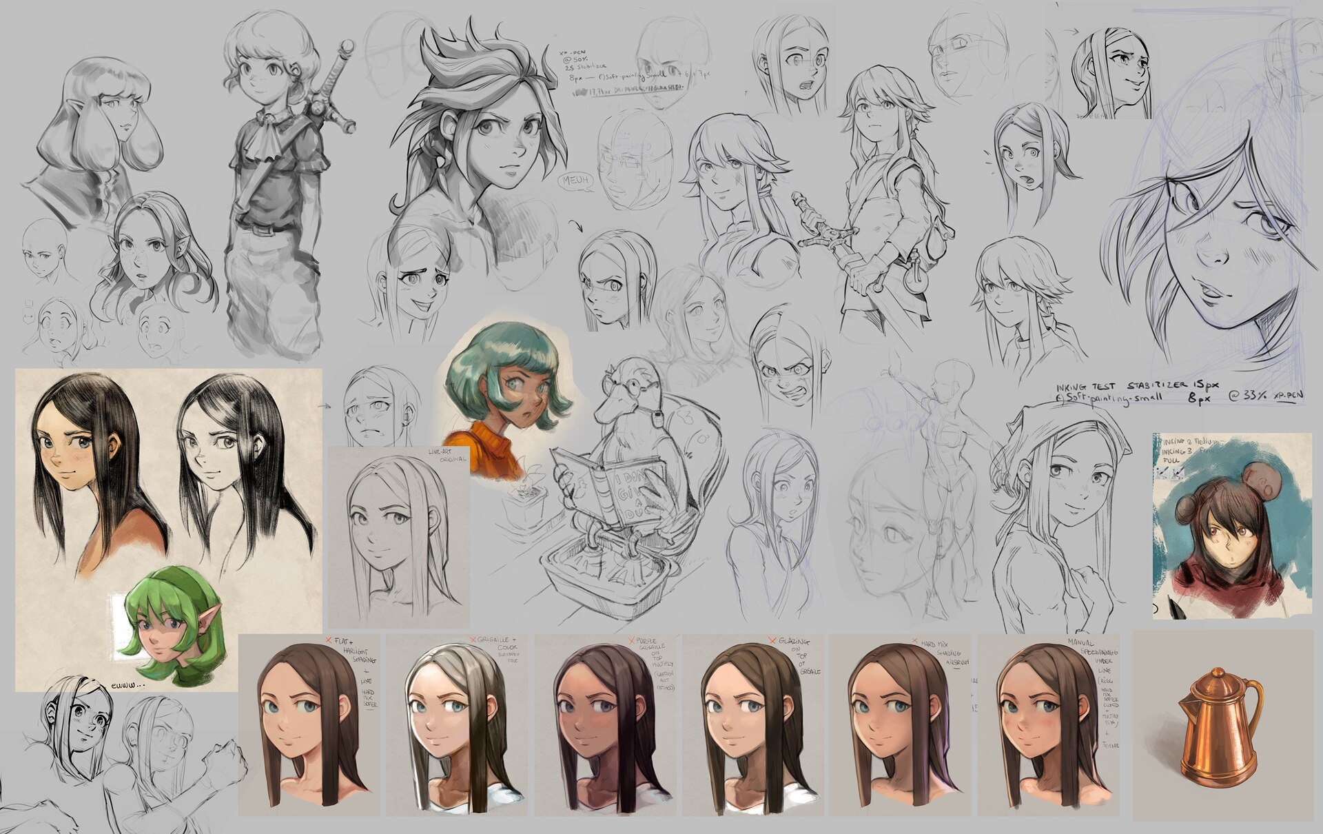
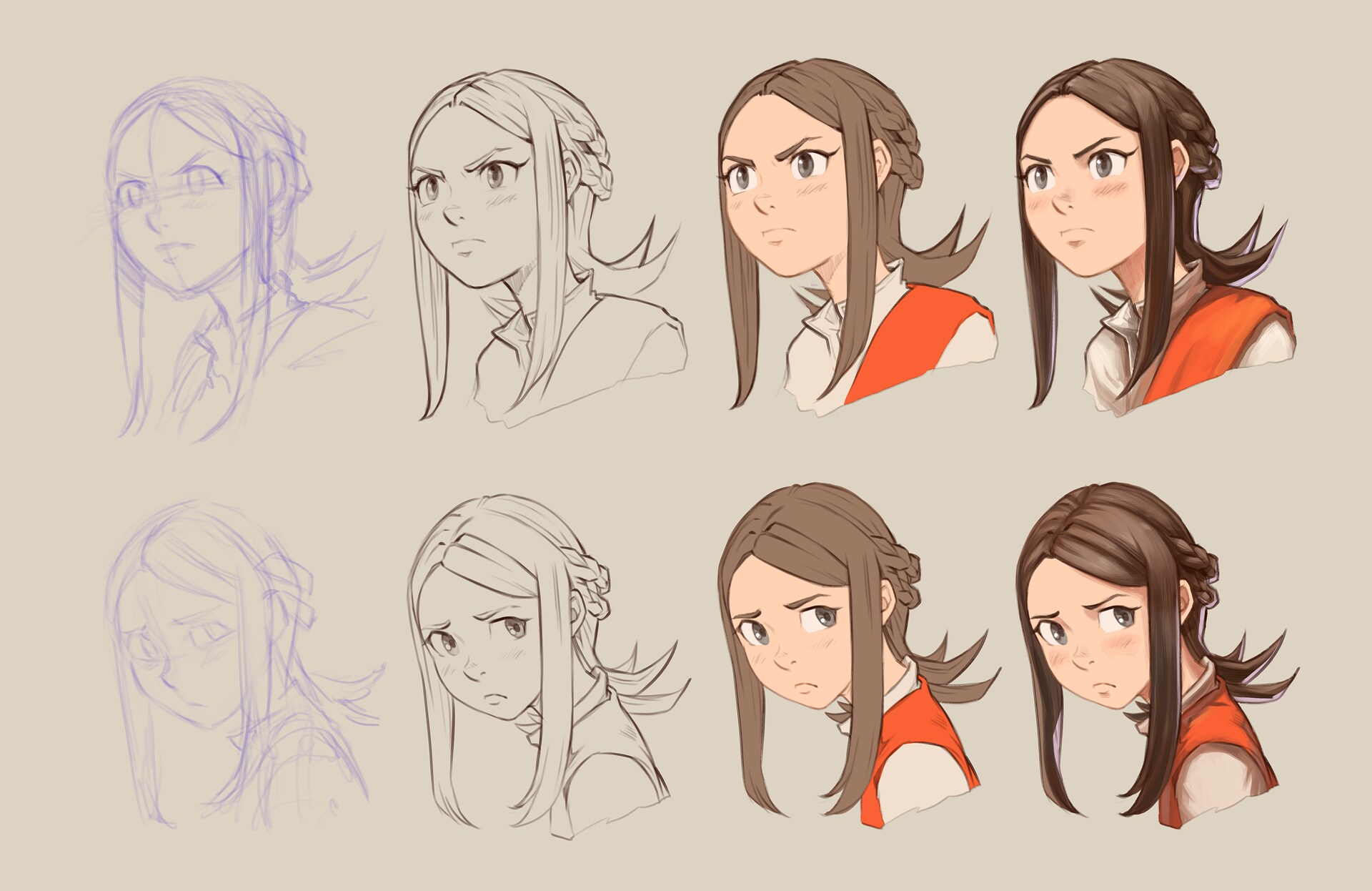
New problem: I never found an efficient process to reproduce this style with its painterly soft line-art. As you can see under; I always start 'meh' then later put a ton of make-up paint-over until it looks good. A too long and uncontrollable process for a comic.
I then decided to 'reverse engineer' that style and find how to produce upfront the soft line-art of these covers. It sounds simple, but finding the right preset for line-art took me a lot of training, failures and researches.
But it paid off: after weeks, I found a close-enough combination that could emulate the rendering of the covers (and my concept-art) while using a simplier 'colored line-art workflow', easier to manage and time saving for a webcomic.
So, I'll refactor episode 37 in this direction now. It will cost me time to redo what was already done, but I'm all motivated about it because the comparison feels already rewarding to me and I want the best I can do for Pepper&Carrot. Let me know if you like it.💛

