What come next after Gimp-painter 2.6 ?
A blog post about my actual test with Gimp-painter 2.6 , and testing the future alternative : 2.7.2 Gimp-painter discontinued , or 2.7+ Git official Gimp with a lake of the features who interest me. It's almost 3 years now I use daily for my freelance work Gimp-painter 2.6 mainly. And because I had to stick with this particular fork for making my artwork , I always kept distant from the Gimp developpement , mainly because all the features I enjoyed in this fork were not ported to 2.7x . But lastly, I discovered I could keep my old Gimp-painter 2.6 installed and run in parallel other build of sources codes. Thanks to this tutorial for explaining me the guidelines of compiling Gimp sources codes in another folder. So, now I can test last Gimp(s). This post show some of the early things I found interesting and other not of my first experience with it.
Version tested :
I installed here 2 branch on my Linux Mint 11 I wanted absolutely to try :
- the 'Git master' 2.7.3 main one ( date 27 sept 11 )
- and a branch done by Sygetch ( date 21 janv 11 ) , Gimp-painter 2.7.2 ( code source here )
1) Gimp 2.7.3 :
Git master (27 sept 11) 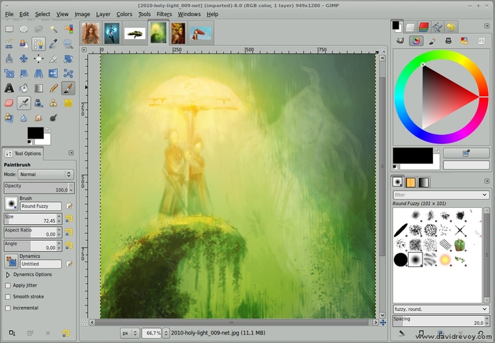 I must admit I very liked the way to work in 2.7.3 with multiple document. This is way better ( thanks 'single windows mode' ) than my experience with multi document opened on Gimp 2.6 ; where I have to constantly hit 'tab' to make the toolbar and the docker reappear after maximizing an already opened image.
I regretted here to can't manage the tab image as in a modern browser ( a little menu for right click on it , proposing basic option as save/duplicate/new view/undock/Pin etc... would be welcome ) , using middle mouse button click on them to close them , etc...
I also saw that the 'single windows mode' made the option ' New view' obsolete because this new view open in a new tab.
But this is still not a final release, so I guess it's part of the rough edge to polish till 2.8...
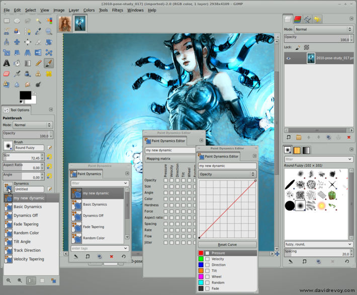 Aside of that , the graphic user interface is almost still the same than in 2.6 ; even worst sometimes ; more windows for the new dynamics , more messy ; as illustrated by this fantastic chain of 5 clicks action to do threw 3 dockers above to just adjust a new pressure curve ( also so a minute ago in a twit of Ramón Miranda ). This look like a production time killer for digital artist.
My early test conclusion:
I prefer keep Gimp-painter 2.6 for the moment. In this 2.7.3; no 'mixbrush' or 'color bleeding' features ... also no textures in brush ; and exept the "single windows", dynamic brushes ( rotate/curves are great !), I don't see any top-notch new stuff ( oh, the new sliders box are cool, but ugly compare to the Blender one or the Krita one ).
I still have to 'add alpha background' very often ; 'extend layer to image size' to paint after just copy/paste. Dealing with floating selections / etc... Use 3 tools to rotate/move/scale ; have the modal panel for level/hue saturation behaving like tools ... etc... all the weirdness and production destroyer are still here. But I know this release is still WIP, and I encourage all dev who work hard on it.
One things that could convince me, would be better performances. ( FLOSS painting and image manipulation tools are still very slow compare to what user can access in the proprietary offer ). Here painting is slow and laggy , painting a A4 300dpi with a icore7 and 8GB ram is still a paint... but this surely depend of my installation ( even if I did nothing particular with flag options while compiling ). Maybe my lib or GTK version ?
1) Gimp-painter 2.7.2 :
( date 21 janv 11 )( code source here ) 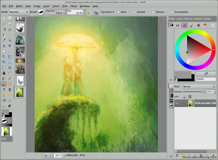 I was happy to can try this branch, because done by the same author of my beloved tool Gimp-painter 2.6. At first launch , I saw a new work on the graphic interface that was pleasant : I particulary liked the toolbar. Toolbar are easier to access with a tablet , because you only need to lift your hand on top of the tablet to setup or change your brush. This is productive.
I also liked a lot the smart way to propose thumbnail of already opened document in a vertical column : as screens tends to be more and more wide screen ( 16/10 or 16/9 ), it's became important to economize screen space on the vertical dimension. It's in fact not easy to work on a book cover 'portrait' format or a 'comic page' without the max height space available. But this not worked for all ; for example I find very not easy to handle the vertical tab button for dockers as layers, colors etc... This produce mainly empty vertical column . For this I prefer the way of 2.7.3 Git master.
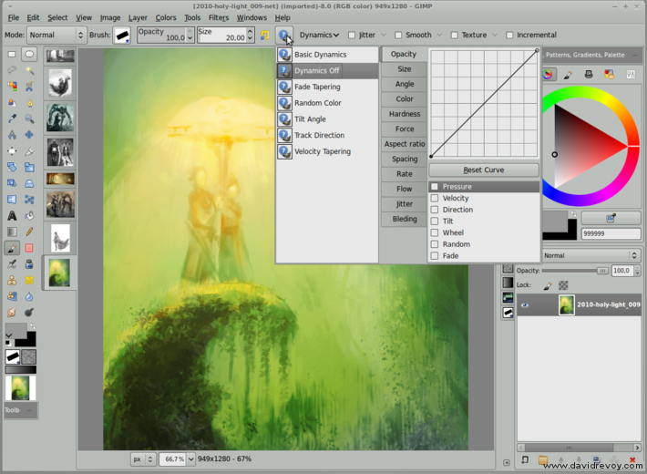 The toolbar become very important in the workflow : most of options are inside dropdown panel ( and thats good ; because similar to Krita or last Mypaint ).
The management of dynamics via the dropdown is way more clean and productive ( even if I felt the lake of a button to create a new dynamics in this drop down panel.) I also noticed new option to the brush engine : Flow / Bleding ( Bleeding or Blending ? = maybe a new terms meaning both ).
This also make the right docker have more space for layer management or color choice.
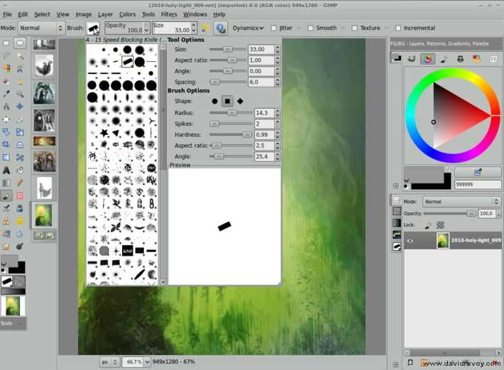
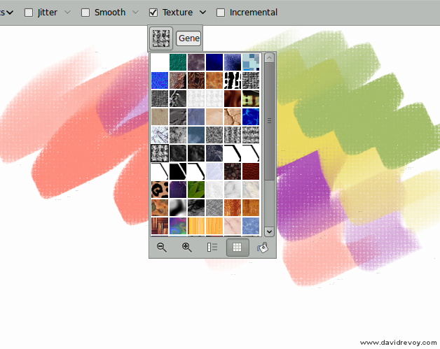
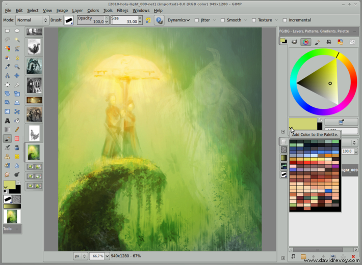 This dropdown design also apply for the brush settings, textures, and even colors as you can see on the screenshot. This is very well done for my usage.
My early test conclusion:
I prefer keep Gimp-painter 2.6 for the moment too in this case. Here also I have performance slowdown , and also a fat and laggy brush outline. But I enjoyed a lot the new GUI... totally performed a real answer to my needing. Also, I liked a lot those points : the centric toolbar for action and the shortcut to the color palette , and the vertical thumbnails for the 'already opened document'.
After test:
Don't get me wrong ; I know the Gimp project is not designed for digital painters only ... And I know the fork Gimp-painter is focused on satisfying people like me. So it's normal if I prefer it.
What I don't understood while running this test, is why so much of easy "low hanging-fruit" features are blocked in a branch since january ?... The repository is public and well known since long time ( read this article on LGW , jan 2011 ) .Most of the stuff I saw don't need 6 months of discussions to stat if they are a valuable evolution or not, in my humble opinion.
That's why I'm happy to be 'skype-interviewed' on the 6 october by the Gimp Ui redesign team to know why so much of confusion around Gimp and Gimp-painter and how they expect to solve it (if they are interested into it). This post will also help to explain my choices.
I hope you liked to have a look on those screenshots , and they contributed to showcase the hard work of developpers behind the Gimp project, and will give justice to the incredible volunteers work of Sygetch ( both developer and a CG artist ). Floss digital painters will get very soon a impressive Krita 2.4 version and a Mypaint 1.0 ; so we have not to complain as a user ; end 2011 will certainly be a key era for the 2D FLOSS digital artist... And my 3 years of old Gimp-painter 2.6 with all his weirdness, bad performance and limitation will change soon anyway ; at least I hope.
Note : To compile and run Gimp-painter 2.7.2 , I needed to apply manually this fix.
Note 2 : I used old unfinished speedpainting of my own done with Gimp-painter 2.6 as image to illustrate the screenshots. Sorry for not more artistic content lastly ; i'm working on a new comic :D so much panel are time consuming !.


20 comments
There is a lot to like about 2.7.3 but it is still a work in progress. I have been experimenting with it and going between 2.6.11 as well on Windows. Unfortunately no matter what I do, 2.7.3 does not like my Wacom Intuos3 tablet ...or at least the sensitivity doesn't work. There are workarounds, but I really rely on adjusting opacity and size based on pressure. The one main feature I really like is the brush engine and very similar tools to the PS CS5 brushes where I can squash and rotate the brushes as needed and build my own dynamics settings.
Thanks for doing this comparison! Not all of us like to try out pre-release software. :) The Gimp was always intimidating when I tried to compile it, as well.
I'm a bit nervous about the new interface, as my monitor is one of the 4:3 ones that are going out of style in favor of widescreen monitors. All the same, this looks to be an exciting release!
Since The Gimp has such a long development cycle, I would guess that the dedicated devs are usually stuck doing the more difficult tasks like creating single-window modes, and the developers who would like to participate for a short time to solve some of that "low-hanging fruit" are scared away by the amount of time between releases - no one would get to see their work for a long time. I really look forward to reading your Skype interview!
Another issue is with the splash screen ...not professional. This has been brought up in other forums as well.
Nice article David!
I can't tell about the painting features because I don't use GIMP for illustration, but in general I found the changes to be pretty possitive. I'm not concerned about the new dialogs, since they're dockable.
Afaik several features of GIMP painter could make it for future releases (no official plans, but iirc Alexia took a look on the blending and bleeding features)
@Steven Powers: It has been said several times. That splash screen is a development splash, and they always use silly / internal jokes splashes in development versions.
The final splash screen wasn't decided yet. You can propose one if you want.
Development versions are intended for developers and people who are used to testing software (and usually build their own compilations).
Changing the current splash screen is so easy that the entire debate about it is pretty pointless.
Will you do a test and blogpost about the new layer blending modes in MyPaint git? ;)
Gez,
It isn't an issue for me,I can change what I like, but it an issue when recommending GIMP to someone else. This isn't a splash screen that you want popping up at work or around your family or kids. GIMP 2.7.3 is pretty solid sofar. It isn't a glitchy app that crashes all the time. Since I like to promote FLOSS apps (GIMP being a favorite)and recommend them to others as alternatives to commercial ones, the splash screen limits that.
UI is not important. But still thank UI of author.
Hope CMYK support can be layered.
Little update, my performance issue were mostly related to a outdated GTK+ ; after grabbing a newer one , its worked as fast as 2.6. I will try with GTK+ 3 from git asap too.
@Nathan Towle : :) during long time I was really intimidated by compiling the Gimp, but I guess I learned a lot learning how to do it for Krita. Finally it's not that hard when understanding witch library to get. About the screen , yep here I've got also a 4:3 ; the 1600x1200 of the Cintiq one as a main monitor. But even with this type of screen, I tend to look for more space vertically due to my work on comics page and book cover. For skype interview, good idea ; I will do a report on my blog.
@Gez : Thanks Gez ! Here I also find positive change in overall. Oh, and good tip to dock the multi dynamic panel , thats help to get organised.
@Jon Nordby : Good idea , I'll prepare something. I also have to post more 'drawing' made on my freetime ... I suppose it's easier to geek around linux and all the FLOSS project after my freelance paintings work, than drawing again :D
@Steven Powers (SMP) : For the splash , I agree the S.M scene is funny ;) Here I use this one ; http://img148.imageshack.us/img148/6849/gimpsplashm.png">http://img148.imageshack.us/img148/6849/gimpsplashm.png , fallen in love for it one day I were browsing on a Arch linux forum , never found who is the original author, but it's the best imo ; clean and pro.
I also get problems here with my install to have both of my Intuos4 M and Cintiq 21UX works ; I think it was also related to the GTK+ version I used , and some problem with Xorg stuff & Xsetwacom.
@Sen Lin : Sure, ui is not that important :) For CMYK support , I advice you to try the Krita developpement version , or wait for the future 2.4. ;)
Hi David, What a nice Article!
I am happy that you finally find the way to test gimp releases. As i see GimpPainter is not dead in developing, that is a good new. Because i also stay attached to Mixbrush features. Today i was talking With Alexia about the "installation Issues" for Development tests. so maybe in the future it will be easier. In your screenshots i can´t see the preset selector wich i found is the most useful feature. We can make "sets" with tags and is very fast to manage. But you are right about the new pannels ,we have to dock them if we want free space.I have sent you the new GPS preview. just let me know.
And yes, Painting apps are changing for good lately.
The splash screen doesn't do justice at all. Have to try out the Gitmaster version though.
@Milad Thaha : :) if you are really bored with this splash, ( I understand, I don't like it too ) . Just copy a png picture in a new folder you create under your .gimp-2.7 or .gimp-2.6 folder="splashes" , file ="gimp-splash.png" ( I'm not sure this is to-do , renaming , btw ) ; Gimp will use it as a new splash screen :D
@Ramon Miranda : Hey :) thx . For the preset selector, no big change a bit the same as the one you use ; just a version under inherited from 2.7.2 , so I guess less polished. Thanks for the Gps preview , I'm testing it on my freetime :) But I tend to paint again in Krita seams the painting engine is back to stability and the new multi-thread engine of Dmitry get merged. Smoother(a lot imo) and faster(a bit) :) a good feeling around this 2.4 of Krita.
FYI ...A windows version of 2.7.4 found at Partha's Place http://www.partha.com/ is available. I haven't installed it yet or tested for responsiveness but I am hoping for at the least support for my tablet.
@Steven Powers (SMP) : Gimp-dev master from Git is theoretically better updated than this 2.7.4 , so I will not try this source code. I read in this place another fork name ? Oh damn. I hope it's just a way to name a separate dev branch...
Had no idea that there was a gimp-painter branch for the 2.7 development series. I really hope that people just get together and merge it back - it would make it a lot easier to get better painting tools out there.
On the subject of splash screens, this site has a bunch of them http://looksuite.net/en/gimp/splashscreens/
Kinda nice to be able to choose even things like this. Gotta love open source. :)
You may be interested in a small bash script I've wrote in order to automate the building process of gimp 2.7.
The script is mainly designed for ubuntu, but it can easily be used on any other linux distribution, you just have to configure the distribution specific part, which is mainly the distro dependencies installation.
The script handle the checkout/update of gimp, babl and gegl, and their respective compilation and linking in per build directories, so you can use as many snapshot versions as you want.
http://blog.zanshine.com/2011/10/cutting-edge-gimp-in-latest-ubuntu.html
@Otto : Thanks for the link , good one !
@zanshine : Many thanks this is a cool script ( I like it keeps lib and compile on /opt/ thats cool ) , I will surely write a blog post about it :)
thanks for sharing david.
i'm a bit disappointed to see the main time killers are still present:
lack of a unified free transform tool and weird floating stuff. (gimp screams for a more streamlined UI! )
i honestly love what i can do with 2.6+painter+gps....it's ways ahead of photoshop for my workflow in terms of customization, color selection and pretty much all painting releated.
i guess i'll wait to see what the guys from painter and gps will do with the future release version.
@David REVOY: It would be nice to have you write something about it :)
You know how it works: The more users, the more features.
If there's some feedbacks, I could imagine to bring some more features, such as branches selection, and maybe GPS and gimp-painter integration.
Well ideas are generally not the problem...
Hi,
can you please show step by step how to compile gimp painter 2.7.2? Thanks
@jj : Sorry , I can't. But you can find great article on how to compile Gimp and learn from it. This is not different. The only things you have to do , is to be in a environment of library compatible with this old version. Basically, this is abandonware.
Post a reply
The comments on this article are archived and unfortunately not yet connected to a dedicated post on Mastodon. Feel free to continue the discussion on the social media of your choice. Link to this post:You can also quote my account so I'll get a notification.
(eg. @davidrevoy@framapiaf.org on my Mastodon profile.)