Production report: episode 29, part 2
Here is the second production report about the future episode 29 of Pepper&Carrot, an insight into the work behind the scene of next episode. If you missed it, read the first production report.
Spoilers alert: I'll not reveal in this page any plot elements which threaten to give away important details about the story of the next episode. But, because I open all the process, if you follow the link on the Framagit discussion and thread, you'll access to the full story, storyboard, etc.
Tests
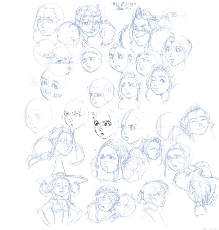
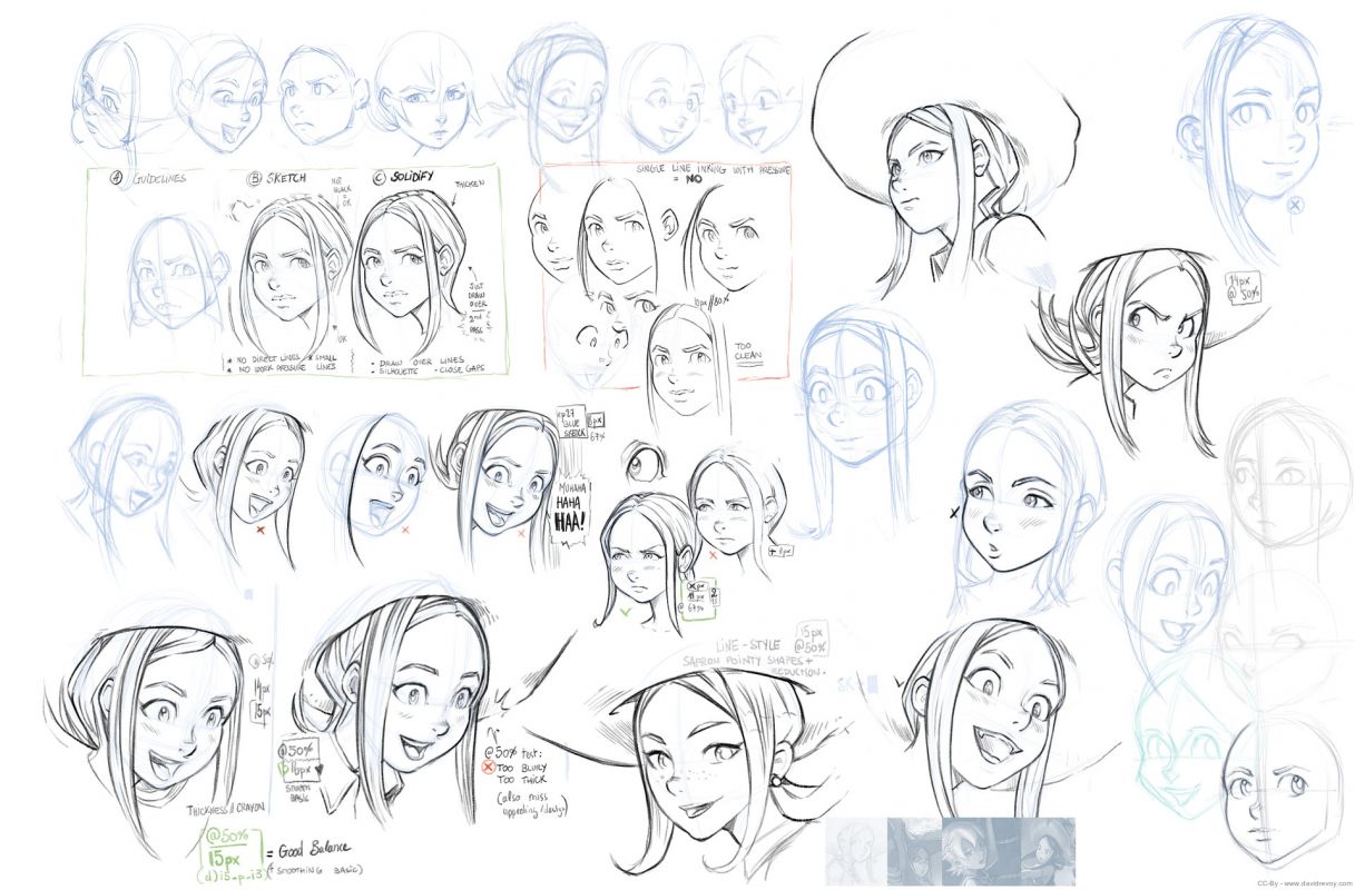
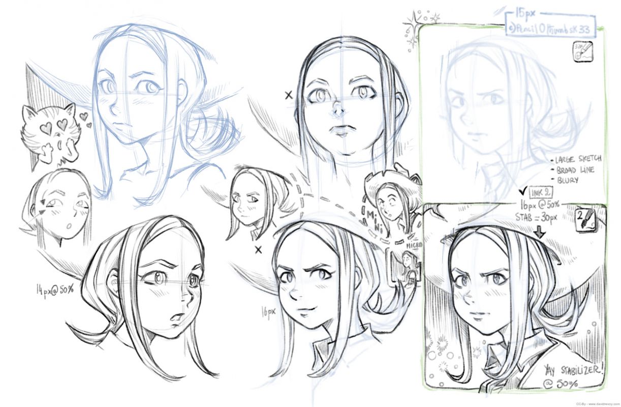
Just before starting the digital inking step for episode 29, I felt I had to upgrade my digital drawing skill in order to be better in sync with my brush presets, Krita and how respond the Cintiq13HD. So I decided to sketch while keeping the same presets and focus on various stylistic researches and constructions methods I wanted to explore. I noted on this researches the brush preset used, the diameter, the zoom of the viewport and if I use a stabilizer method or not until I felt I had something comfortable and predicable.
The digital page size
I also did researches to match as near as I could my traditional comic-page inking experience. My only previous experience with the Cintiq13HD and inking (read episode 23 Take a Chance making-of) wasn't good as I produced a too thin line-art and then I had issue at coloring... For my researches on episode 29, I found that at 50% zoom on my 2975x4200pixels large comic-page, I have a page that exactly matches my ideal traditional page size (something slightly lower than a A3 but bigger than a A4).But I inked most of the time the pages at 67% zoom of the viewport with a 11px large brush (you can find my inking preset on my duo brushkit). I drew on the 50% zoom only for close-up.
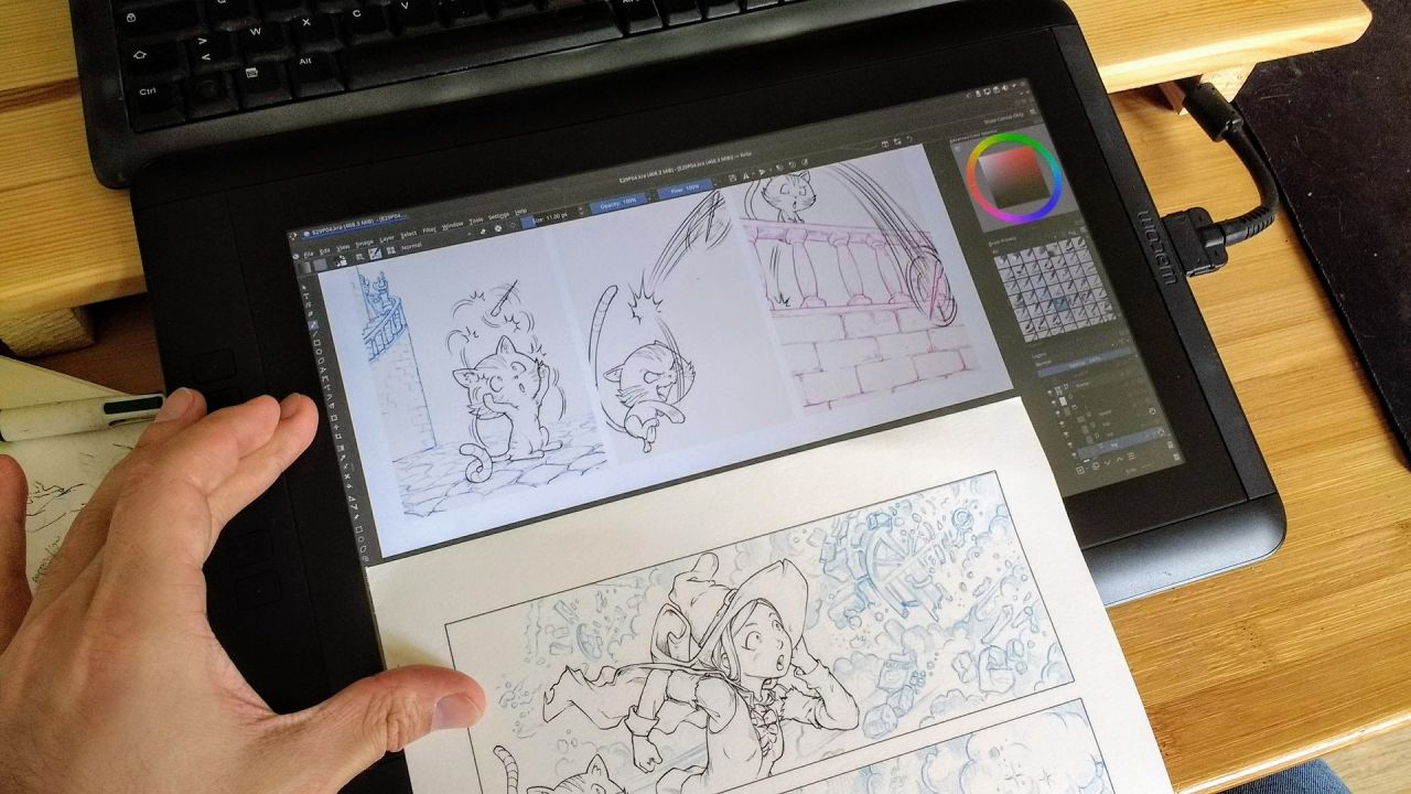
digital inking VS traditional inking : matching styles and widths.
A subtle background-color
A little tip I found on the way was just a background color; I was used to the light grey #C0C0C0 but it was also cold and sad. An easier one for my eyes to work on the Cintiq13HD was #F9F5EE. It also simplified working with the white borderless frames around the panels and the borderless speechbubbles.
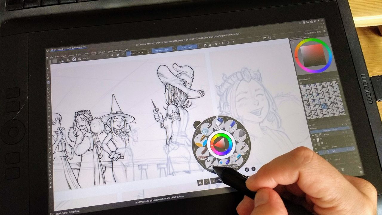
While Inking blue digital pencil
Blue Pencil
I used a blue #1871BB to do all the penciling. This blue has enough of contrast to draw with it and it was subtle enough when the opacity of the layer was reduced at around 25% to enjoy inking over it. I decided to keep all the backgrounds in blue-pencil only and ink in black only the characters. The background will receive a full paint-over pass and they don't need to get a really precise drawing line-art as the character did.
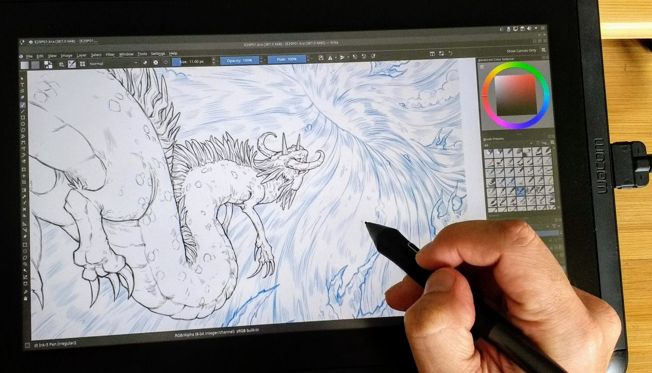
A panel with the character inked, and the background in blue pencil
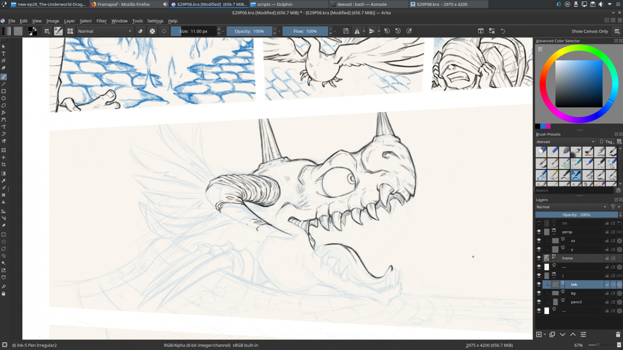
While inking at 67% zoom of viewport
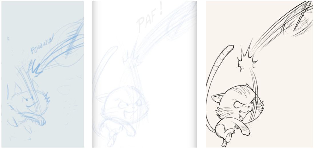
Three steps side by side: storyboard, pencil and inking
3D helpers
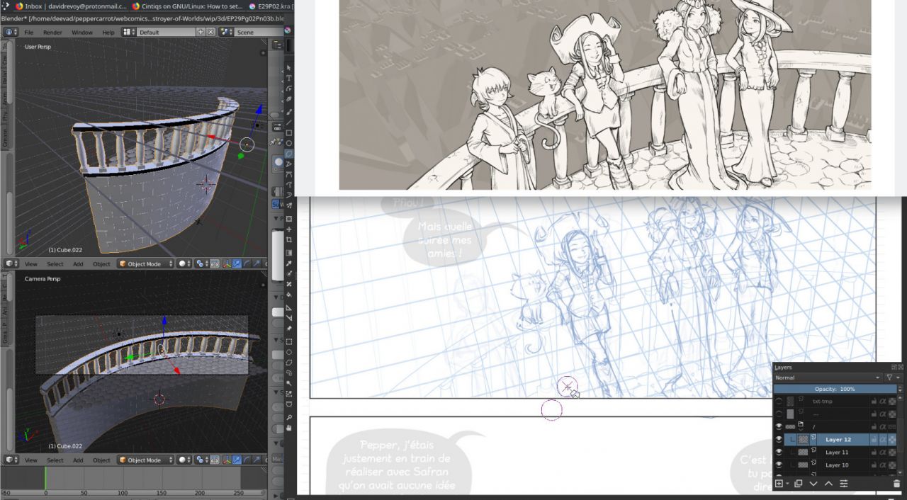
Sometime, it was too hard to draw curvy elements into perspective. My freehand attempts were looking too woobly. In that cases, I used Blender 3D to quickly model backgrounds elements. I then rendered them using Freestyle (a method to get 3D elements traced with lines) and I merged the render tinted in blue with my pencil layer. I kept inking manually over the render to get more life in the line. In episode 29, I used a lot 3D for backgrounds.
Coloring: the last step
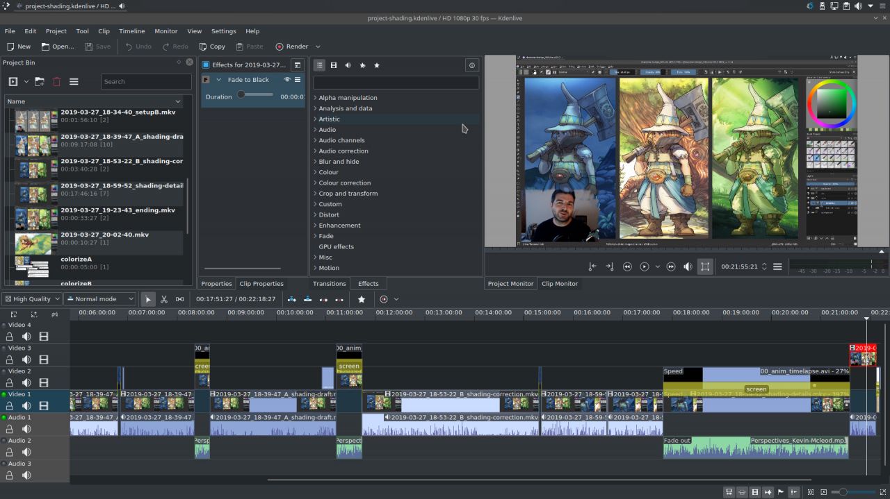
Kdenlive for video-editing my tutorials.
The next step (starting tomorrow) will be to color everything: characters and background and for that I'll use the Colorize Mask and a single shading layer. I explained my method last weeks on two video tutorials I published.
Episode 29 should be ready before the end of April and the process of starting translations before the release will start within the next days and be annunced on the translator mailing-list or on this thread on Framagit. I'll probably publish a third part about coloring after the release.

