Production report: episode 29, part 1
Here is the first production report about the future episode 29 of Pepper&Carrot, an insight into the work behind the scene of next episode.
Scenario
The work on the scenario started in September 2018; at the same time as all other episodes related to the trilogy of the Coronation of Coriander. But between September and January, I had the time to change my mind about the mini climax I wanted. The base concept of ep29 never really changed: a giant monster attacks the party and an original take on the classic "A heros save the world". So, I rewrote the episode from scratch in January (proofing to myself writing episodes ahead was useless) and I posted the new English version on a new thread on Framagit to collect feedback.
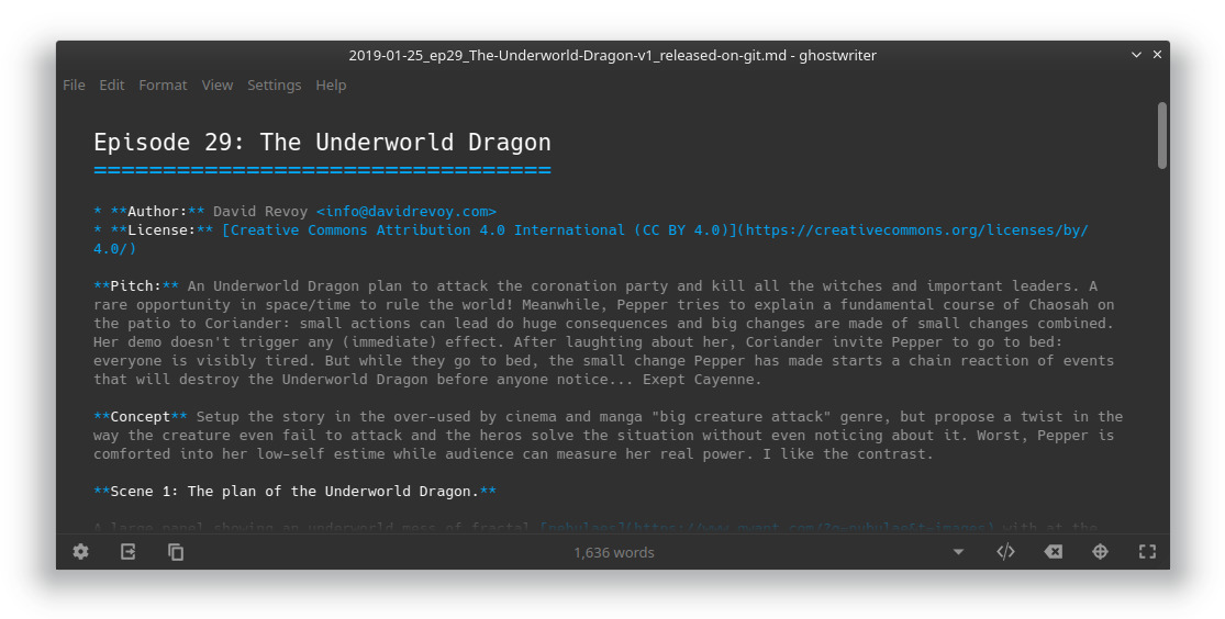
The first public version of ep29 scenario. Markdown format, Ghostwriter editor.
Production research
The previous episode of Pepper&Carrot was -again- too long for my taste to produce and not enough fun. It took me hundreds of hours to complete details of episode 28 because I went into a paint-over workflow and I clearly understimated the work between the base artwork at the "beta" release and the quality I had in mind for the final (paint-over).
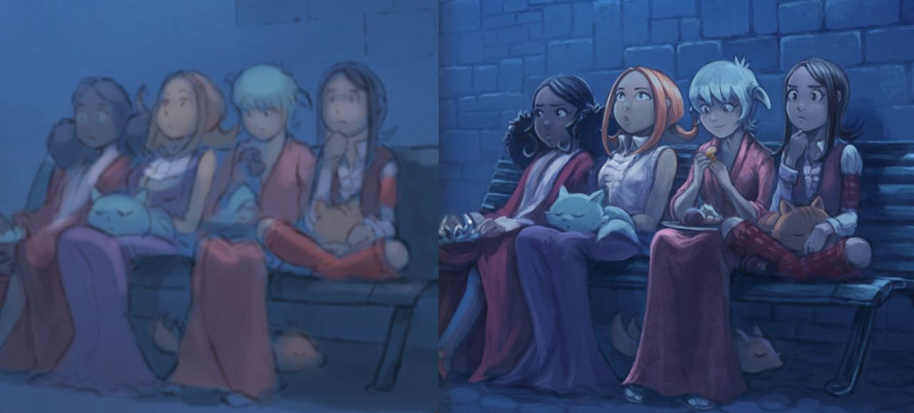
Episode 28 process: On left, beta version; on right final (paint-over).
This technique of paint-over is a lovely one and quick for a single illustration where you are free to stop the details at any time; it works if you leave area undetailed as I made on episode 1. A thing I learned, it becomes very time consuming when this technique is used in a series of panels with consistent lighting and colors. The problem being; you need to match the same level of details each time and the same color palette and values. I even had at one point to remove details of some panels on ep28. The eight pages took a full month of detailing full time . I had time to meditate on that. That's why I started to look back at the more classic workflow with line-art, flat coloring, shading and decided to run more experiments with them (even if I dropped them in the past for being exhausting too and long). Now, I'm looking at simplifying: keeping details thanks to the drawing; and simplify the hours of painting.
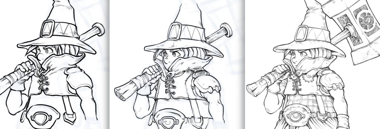
Experimentation of various inking presets and simplifications (click to enlarge)
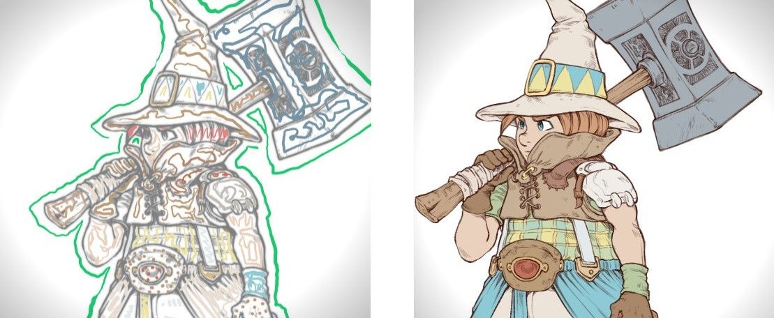
Experimentation using colorize-mask over detailed line-arts. It works surprisingly well.
As my tests started to be more robust, I decided to test the full workflow on more complex illustration ("Flight of Spring", process captured in a video). I developped new rules for inking, for flatting and for shading this way. I started to write video tutorials about it and I hope I'll have time to record them and video edit them before the end of the month.
Storyboard:
After collecting feedbacks from the scenario release on Framagit, I started to rewrite the story. My plot had a big flaw and it was necessary to adapt the script and fix it. That's why this step is precious and I thank my beta-audience for that.
Making this storyboard marked a turn for me in the production of Pepper&Carrot: I was sharing previously my storyboards and all my process in English but even with talented correctors and proofreaders to enhance my English I felt the dialogues were still suffering of that process compare to what I had in mind, especially when English was backported to French. So, I decided to author back my storyboards into French at the root, so I can better sync the little subtle intention of each characters, the no-spoken words, emotions of certains words or expression. I don't have the skill to do that in English (as you can probably read right now on this article if you are a native speaker).
It was also a complex task to compress the epic arc of episode 29 into only eight pages. The scenario cut on the markdown text format never really succeed at cutting exactly good looking pages. For the short format of my episodes; each speechbubble, each word has an important meaning for the whole structure. I drew the storyboard in a long Krita document to easily insert panels, move them from the previous to the next page, taking notes on margin, etc... This way I can scroll the document and re-read the story and fix it on the fly and get an idea of how I use the zoom of my virtual camera to frame what character at what time.
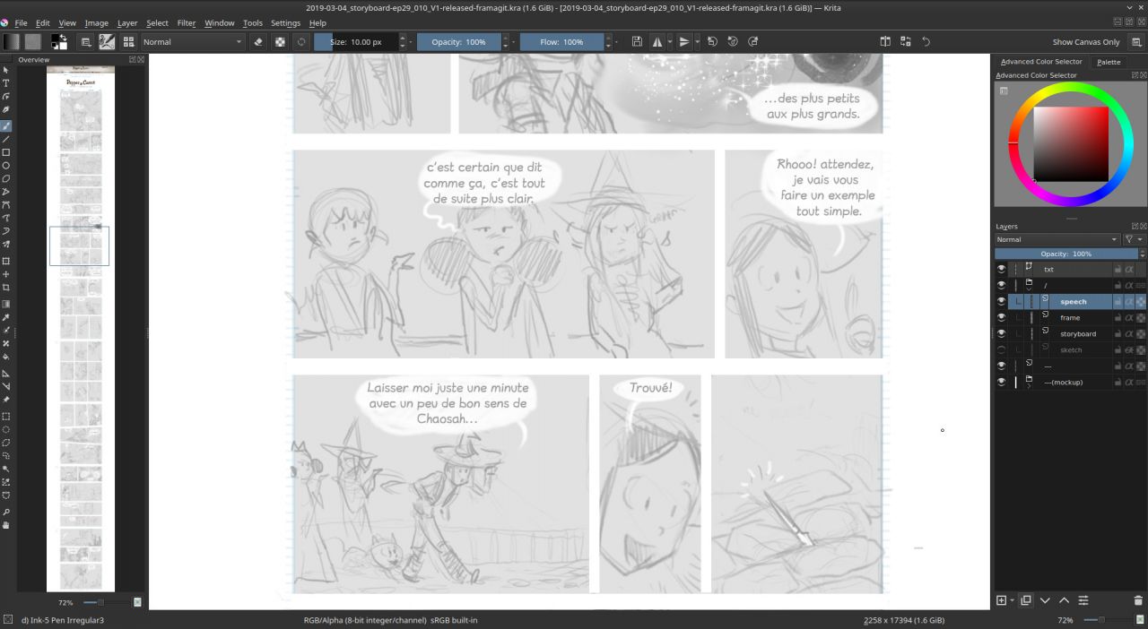
The very rough storyboard of the eight pages was done this way in Krita.

Page 1, storyboarded, without speechbubbles
Getting feedback on this French storyboard was more difficult; because English contributors had to read it side by side with a text file in English (a quick English translation proposed by M1dgard and enhanced by CalimeroTeknik). I have to improve the workflow next time.
Too ease correction and translation to English; it was time for me to split all the storyboard into individual Krita pages and split the speechbubble to Inkscape. So I made this long step: Adapting the project to the translation system of Pepper&Carrot, vectorisation of speechbubbles and retyping all the text. It was hard to guess at this early step the best design for the onomatopia using the Filter Editor of Inkscape and get dynamic effect so the translator can still translate them. I'll certainly have to adapt the artworks colors to match with the onomatopia.
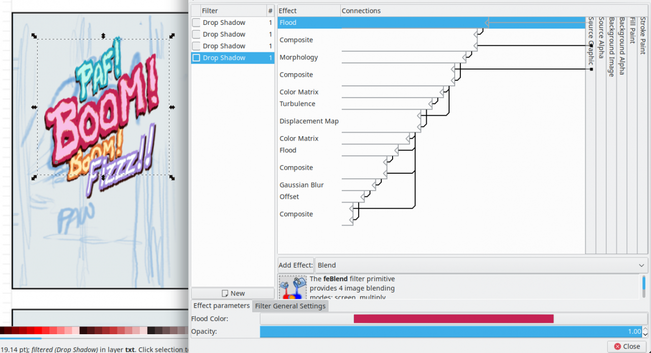
Inkscape Filter Editor in action to decorate onomatopia
After that, the French artworks and SVG were sent on Framagit and the discussion about the English translation is still running right now in a Merge Request (but also almost ending).
Preproduction and Concept-Art
In this episode we have an action happening accross the street of Qualicity and a giant dragonish creature coming from another dimension. It wasn't possible to start drawings without doing a round or two of research.
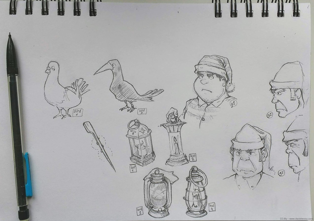
Research for props, and secondary characters.
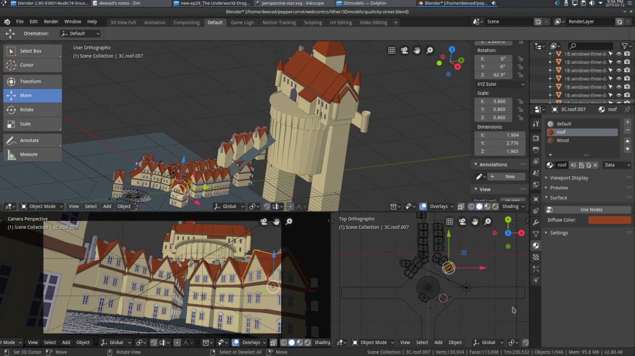
Mockup for a part of Qualicity in Blender (Eevee, yay!), click to enlarge
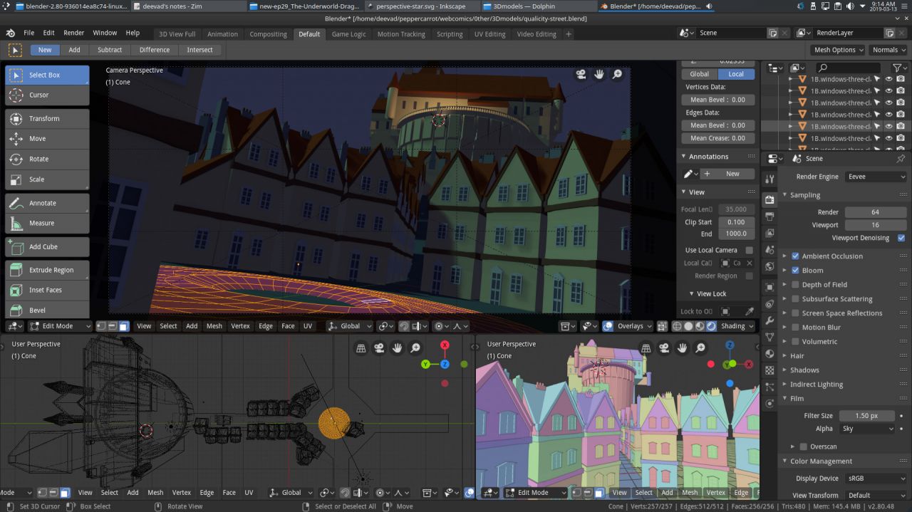
... and rendering the shots with a quick shading to ease background creation, click to enlarge
Production: inking
The production started two days ago, so right now I only did the inking of the most difficult page of the eight; a page with a lot of panels about a dialog. I'm evaluating if this inking is matching the research I made or if I'll have to redraw it. The size and resolution differs and brush, stabilizer, reacts really differently depending that. So,I'm typing this production report to take a little bit of distance and get an overview of what was done since episode 28.
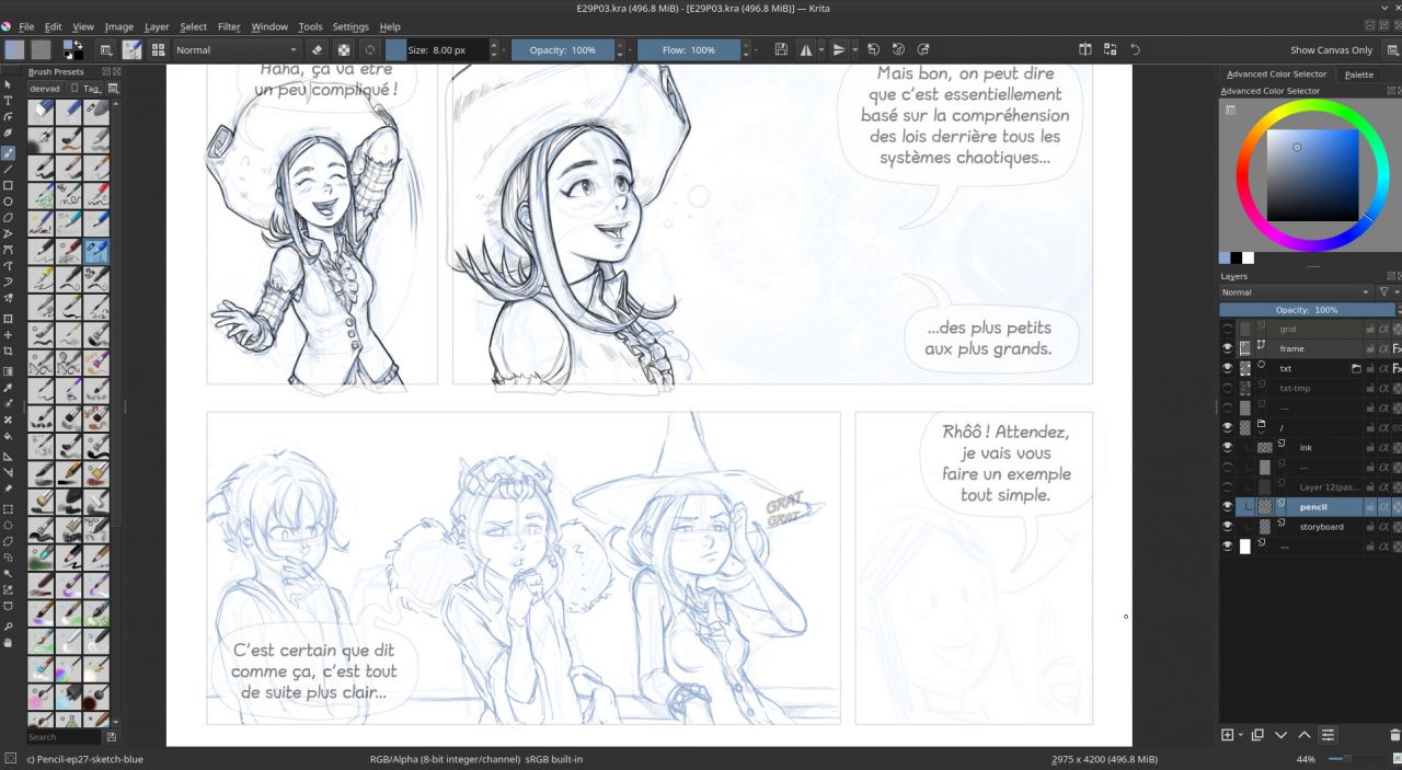
An overview of the process:
top inked, blue pencil in middle and storyboard still visible (click to enlarge)
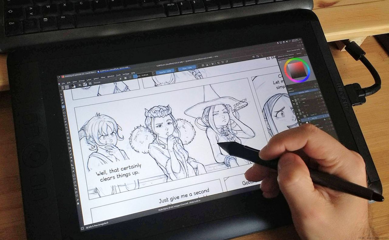
A screenshot while inking a panel on the Cintiq13HD, (click to enlarge)
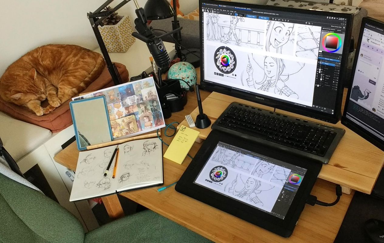
The setup of my desk right now and my tiny wood furniture I made on
top of my desk to increase the comfort of using the Cintiq 13HD
That's all for this report about the production of episode 29. I hope you liked this post! Next part will be posted when I'll complete inking, flatting colors and when the episode will be receive the "beta" label (meaning ready for all translations before the release). I hope to reach the beta by the end of March.

