Making of the second cover of Pepper&Carrot
This cover was painted from scratch with Krita. Here is a little gallery of making-of, and work-in-progress pictures.
Digital sketch
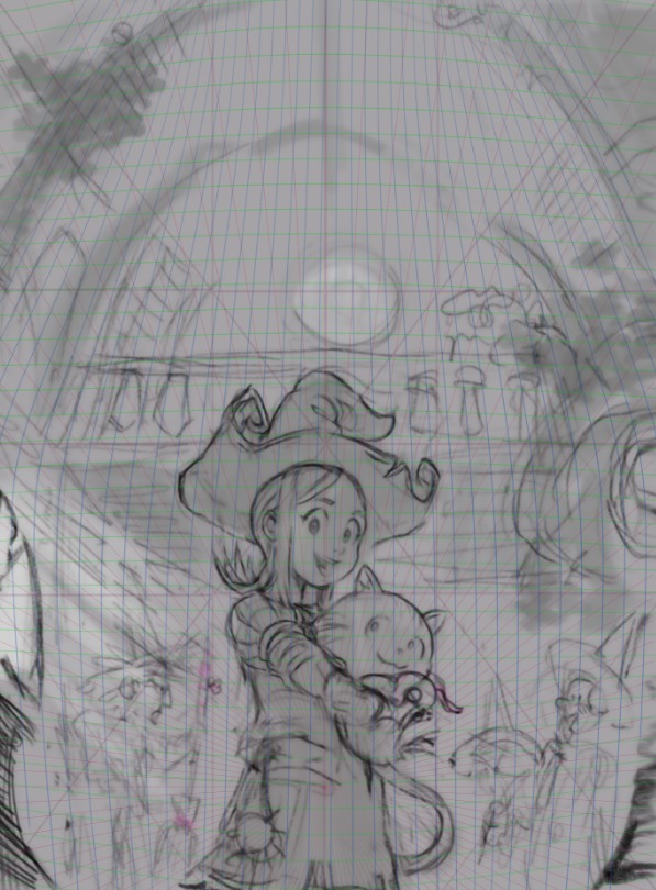
All started with this digital sketch done over a deformed perspective grid and composition guidelines for a vertical book cover.
Mapping the house of Pepper
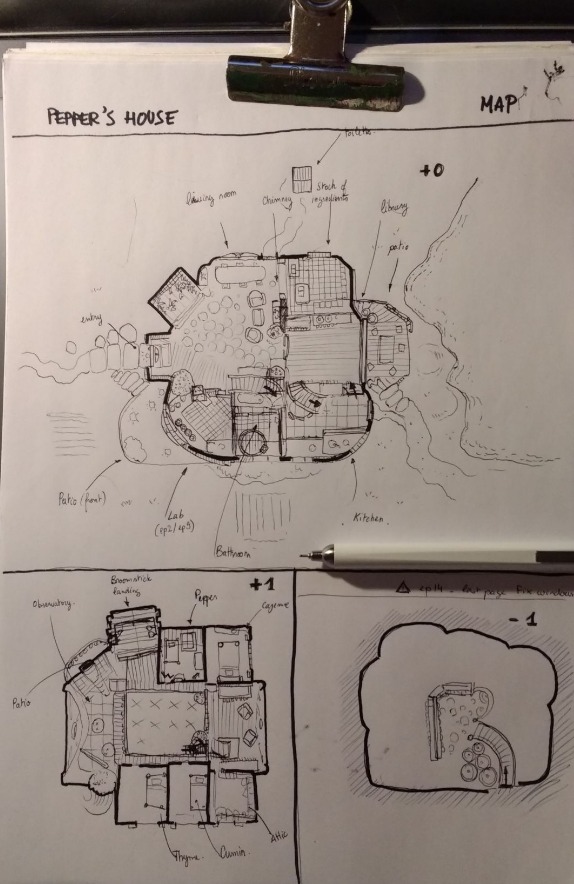
To make this shot from the interior of the house of Pepper, I also had to map her house, and make it consistent across the episodes. Episode 14 received a little update to be sure the comic would match the new map of the house.
Process:
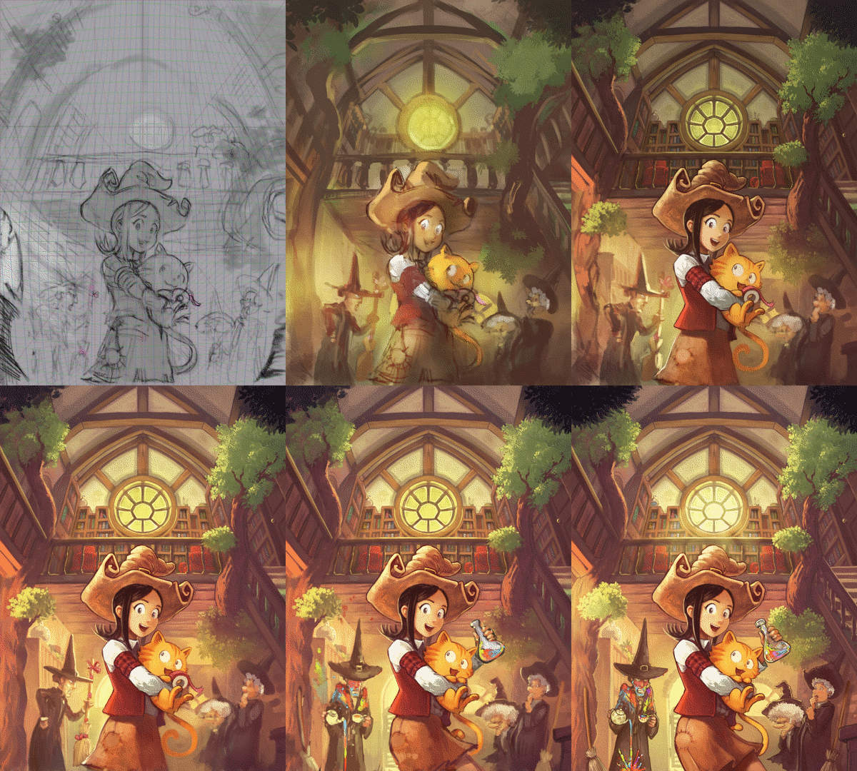
As you can see in the gif animation under; it was a long and incremental work of speedpainting and then detail with paint-over. But this process was probably the most flexible to keep a control on the render and ambiance of the global artwork.
Testing variations around the theme:
The theme changed a lot during the painting. I wanted to find something funny that communicate instantly the comedy theme of Pepper&Carrot. A big thanks to C.Maloney and Valvin on our IRC channel for the feedbacks all along the process.
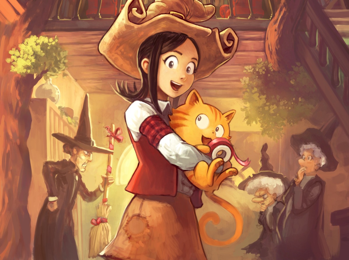
First Joke rejected: Cayenne was asking Thyme and Cumin what happen to her broomstick. The clue was subtle the pink ribbon was in the paw of Carrot.
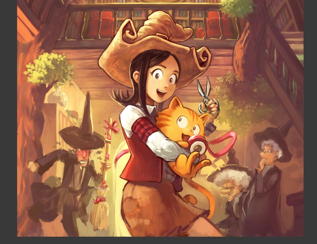
Second Joke: Similar to first one, a bit more dynamic, with scissor to try to make the message more obvious... but it wasn't working.
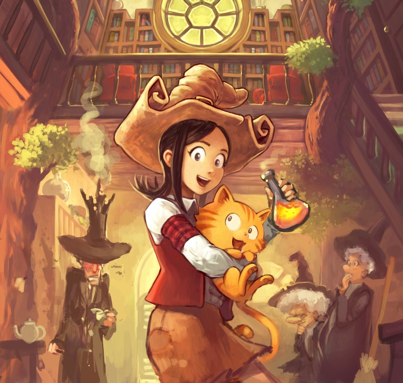
Joke C : the good old 'Kaboom' explosion gag. But hard to make a relation between the potion
and the explosion. Also, explosion are too aggressive for a pranks... But the final version is just a variation around this theme.
That's all. Thanks for reading this article!
You can see the final artwork in full resolution here.


11 comments
Is there a real life girl that this character is based on?
Its so sweet! So lovely to see a new artwork! Very helpful to see the process.
Great as always, deevad.
What has it got in its pocketses?
Seriously - what is that round object in Pepper's (i assume) pocket?
It's a circle patch of leather, not a pocket.
http://www.peppercarrot.com/extras/forum/2016-11-29_Selection_001.jpg
For Pepper? No, it's a 100% character from my imagination.
Ah. Patching a hole, then?
Exactly :)
Thanks you to let us participate to your wonderful work :)
It's a bit disappointing that source kra file (located in "Sources" -> "Artworks") is not really a layered source. I mean, it doesn't contain separate layers for line/fill/shadows (the image is "flattened"). This makes it almost useless for remix-reuse (unless I put some effort into separating characters manually). Any specific reasons for this or am I missing something? ^__^
I Konstantin; no specific reason ; if you look at the work-in-progress, you'll see it's how the picture was made: flat.
The outline were painted as other elements of the painting: it's details. It's a painting technique I have, and be sure I'm not hiding special source files somewhere else :)
Post a reply
The comments on this article are archived and unfortunately not yet connected to a dedicated post on Mastodon. Feel free to continue the discussion on the social media of your choice. Link to this post:You can also quote my account so I'll get a notification.
(eg. @davidrevoy@framapiaf.org on my Mastodon profile.)