Making of: Yin Yang of World Hunger
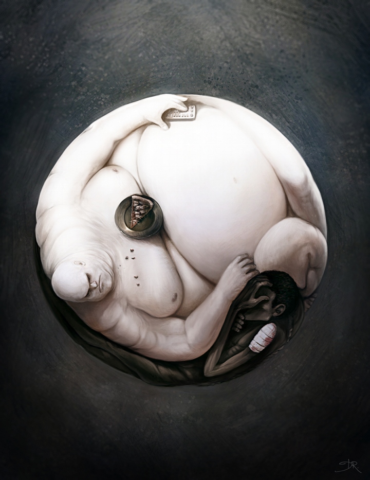
I created this personal artwork in September with the following text: “Enough food is produced in the world today to feed everyone, but it’s not the case... That’s the best way to see the total failure of our actual human societies. This is what I tried to represent in this picture. You can help with signing this free online petition www.1billionhungry.org to express your support against world hunger. Done with Mypaint and Gimp on Linux”. A large movement was created around this artwork with thousands of blog and social websites sharing this visual message. A lot more I would ever expect from an artwork. Thanks ! I propose you to discover the making of behind “Yin Yang of a world hunger, this making of was published months ago for Cgarena.com . I'm happy to take time this evening to also post it on my blog to share with my visitors. The cloned article is here.
TRADITIONAL
The idea of this artwork was born in the metro of my city. When I was back in my home studio, I speedily sketched on a ‘post-it’ yellow paper and glue it on my desk. It often happens to me to have an unusual idea and leave it on the corner of my drawing table to see if it’s not a whim of the moment.
Day after days, this little post-it bad sketched idea watched me working with always the same intensity. So I decided to do a digital painting of it, even if it’s not really adapted to my ‘Fantasy’ portfolio.
 First step was to do a larger and better version of my original sketch. (The original post-it sketch was thrown to garbage just after finished the cleaned one, too bad for the making of). The above photo created today while writing is a reconstitution of the tools used.
The paper used is an A4 page for printer. I used on this one a hard pencil as H, a black liner pen 0.1 and a black marker to fill some area. I used the eraser to brighten some part darkened by the pencil.
I scanned it with Xsane on my canon Mp560 multifunction printer at around 150 dpi. I didn’t look for grabbing a hi-resolution version of the picture, but I wanted to use it as a guideline. 150dpi is really fast too and make the transition from the drawing table to the computer less painful in my opinion.
The scan is cleaned and cropped with the tools of my picture viewer Gthumb. When the acquisition work is finished, I can open it in my main program: Gimp to start to prepare it for digital painting.
GIMP - PAINTER PREPARATION
Before starting the digital painting process, I like to prepare my artwork with few tricks to make it easier to paint on. Cross hatching lines of my sketch, hard outlines and high black and white contrast are unwanted effect of the scanned picture, and to break it I apply this solution:
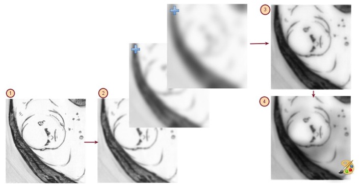
 From the picture on the previous page (a reconstitution I did):
1. The scanned sketch.
2. I duplicate the sketch 3 times to obtain 3 layers. On the top one I apply a big Blur effect (with a large radius) Filters > Blur > Gaussian Blur. On middle layer with a less and large radius. The first one a radius just too softly blurs the lines.
3. I change the layer blending mode (on the layer windows) to ‘Multiply’; the result become too dark, and to avoid it I reduce the opacity of some layers.
4. I flat the result Image > Flatten Image and I shade the overall with an airbrush in multiply blending mode.
 5. Now the picture is ready.
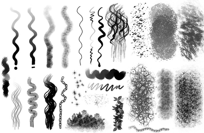
Here is a step I kept from a backup drive of the preparation step of my illustration. I also used a brush ‘Sparkle’ to overlay a little texture. The sparkle brush is from my brush kit ‘Chaos & Evolution’ for Gimp-painter ( Note : Chaos&Evolutions brush kit are merged now with the GPS project ; up to the 1.5 version ) . To finish my preparation, I scale the result to a better size to work details: around 1800x2400px.
DIGITAL PAINTING WITH MYPAINT
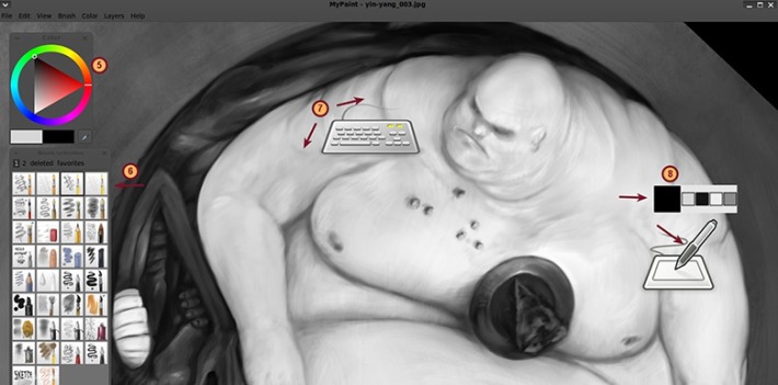 When my preparations are over, I open the picture in Mypaint (I use flat PNG to communicate between the two applications most of the time). I prefer to paint in this painting program for many reasons, the most evidents are about the fast 2D engine, and the good ergonomic. On the picture under :
5. A simple ‘GTK wheel’ and fast color selector (a more complex with advanced feature is also available) but I like this one a lot since we can use it in ALL other open source programs I know. (ex: If you develop a strong color selection ability with this one, you will be able to use your abilities everywhere on Linux after).
6. The icons of the brush selection, here it’s my Brush Kit V3 for mypaint (installed by default with many others strong brush kit ) as it’s a recent “reconstitution screenshot”, some tools of the future V4 can be seen (still in experimentation ).
7. Working with an illustration condensed into a circle is easier with a program able to rotate the workspace. With Mypaint , you can assign 2 keyboard shortcut for rotate left/right or use Ctrl+Space to rotate depending of your stylus position.
8. The right-click in Mypaint propose a little pop-up menu next to the pointer with a 5 block of color history. This is easy to call from the stylus pen button. On a grey scale work it’s make an easy palette to select last greys used as well as pure black or white.
With Mypaint I finish a black and white version of my illustration. I take care of the modeling, the shading and refining the drawing of each shape.
RECOLORING IN GIMP - PAINTER
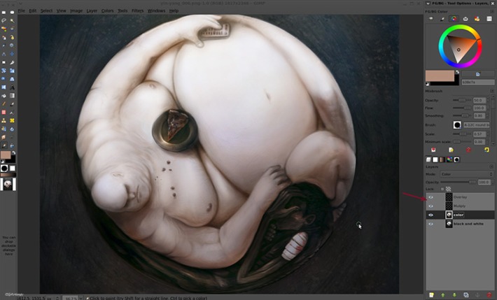 I re-import my artwork in Gimp-painter, and I crop the artwork to the good size (My paint infinite canvas compute sometimes extra-borders at saving , it’s a well know side effect of the ‘infinite painting workspace’ features for Mypaint users). In gimp-painter I create a layer above my grayscale artwork with the ‘color’ blending mode, and I start to paint on it the color I want to add to my artworks.
With the same process I work on deeper shadows on a multiply layer, and highlights or effect with an overlay layer. This is fast and efficient.
When I’m happy with the result I flatten the picture and continue to paint with the ‘mix brush’ of gimp-painter to correct the details.
RETOUCH IN GIMP PAINTER
 I always finish an illustration with a bit of image manipulation to enhance my effects and rendering.
I often sharpen (Filter > Enhance > Sharpen) my picture to reveal the painting strokes a bit more. I also in this case overlay a texture (here on the background, a texture in grey level on a layer in ‘overlay’ mode) and I play with the ‘balance of color’ and the ‘contrast’ of the picture. (In the ‘color’ menu).
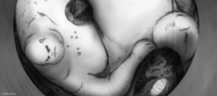
I usually have more than one result with these manipulation experimentations. (Here under 4 results thumbnails ). At this stage I like to let those result ‘sleep’ on my hard drive for a night or few days. Few days after, when my eyes “refreshed”, it’s easier to do a choice, and it’s often evident. I will choose the last one: even if the contrast burn a bit the black and overexpose the white, I like the effect of dramatic light.
That’s how end this making of.
Nothing revolutionary in terms of workflow aside the fact I use only Free/Libre/Open Source Software on a Linux System.
This artwork was not meant to be a technical demo in the result, and as you saw In this article; all the step from A to Z were easy and totally controlled in a minimal of execution time.
I hope this article will inspire you a bit or give you ideas of a workflow to produce your own artworks. Thanks for reading!
Final :


19 comments
:)
what is original image size?
Hi Deburger ;)
The original sketch is around 15cm by 15 cm ( made on a A4 white page and cropped after ). For the final artwork, a bit little in resolution ; 1792x2324 px
Very nice walkthrough, really enjoyed reading it.
Your website is a dwell full of insipration. Wonderfull use of all sorts of techniques to accomplish your goal.
Am Following you on twitter now, to never miss anything new :)
Thanks a lot Mohammad and Philipp for following :)
Hola David
The Ying Yang of world Hunger is magnificent not only the concept of what is happening, but the way the lines and the shading is used..
I really hope society changes.. People like you make others visualized it better!!
ps the crumbs really bother me on the fat man's boobs he probably has some under his skin :S
Yin is characterized as slow, soft, yielding, diffuse, cold, wet, and passive; and is associated with water, earth, the moon, femininity and nighttime.
Yang, by contrast, is fast, hard, solid, focused, hot, dry, and aggressive; and is associated with fire, sky, the sun, masculinity and daytime.
Which one do you consider your self Yin or Yang?
@Paola Bieri :Thanks Paola for your comments. I consider myself as a searcher of the void between the 2 extremeties in the Yin Yang, so my ideal is on the invisible limit. But I'm still really far ; I think personnaly I'm still a Yang spirit in a Yin body , ( and sometime vis-versa ).
Wow, cette oeuvre est tout simplement saisissante, tant au niveau du concept que de la réalisation! On y retrouve toutes les relations qu'on peut associer au Yin et au Yang; la relation d'interdépendance, d'opposition, mais aussi d'engendrement. Très bon concept.
@Caroline : Merci
It's in the todat's deviations on Deviant Art
your art is very meaningful.
very good picture, it actually mean's something.:)
The big one looks like a "Wilson Fisk". Does he ?
Le gros ressemble à Wilson Fisk. Non ?
@Bruce : pas voulu :) et je connaissais pas. Est-ce que ça apporterais quelque chose au dessin si c'était voulu ?
This is so amazing, Deevad! I was searching for yin/yang dance and here you go! what an amazing representation, spot on! And even coincidentally black/white, obese/undernourished, male/female ... its great message. Great message for the mind and heart. I'd like to put my 5c in addition to it... The world is out of balance isn't it? Is it TRUE? Its great as it is, Deevad! It made me notice it, this out of balance Yin/Yang. And to add balance to Yin/Yang I'll make my own picture of a large white center in black and small almost none-existent center in white. I love it! Great work! My respects to you! Mila
PS: I am not sure if i can send you a picture. Picture is worth a thousand words. x
@mila : Hey, thanks Mila for the feedback !
If you want to send a picture on the comments, you can ; just copy/paste a link to it.
This is an amazing concept and image! I just wrote a short essay on it for my theology class in social justice.
-C
@CG : Thx !
Very cool artwork
Post a reply
The comments on this article are archived and unfortunately not yet connected to a dedicated post on Mastodon. Feel free to continue the discussion on the social media of your choice. Link to this post:You can also quote my account so I'll get a notification.
(eg. @davidrevoy@framapiaf.org on my Mastodon profile.)