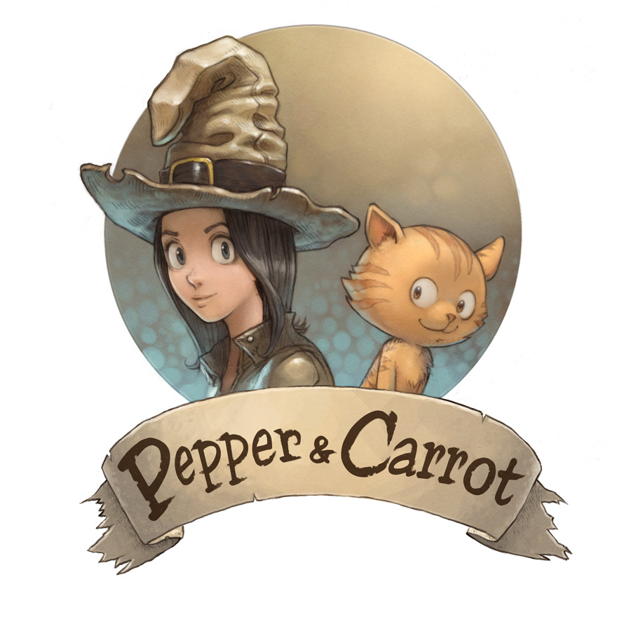
Here is the re-design of the 'logo' of Pepper&Carrot. The first version of this logo was done just after publishing the first episode, around April 2014. On recent episodes, the design of Pepper and Carrot evolved and the first version started to look too different to keep representative. I hope you'll like them! I'll maintain this week all the places online where the old logo appears.
Download :
High resolution on transparent background available here http://www.peppercarrot.com/extras/?dir=logos
Previous logo ( April 2014 ) :

License: "Pepper and Carrot logo" by David Revoy − CC-BY 4.0
Tags: #artworks | Download: Markdown
14 comments


14 comments
The faces and the colors are much better, but I liked the hat in the old one better. But still in general a big improvement and awesome work!
@Michi : Thank you Michi!
I really like the new logo. And I always like the big hat Pepper is wearing now, so distinctive! :)
@Jooncat : Thank you for the hat :)
Beautiful! Even better than the first one :D
I'll try it <a href="http://agar-io.us">agario</a>
I like the new logo better than the old one not just because of the improved colors and artwork but also because Pepper is smiling while hugging Carrot, who is looking up at her. This is contrast to the first one where she doesn't smile as much and she's standing a few inches apart from Carrot.
Also, Pepper's hat is more distinctive in the new logo than in the old one.
The mention of the hat made me think of a story idea (one episode long) where Pepper loses her hat temporarily or someone tries to steal her hat. Then she and Carrot retrieve it or bring it back.
@Nina : Thank you for the feedback!
Last week I added a "fan-fiction" category to the blog, if you write stories ; I'll be happy to repost it.
I agree with Nina. Congratulations on this new logo! I'm going to use it to make comic books of your stories in Esperanto
I love your artwork. You are an inspiration for me. (By the way I'm 12 years old.)
@Andrea : Thank you Andrea, you are lucky to be 12 ;-) I'm almost 3x older.
The image of Pepper and little Carrot here is outstdanding. Inspiring to see you continuously improving your design!
Hi David, is there a writing of yours somewhere that explains your decision to not use spaces in the comic's name? Thanks!
Hi,
I don't think I ever wrote about this topic. When I had to do the design, I decided to spy how another large and successful brand managed with a brand name like "xxxx&yyyy". I studied www.benjerry.com and liked their choices and consistency, that's why I don't have the space ; and that's also why I'm using www.peppercarrot.com instead of adding a special character in the URL. :-)
Post a reply
The comments on this article are archived and unfortunately not yet connected to a dedicated post on Mastodon. Feel free to continue the discussion on the social media of your choice. Link to this post:You can also quote my account so I'll get a notification.
(eg. @davidrevoy@framapiaf.org on my Mastodon profile.)