What is the best Krita cursor?
 Updates:
2017-01-08 : Tutorial also available in Japanese thanks to Guruguru: http://sp-cute.hatenablog.com/entry/2018/01/08/180930
Introduction
When you create an artwork with Krita, there is one little thing you'll focus your eyes for hours: your cursor. This cursor represents the tip of your "digital pen" and from this brush tip will emerge the few or hundred thousands brush strokes necessary to create an artwork. That's why this part is really important for many users across any digital painting software. Over the years, the Krita team added many presets and propose nowaday many variations of cursors. But what is the best Krita cursor you can select to create your own artwork? Why this one over another one? the pros? the cons?... In this article based on Krita 3.x serie, I'll share my tips and feedback about this important feature and attempt a full review of the brush cursor. An ambitious article!
The Settings
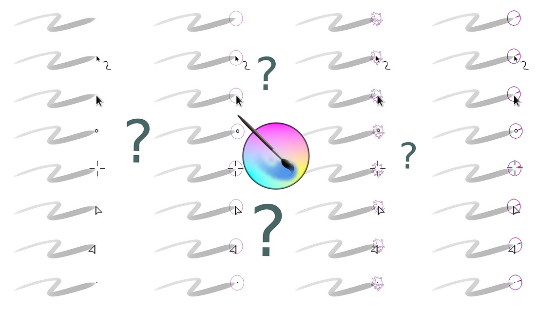
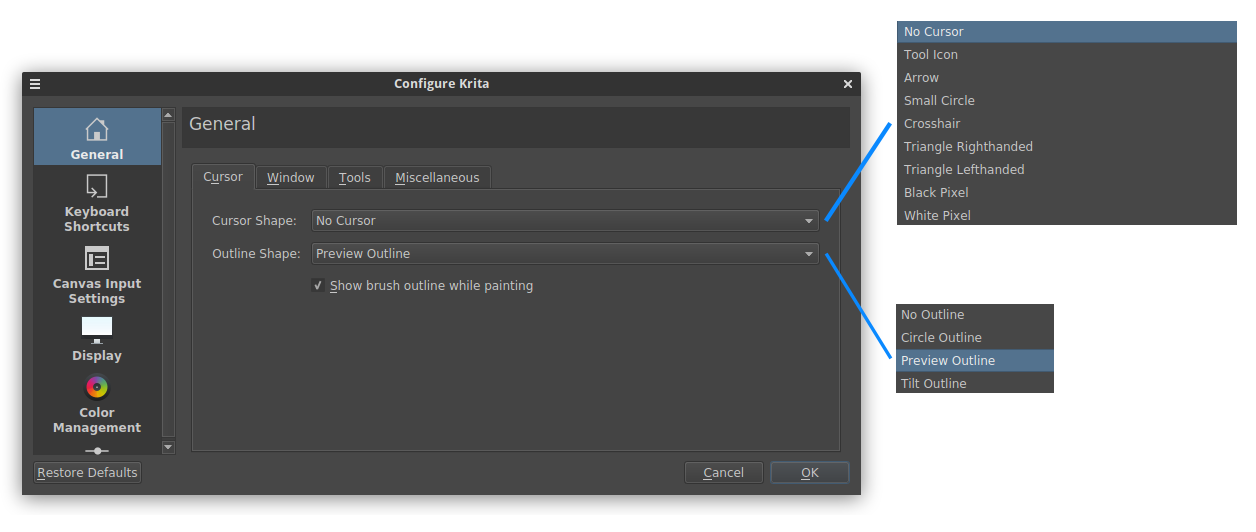
The "Cursor" panel is a very important interface in the Configure Krita windows. It's not a pure hazard if this panel appears at first when you open the settings ( on top menu bar : Settings > Configure Krita ). Krita propose on this panel to setup two aspects of the cursor : Cursor Shape and Outline Shape. With Cursor Shape option, you can select within a list a preset that will replace your actual cursor with another shape. By default it is set to No Cursor and the list contains nine other options. This Cursor Shape is just a Black or White static image pasted at the position (x,y) of your pointer on the canvas. This static images are configurable in the source code of Krita as *.xpm images in the folder krita/data/cursors. The second option named Outline Shape is more complex ; it's a decoration generated by Krita around the (x,y) position with more dynamic feedback about the shape, type, size of the selected brush. By default it is set to Preview Outline and contains four other options. Finally, a checkbox under this two list proposes you to Show or Hide the Outline Shape while painting (when the stylus hit the tablet). It is checked by default to always show it.
All the possibilities:
If you combine the two lists, you can obtain thirty six cursors! I made a table of all the possibilities (it was long, believe me) so you can get an idea of all of them. If you are familiar with my videos or screenshot, I'm using mainly two presets depending of the task I'm doing. I highlighted them in green on the table graphic under:
Choice 1: Painting (No Cursor+Preview Outline)
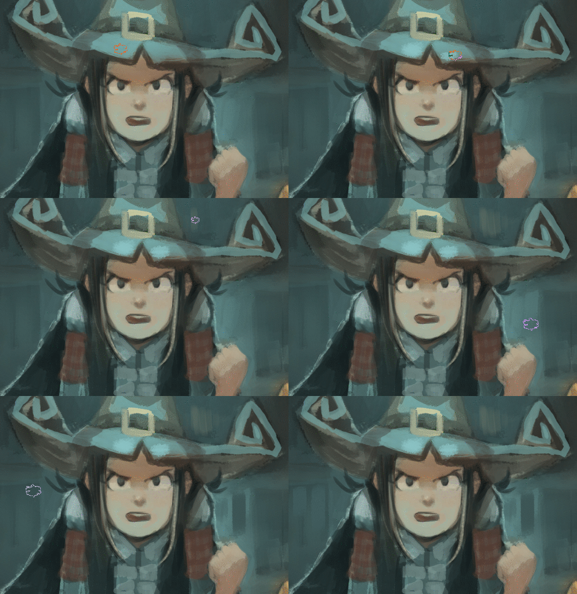
For painting (but also coloring and speedpainting), I'm using the default settings: No Cursor+Preview Outline. There is a good reason why this setting is selected by default: its working in most of case. Here under is a little demo about how it looks while I'm painting with it. In short, your cursor transform into the shape of your selected brush. It's convenient to always have an idea about what type of brush you selected and what is the size of it. You can not go wrong between the feedback of a textured brush with a specific outline and a large airbrush with a specific pure circular outline. The color of the Preview Outline also change depending of the background color of your artwork. The outline is dark when you fly over a white background, and bright over a dark background. It also change colors and adopt hue of red, blue, pink etc... to increase the contrast with the background color. Eg. look on the animation under when the Preview Outline is over the tip of the hat: it turns almost pure red.
 The Preview Outline is a solid choice in almost any cases. It gives a far better feedback for the brush preset than Circle Outline or Tilt Outline ; the two other Outline options. This two only display a circle with maximal diameter of your selected brush, the Tilt Outline adds a little line to show the tilt direction if your tablet as tilt support. But Preview Outline -even if it's still my favorite after years of painting with Krita- is far to be ideal... In order to present why I need to use a second setup for my cursor selection in Krita, I need to introduce under also all the cons of the default Preview Outline:
Preview Outline cons:
1. It's noisy and aliased. This is an effect you can see with most presets using rotation sensors: the aliased pixels dances as the shape of the cursor get retraced while flying over the canvas. It makes focusing on the artwork more difficult.

2. Weird feedback of max width. Krita change the size of the Preview Outline when a dynamic sensor on size is attributed to the active brush presets. Software like Mypaint ( I also saw video of Clip Paint Studio) preferred to not give this type of dynamic feedback. I would prefer here getting the max diameter always visible to give me a better feedback of the max width size. Keeping the display of the max size helps for example to match the border of a orange shape when I'm filling an area.
3. Not precise. The Preview Outline doesn't display its center. This can be solved by adding a small cusor in overlay and I'm often using it when I'm doing detailing. Krita propose two options to solve that. The first one is to use an additional Cursor Shape on the top as the Small Cursor preset. But this cursor is a bit big with it's 3x3 pixels. But it works on white and black background. The other solution is to add the cursor Single Pixel white or Single Pixel Dark. The two solutions are very efficient: getting a single pixel in center for precision really helps to aim the start of a stroke. Unfortunately, this cursors are not adaptative for the color of the background, and they need manual switch very often...
![]()
Preview Outiline + Single pixel black
4. It blinks a lot. Another side effect of showing the dynamic of the size sensor in real time: the cursor often jumps from max width to minimal width, transforming the drawing experience into a very "blinky" and stroboscopic experience.

Krita
Choice 2: Drawing (Triangle Righthanded+No Outline)
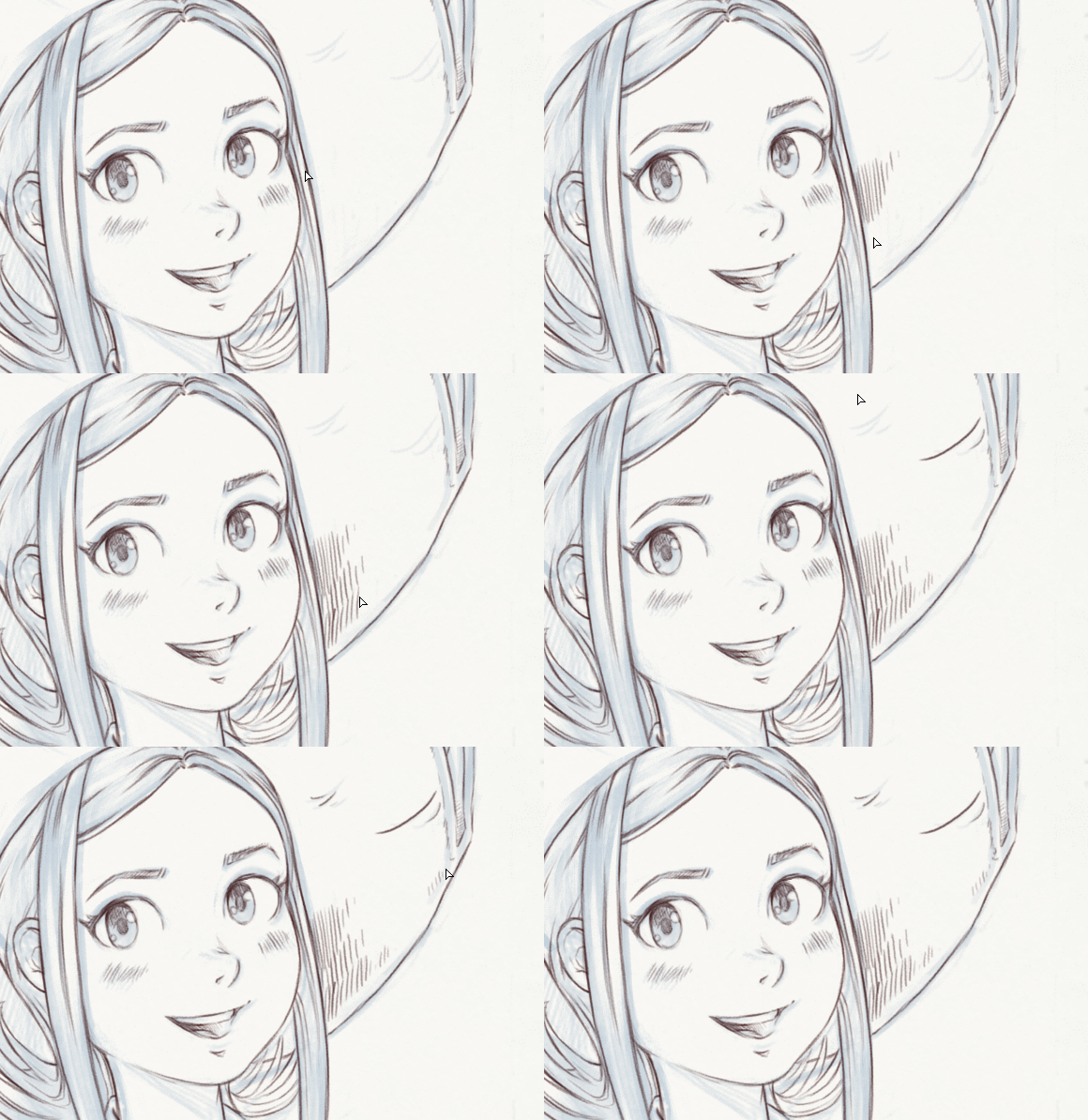
To workaround the blinking and precision issue of the Preview Outline, I'm using the cursor Triangle Righthanded, alone, without outline. It has a a sharp tip when I'm drawing ( a Lefthanded version also exist if it is your case). The triangle tip feels like the triangular tip of a sharp pencil, I can crosshatch quickly without getting an epileptic blinking effect. Here is a quick demo of how it looks:
The limitation of using only a Cursor Shape is obvious: It's hard to get a feedback when you change brush preset (for exemple, when switching to an eraser preset while drawing, or when using a large deform brush to push and adjust a sketch) , but in case of doubt , it is still possible to press "Shift" and Krita will show the brush diameter (to propose a resize gesture).
Also, Cursors Shape are more performant in Krita than Outline Shapes, they often give you a better feedback of your real position while Outline Shape always have a latency to be traced. You can see how the outline lags behind the cursor in the tiny animation here under. Cursor Shape is always realtime while the Outline Shape is lagging behind. This low latency is decisive when you sketch, do crosshatching or when you draw quickly little details. Preview Outline always have a couple of milliseconds late... It's often good enough while painting with large brushes but a no-go as soon as you start adding thin detailing or doing lines. That's one of my little secret to have better precision and accuracy and sharing it was the goal of this tutorial ;-)

Cursor Shape are faster and more precise than Outline Shape
Conclusion
Thanks to the Krita team, we have many options to cover many usage cases! With this large spectrum of settings, it's always possible to workaround almost any situation. I hope you'll have fun exploring all the cursors after reading this article and I also hope this article will help many user a bit lost within this type of choices. Did you liked this article? Have a feedback? What is your favorite cursor setup? Share it on the comments bellow ! :-)


22 comments
Great article David! This is the most in-depth article about brush cursors I have ever come across. Thinking about the drawing vs painting, I wonder if it would be an interesting option to have a "smart cursor" in Krita that changes the cursor settings depending on your brush size. The cursor could look one way with small brush sizes...and different with larger brush sizes.
It would be an interesting feature to think over and implement.
Thank you!
Changing depending the brush size is a really, really big challenge. Because a 100px brush at 10% zoom of the canvas appears as a small brush cursor while it appear very big at 200% zoom of the canvas. So, it's not really dependent of the size of the brush, but of the size in inch when rendered on the final device. (Yes, HiDpi monitor increase the difficulty here). So, I wouldn't take a path like "smart cursor".
The actual system is fine :) Maybe an additional checkbox to deactivate the "dynamic size sensor" on the outline would be a great addition to avoid the blinking effect. Maybe another checkbox for having a
single pixel XOR (changing color depending the background color, same rendering than Outline Shape) would make obsolete "black pixel" and "white pixel" Cursor Shapes and give enough precision to use also the Preview Cursor as a detailing or drawing tool.
hi, thanks for the info, now is more clear what cursors are.
i like to preview the shape of my brush so i have an idea what i am working on.
Wow, i had no idea how many brush cursors and outlines were there! and that there was a difference! Thanks for the eye-opener!
My fav is Tool Icon + preview outline. If used for lineart/inking, the preview outline will be too small to notice, but it will helpful when using larger brush to paint... Krita should have its cursor 'max diameter always visible' just like MyPaint... :O
Oh wait, where's my cat avatar?
...... oh, that's in another site... :(
I personally use a BIG high contrast customized system cursor (32 px or more) because it's easier to see it on screen while I'm drawing. This makes it easier for me to understand where the tip of the pen is going than anything else.
Ha yes, www.davidrevoy.com is still on a 900MB hosting, and with over 9000 comments the catavatar code was exploding the host budget. I had to fallback using a tweaked version with only random color and a letter, CSS code only. Sorry about that!
Great article David!
Nice way to show the difference between different brushes
hi David, tnx for your lesson, they are great! i have issue with the brush , can you help me? i want beginning and end of my brush get fade, i try with the pressure , but i does not work, im depressed :( can u help me?
Hi, if the pressure of your tablet doesn't work ; you probably get a problem with your operating system, driver and tablet. So, you need to refer to the documentation or support of the brand of your hardware at first to get stylus tip pressure working.
Great article!
Few years ago I used graphic program with drawing cursor like pencil or painting brush with nearly natural size. This looked like normal pencil drawing on screen. Of course this pencil hided large size of canvas, but it was really better feeling. I don't remember name of this program. It was chinese product. Believe me that was great!. Tip of this pencil was in the center of drawing and the rest normal sized pencil moved like big 3d sprite according your strokes. I miss such a solution.
I found similar look in this screenshot:
http://img.brothersoft.com/topics/img/2010-08/1282874769.jpg
But I remember in my program pencil was in still slope and that was good.
This has definetely piqued my interest. Would love to try out something like this just to see how it feels.
Removing the preview cursor made a substantial and immediate impact on my digital sketching. Thank you so much for this!
Thanks.
Not bad although every drawing app should include an option for custom cursor, in PNG format.
Yes, custom cursor would be great!
Great topic! I mostly use the small circle cursor with no outline. I got used to keeping in mind the width of the brush, because when you change the size of the brush the preview outline appears. That is enough for me. Than I just need the small circle to know where I am haha.
Cheers!
Thank you for this well researched article and the informative animations.
Great, I don't have to be trouble by the settings anymore. But is there any way to prevent Krita from dynamically changing the brush's cursor size when using a brush that changes size depending on pen pressure? It's annoying how it keeps changing especially when I'm working on thin lines with my shaky hands haha
Thanks! The best you can do in this situation is to uncheck the "Use effective outline size", it's a feature that was born after the release of this article afair. Have a good painting time!
Post a reply
The comments on this article are archived and unfortunately not yet connected to a dedicated post on Mastodon. Feel free to continue the discussion on the social media of your choice. Link to this post:You can also quote my account so I'll get a notification.
(eg. @davidrevoy@framapiaf.org on my Mastodon profile.)