Making-of episode 23
Summer 2017 is almost over, and I'm starting the autumn with this making-of episode 23. The production of episode 23 took me longer than usual because I wanted to open every steps to the Pepper&Carrot contributors and because also of my own perfectionism and focus on quality. The style for this episode is really clean, detailed and two month full-time from roughly mid June to mid August 2017 were necessary to complete the seven pages of "Take a Chance" (three weeks were necessary to get a final story adapted to our Git repository for the translation effort, then three intensive weeks were necessary to produce the penciling, inking and painting of the seven pages.) I want to thanks Calimeroteknik, Nartance, Valvin, Cmaloney and many other around our IRC channel for the feedback during the storyboard development. Also, thanks to all translators for the amazing work (the episode is already translated in 18 languages as I'm writing this making-of), and of course, many thanks to all the patrons of Pepper&Carrot for funding all the time I'm spending on this project! I built this article around the visual I collected while painting episode 23. My goal here: less text, more pictures. I hope you'll like scrolling this gallery! Feel free to comment at the end if you have a questions, and if you want to read the final episode, follow this link.

My operating system: (dual screen screenshot, Ubuntu Mate 17.04 + Cinnamon desktop)
My main tools for episode 23: Krita 3.1.4(appimage) and Inkscape 0.92.2(built from sources)
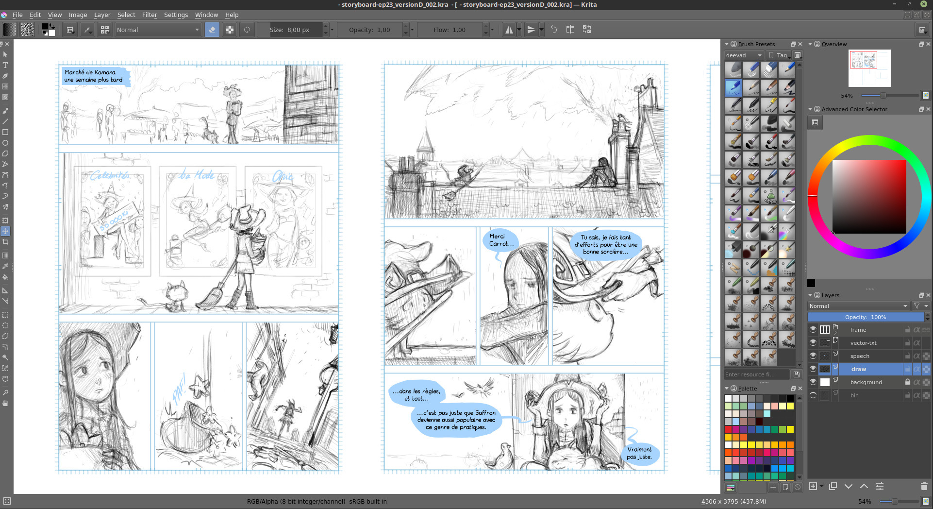 Storyboarding with Krita 3.1.4 : all pages embed on a single document
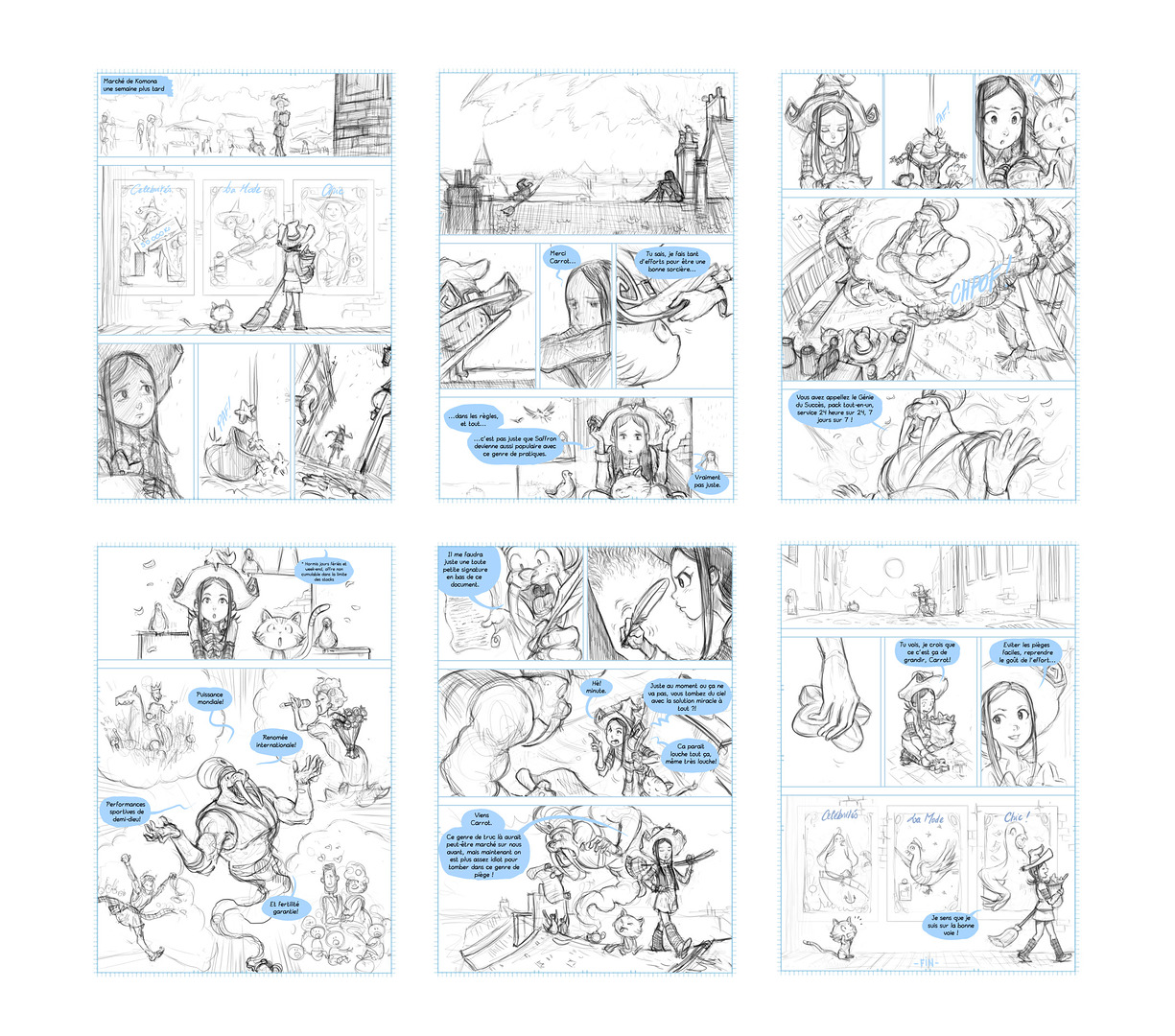
Version "alpha" of the storyboard: six pages only but the story had issue to understand the ending. 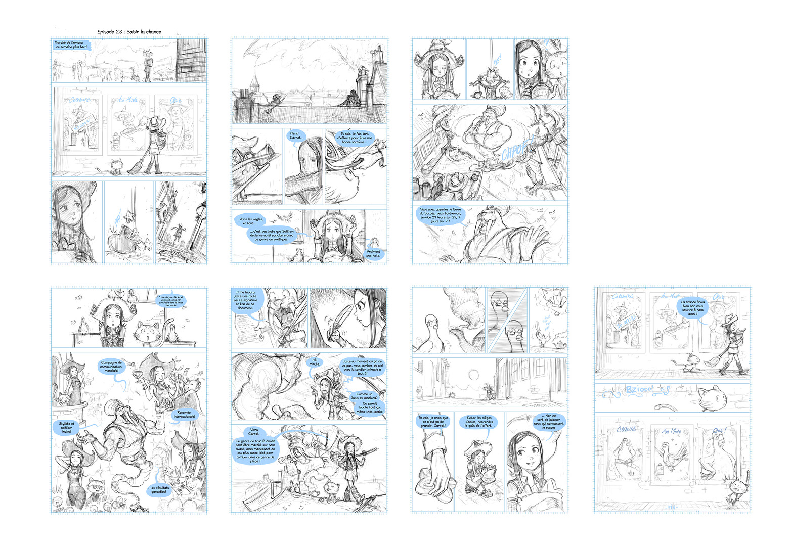
Final version of the storyboard: seven pages to better develop the ending with the help of Calimeroteknik, Nartance, Valvin, Cmaloney.

Cuting storyboard to single pages, artwork in blue, upscale to final resolution, and retracing panels in dark
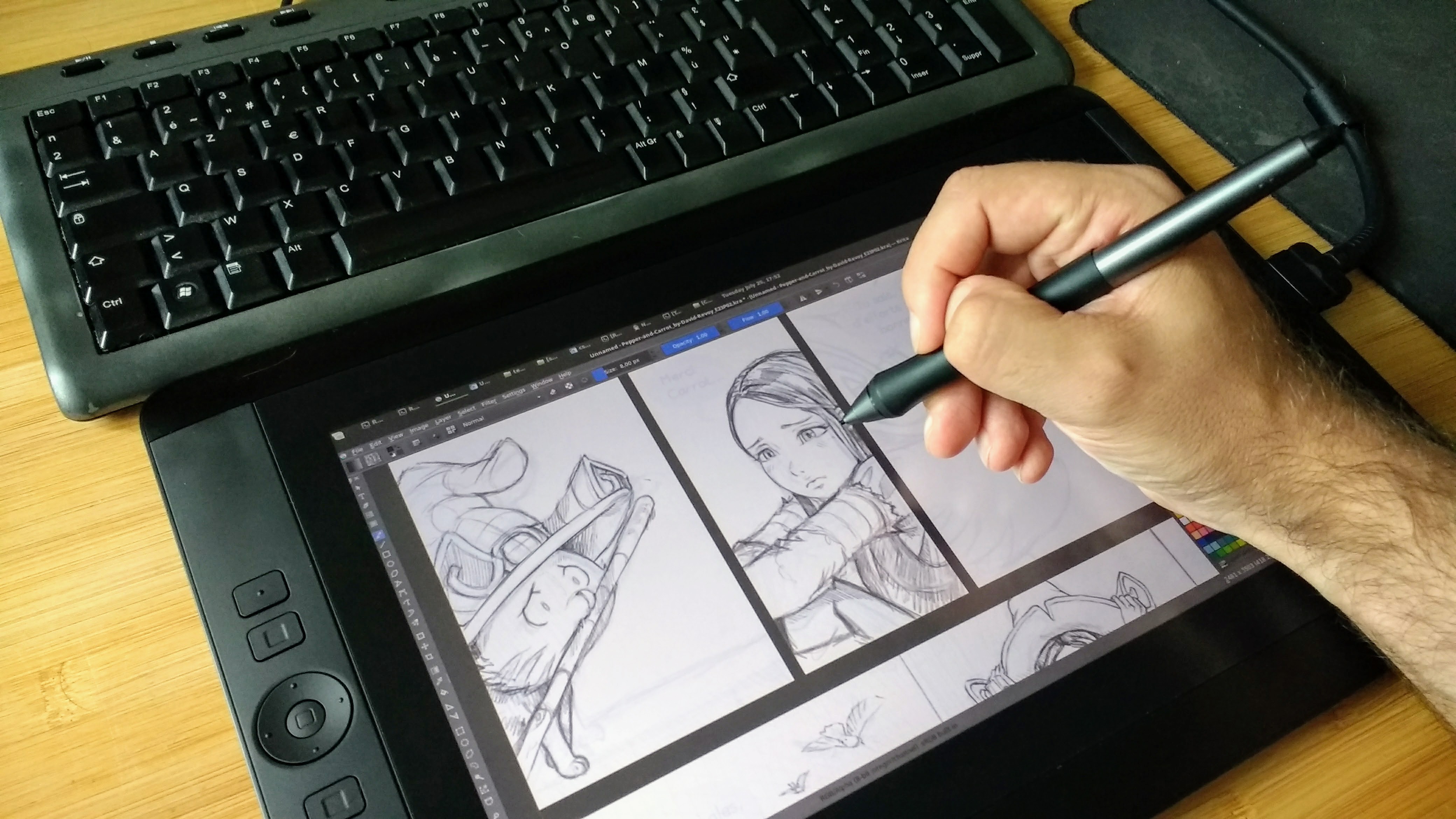
I'm using a Wacom Cintiq 13HD to redraw the artwork. The storyboard is still visible, but in background and low opacity
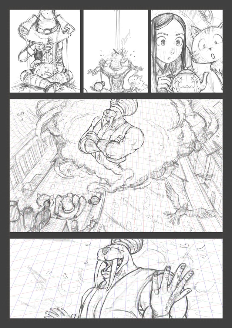 A page penciled, with perspective grid visible.
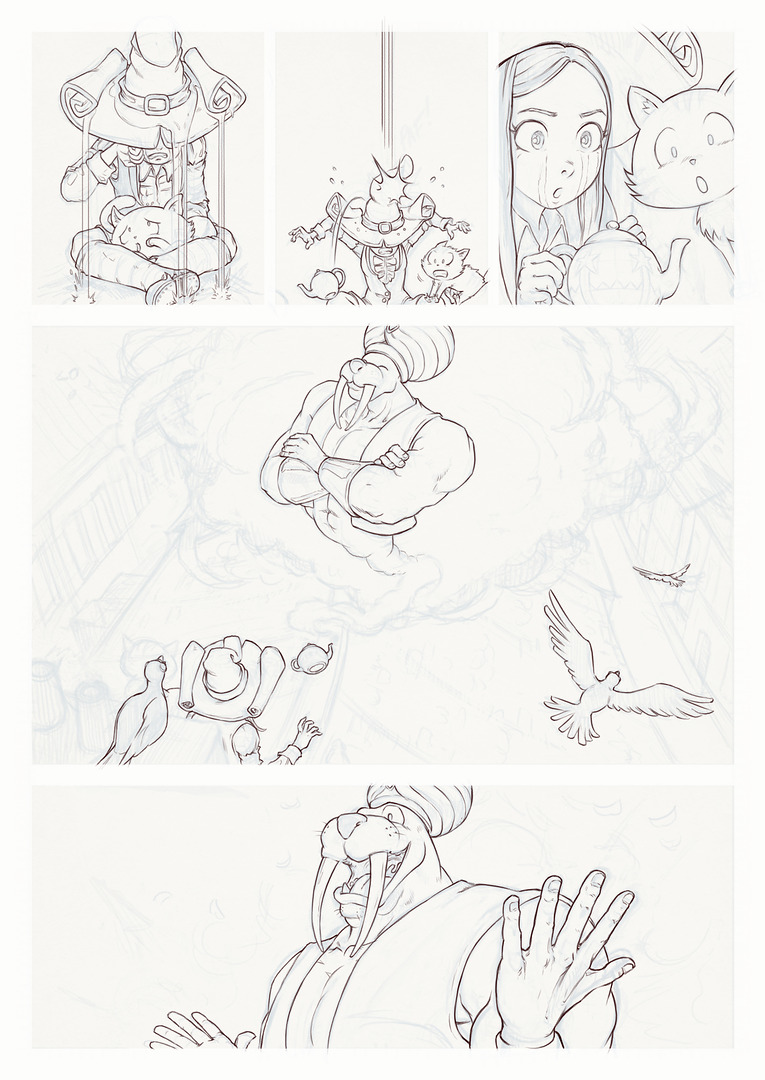
Inking: I repeat the process and redraw all a third time with a thin pen over the pencil.
I don't ink the background landscape. They'll be fully painted over.
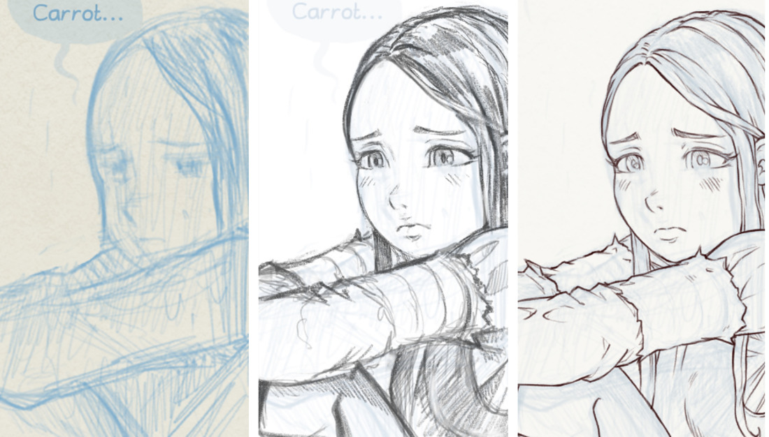
Overview of three steps over the same panel : Storyboard (left) Penciling (center) Inking (right)
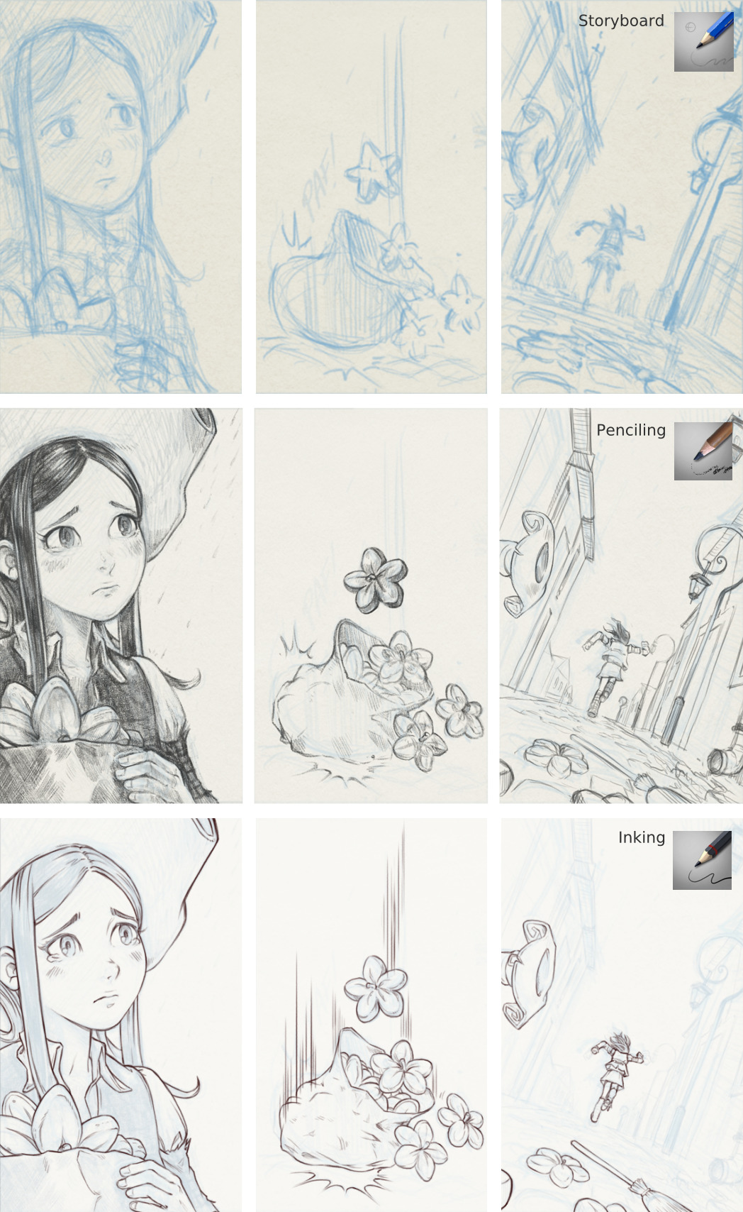
_Overview of three steps with indication of brush preset used for each step

Inking in progress: I'm inking at 67,7% zoom of the viewport, with my perspective grid and the penciling in blue.
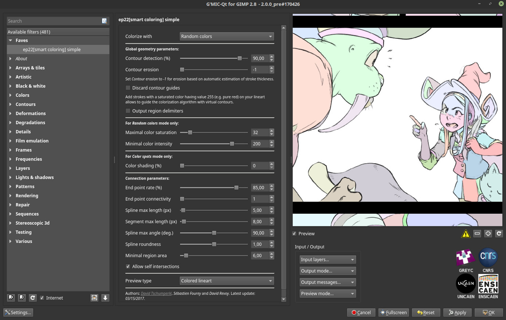
GMIC-Qt "Black&White > colorize [smart-coloring] " in action with custom settings. The filter auto-fills random colors under my inking.
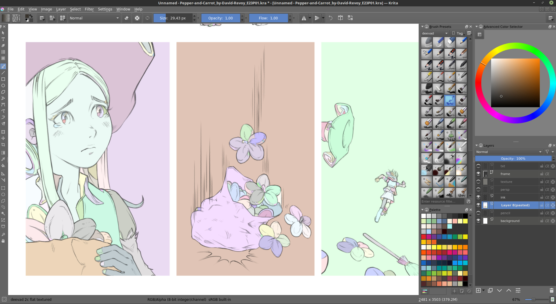
Result of Gmic "smart-colorize" over the bottom of page one
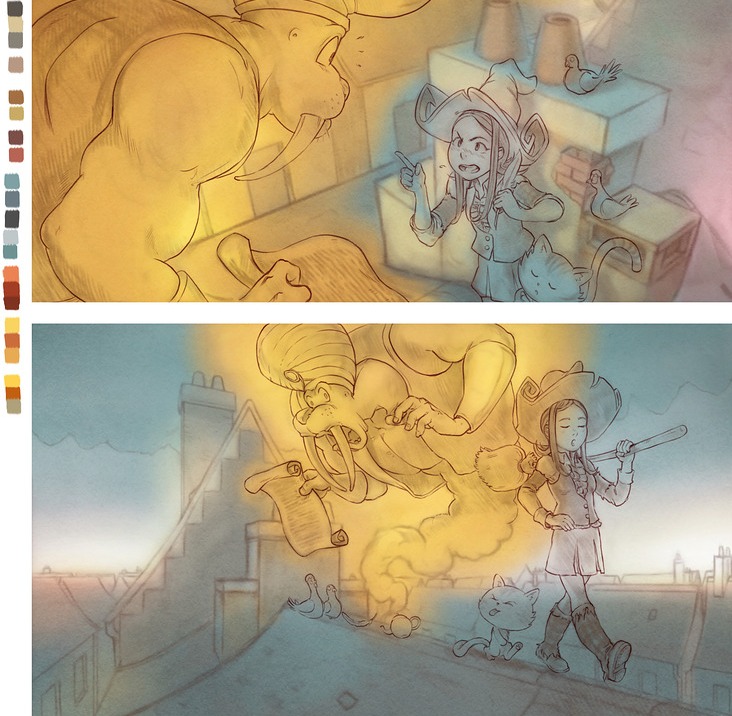
Background paintings started with transparent characters and big airbrush under blury/redish lines
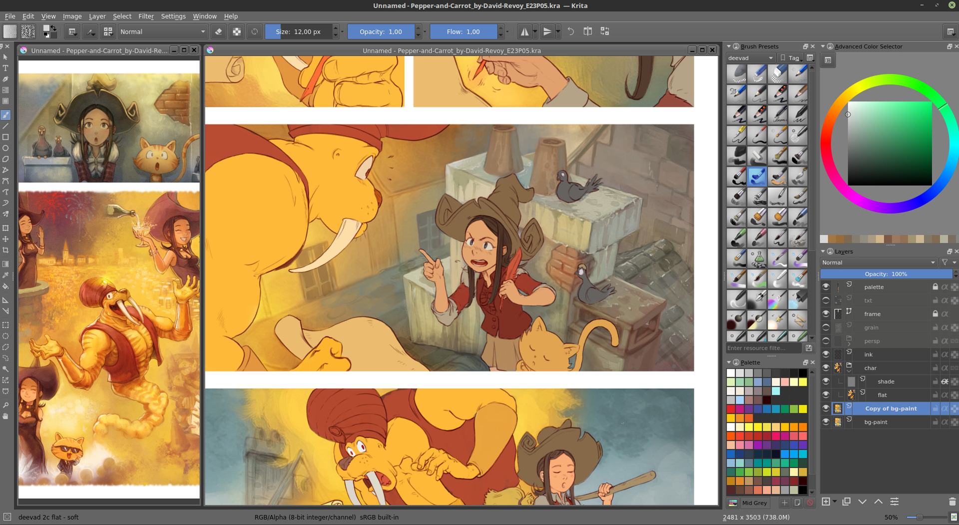
Fully painted backgrounds with flat and non shaded characters.
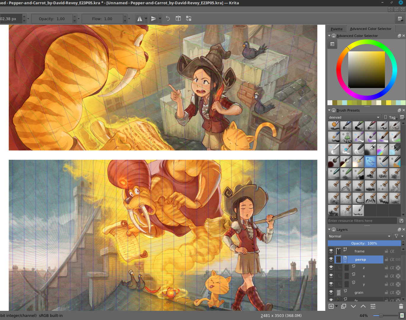
Final shading on characters ( with perspective grid visible )
 Overview of three steps over the same panel : Storyboard (top) Inking (middle) Final rendering (bottom)
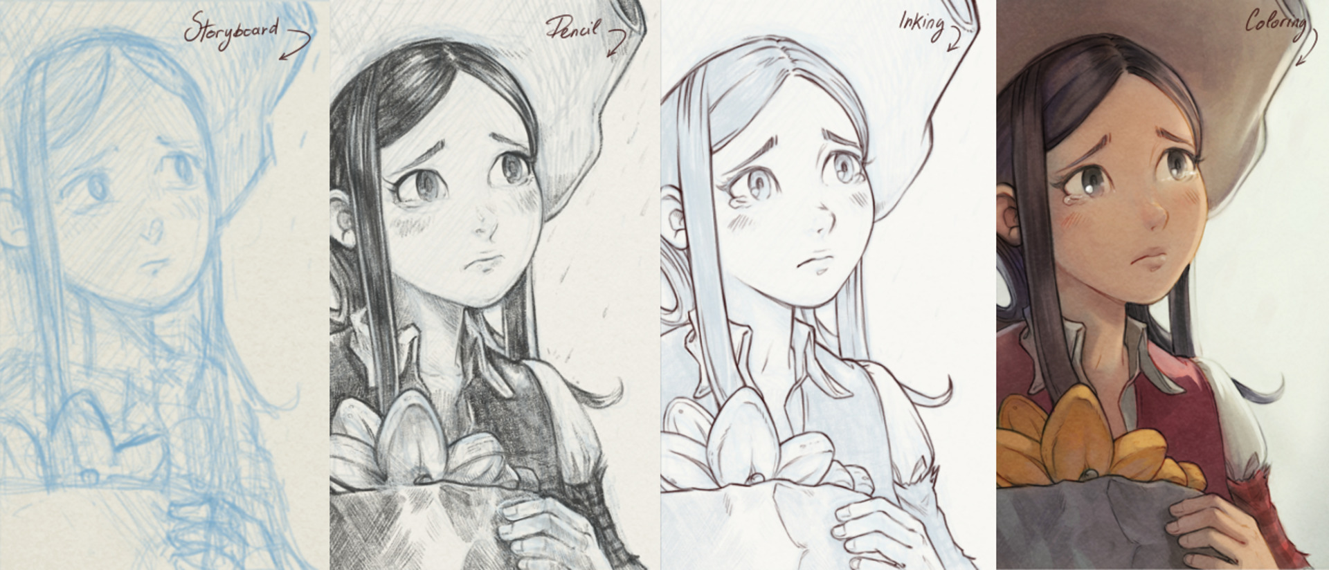 Overview of four steps over the same panel
If you want to have a look at the final version; follow this link and for Krita sources files follow this one.
