Mockup: perspective tool
Here is another article to propose ideas on how to improve perspective tool. As usual, only mockup and ideas here. No codes. I made it because I felt driven by the sincere desire to propose a cool design. Solving problems on user side and designing an ultimate feature was a fun brainstorm for me.
1 - Initializations
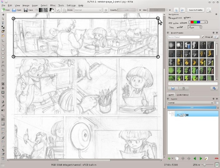
The user select the perspective tool in the toolbar , then click four point on the canvas around a rectangular ( can be irregular ) area. This define the world limit.
2 - The widget proposed
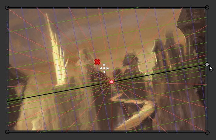
Just after releasing the 4rth click, Krita change the area for the default perspective widget.
Three colored dot stand outside the area frame and can be moved around , one by one . They influence the grid lines inside the area ( as vanishing points does ). Red and Green ( X and Y ) dots are linked by a black line : the horizon line

3- Adapting by removing
On this comic frame sketched , no need of a third vanishing point. By clicking the red cross next the blue dot , the dot is removed. Krita then propose verticals blue lines ( two vanishing point mode ).

4 - Adapting perspective grid
Luckily, horizon line is placed at 1/3 up by default , similar than on my sketch.
I just need to drag&drop the red dot a bit outside the canvas to adapt my red perspective grid lines to fit my sketch scene. While I'm dragging the red dot around, all the red line inside the area keeps changing to target the point I'm moving. I can see the change in live.
Not a lot of click or menu , work done ! :-)

5 - Possible customization
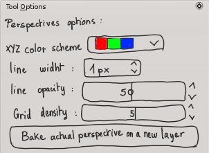
'Tool option panel' can propose extra customizations :
- Various color scheme for the 3 axis ( default X Red , Y Green , Z Blue as in Blender 3D, additional can be all black or other color alliance ; pink / violet / teel , yellow / green / orange ...etc... On the mockup I drew the color square, but a textual list of preset name can be sufficient )
- Line width of the grid and opacity ( if the user works at various resolution )
- A grid density defining the amount of subdivision of the minimum amount of rays.
- A button to 'Bake' the lines into a new pixel layer : useful to save lines for a ORA or PSD export or to do a Transform warp on a baked perspective to bend lines , or for user who prefer to turn visibility of the perspective using layers.
6 - Ready to draw
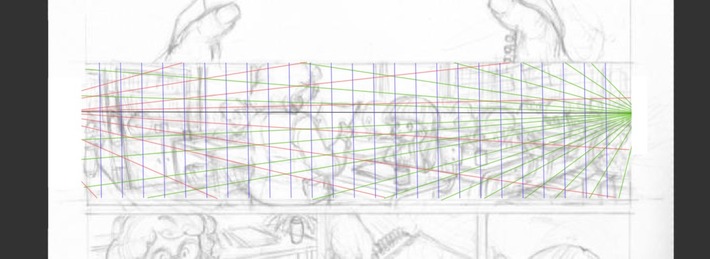
Here is a mockup after user increased density and switched to the freehand painting tool to start detailing on a solid perspective grid. The widget disappear, only the colored 3 axis grid remain. They can then activate 'Assistant' on the tool option and draw with a magnetic way on the 3 proposed axis. ( ex: to ink his background , objects ) Also the grid gives sensors information to the input dynamics 'Perspective' in the brush editor. User can decide then to map pressure or brush size to follow a variation according the perspective.
7 - Other usage case : distant vanishing point
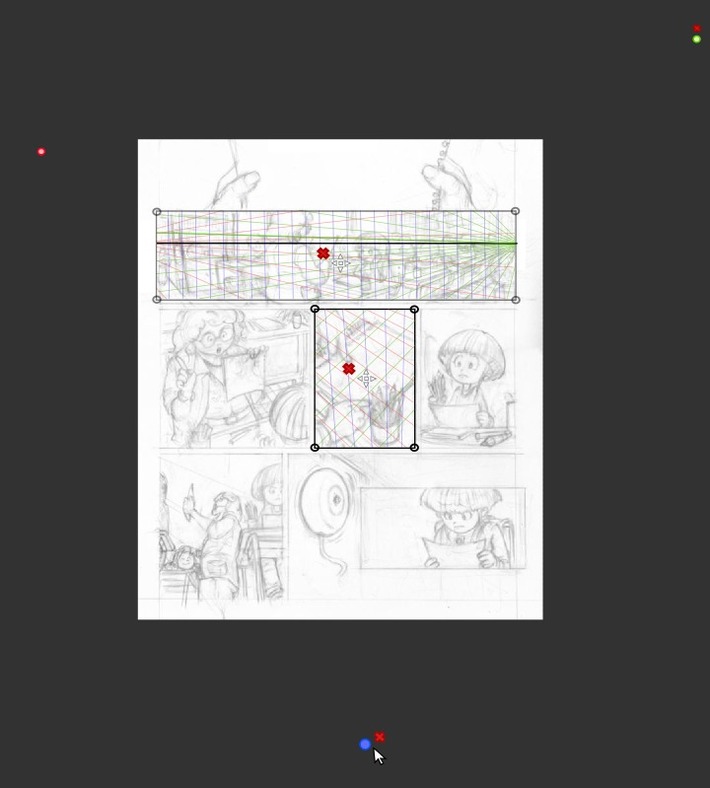
Area 'world limit' are designed to let comic/manga artists to setup multiple perspective area on a single document opened.
Zooming out the canvas can help to place distant vanishing point outside the canvas , on the borders.
8 - Other usage case : single vanishing point, tilted horizon line
If you remove the Green and Blue dots ( you can't remove the Red by design ), you fall into the single vanishing point mode ( the two other axis are then perpendicular ).
Note : to solve a special use case 'Tilting the horizon line on a single vanishing point perspective' a new gray dot appear on the horizon line ( or take the place of the old Green Y one ) and let user tilt this line.
Conclusion
I studied many 'perspective feature' on other 2D softwares and studied videos tutorials to produce this article.
I hope this document will inspire or help ( or even only influence a bit ) the development of a solid perspective tool.
To finish , I propose you to have a look at this making of pictures ( under ) I did on November 2012, just to inform : It's 4 years ( since I'm using FOSS only ) I'm doing my perspective system manually with a simple line tool ( before I was addict to my Manga Studio Ex 3 license ) , and all in all, it's also OK do it this way ... Just longer, less flexible ...etc...
I'm not in a hurry about having a new shiny tool , and I'll even continue to draw a lot of new environment without it

... and the final image here Note : Screenshots in this article are mockup done with Inkscape. The comic page used is a old test page of my graphic novel project L'héritage en couleur.


19 comments
GREAT proposal man. I am all for THIN and SEMI-TRANSPARENT lines. It suppose to help me after all and will not do so by covering picture ;).
Great idea! You are really a gem in the linux art program scene, need more folks like you. :D
Genuis ..David, i was always missing Perspective element, and reason for that is possibly not being from regular artistic background...
This would be plain GOLD!
You've really spent a lot of time for making this mockup, thanks! Maybe this will find it's way into krita :D
Hi David,
Nice mockup indeed: there is always room for new improvements in Krita :-)
The new unified transformation tool on Gimp 2.9 looks quite cool as well:
http://www.gimpusers.com/tutorials/whats-new-in-gimp-2-10
My best regards!
For windows users (I suppose it can be run under Wine, with .net 4 simulation) there's a nice tool for perspective building, made by Epic games -the Unreal Tournament game series and Unreal Engine developer. It's called Carapace. Those interested may check the video by Matt Kohr at http://www.ctrlpaint.com/perspective-grid-utility/
It is very powerful and intuitive, but tied to the Microsoft Windows platform, unfortunately.
I hope someone finds it helpful, for one purpose or another.
David, thanks for your work! Cheers from Russia!
Hey thanks all for the nice comments ! :)
@Silvio Grosso : Oh great. Good news for Gimp users. Nice to see every project growing.
@Alex1988 : http://www.ctrlpaint.com/perspective-grid-utility/">http://www.ctrlpaint.com/perspective-grid-utility/ Revelation ! thanks for the link. I don't think I can run that on Linux ( note : tried on Wine , but didn't worked ) , but I feel flaterred to had found a similar design with grabbable 'dot' vanishing point, and terms like 'density. Your video link is really a good addition to this article as a reference.
I think, David, you your oppinion very powerful to the developers, and if you need tool like this means that the almost all linux digital painters need this too (incl me :)). I hope devs will note this and begin to write a code )))
@Silvio Grosso, there is so many improvements in 2.10, cool! Faster rendering, CPU/GPU multi core support - sounds great, I have a powerfull desktop, so hope that will increase performance greatly. Thx for the news!
Hi all,
I am going starting work on this tool and will try to make it as helpful as possible, but, will need help from probably all of you.
@David, it's a great idea you have come up with, thanks a lot for that :). Will get in touch with you for discussing the flow of the tool soon.
@Alex1988, the link isn't working, can you please find the video again. It seems like, it can help me a lot with the development of the tool.
@Shivaraman : Hi , cool ! I'll be on IRC, mailing list, or anywhere. Do you want I migrate this documentation to the WIKI development of Krita ?
Here is the link of @Alex1988 , I think the author changed the page and video hosting :
http://ctrlpaint.com/videos/perspective-grid-utility/">http://ctrlpaint.com/videos/perspective-grid-utility/
Indeed a cool demo of the Win freeware 'Carapace' who got cool feature.
Sketchstick yesterday on IRC told me an interresting thing about : 'perspective point' , they should not have only a 'X' to delete them , but also an 'eye icon' to toggle visibility off/on of the perspective point, because sometime, grid can become complex.
@David: Yeah cool will talk to you soon on IRC. Well, I'd like to discuss as to what all should we put in the WIKI development of Krita, according to the flow I would like to follow on the development.
I'd look into that video, hope it is helpful.
Nice idea indeed, have added it to the list of TODOs for the tool.Now its time to make Krita more handy.
So why should you choose a scissor lift in the first place.
Whilst some are designed for use by a single person, others are capable of withstanding ttwo or even three workers at
a time. The programs consist of classroom presenation and a sries of
tests after studying different unijts of information.
Great idea awesome work.
Can you add an option when you start drawing, the "fill block" (for example) is selected by the user...
Sorry for my bad level in english, I'm a french who learn :)
Hello!
It's me again, with more idea and rebukes, that will help strengthen the quality of Krita.
I'm talking about Insane Bump. That is just for Gimp.
I have a look at it.
And I liked it, because it is a very good plugin for those who like to work with map 2d and 3d.
Just do the same as others that improves one thing and make others worse.
You can put more this feature but do not remove or damage the normal map that is already there.
AH!
Do not let this feature
process of the animation object at the time of transformer on the map "the animated character after being transformed into the normal map".
example:
I did an animation, I painted everything and I left everything ready. In so I want to turn all animation into a normal map format.
At the time the soft could not come up with that.
I will certainly be very frustrated.
Try to avoid this kind of problem when passing an animation to become the normal map version and begin
In case you did not understand about the hospitalizations between soft and other plugins.
I do a normal map in a plugin, and I want to improve this mappin; more use another plugin, so this plugin it has to do its calculation and rendering apartir and on top of that mappin that was done.
The same would be with another soft being it 2d or 3d.
because this plugin would get the data of this mappin out of this "software" and do a calculation and rendering on top of that mappin.
Hello, it's Me!
I saw other attributes of or other software and had noticed, you do not have some items that an artist need.
One of these items and magic pen of photoshop and the others and what comes with him, you therefore these items are very important for effect.
The other is window of the "path" same as have on photoshop, as it is used to connect with 3D .software with cinema 4D.
And you guys see well about the plugin I told you.
Quixel nDo2 and Insane Bump.
And other plugins are:
deformed = sculpture, this is very nice to do 3D effect.
missing more some items as polishing the sculpture because the final topology stays a lot strange.
Bump map
Normal map
Depth map (EFFECTS).
the plugins I was talking about were software
Gimp
Hey Diogo; this article was published in 2013 and I'm affraid no Krita developer visit this link. If you want to submit idea for development ; maybe the Krita forum will be a better place to reach the dev.
Post a reply
The comments on this article are archived and unfortunately not yet connected to a dedicated post on Mastodon. Feel free to continue the discussion on the social media of your choice. Link to this post:You can also quote my account so I'll get a notification.
(eg. @davidrevoy@framapiaf.org on my Mastodon profile.)