


10 things I learned during Inktober 2017
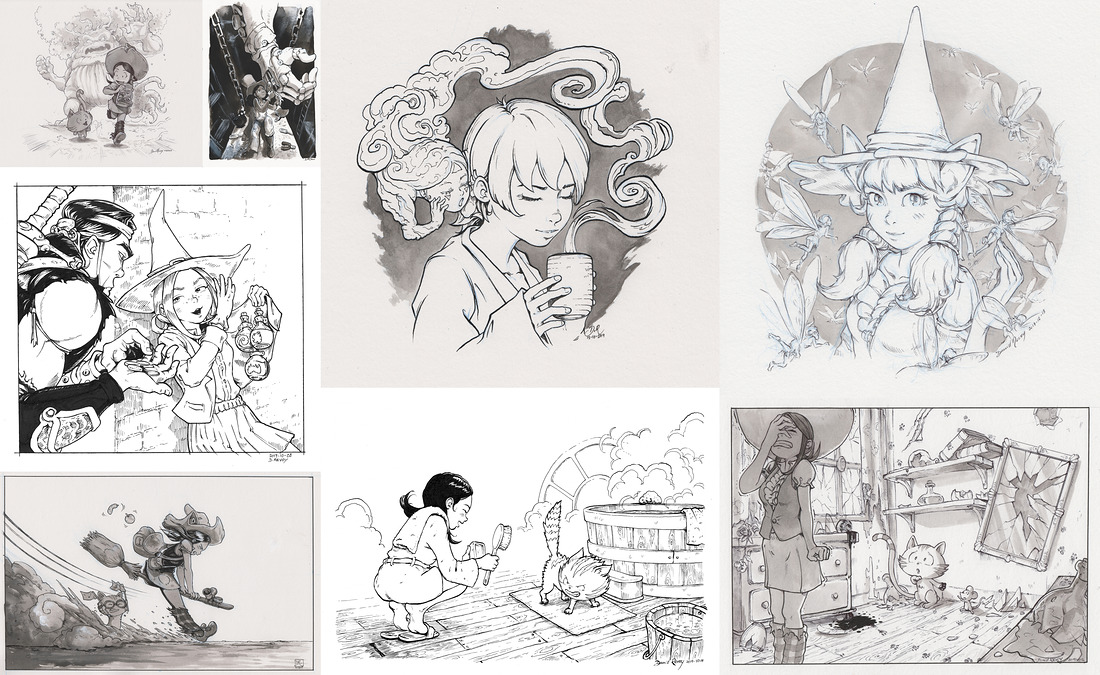
Here is my report after the thirty one drawings done daily on Inktober 2017. I hope this advices will help you to also do this challenge.
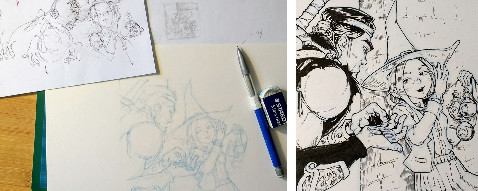
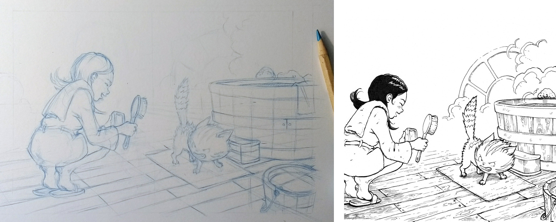
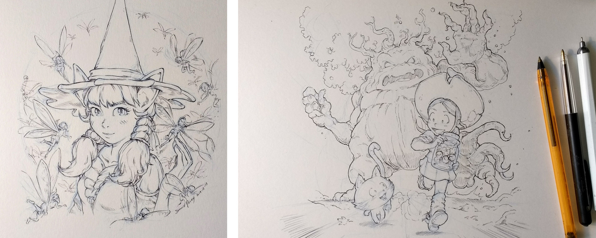
1. Doodle and thumbnail
I keep a stack of low quality paper on the side of my desk and I doodle quickly my ideas and my compositions before starting any real artwork on final paper quality (eg. the ballpen quick sketch on top-left corner on the photo under). It really helps me to design the idea behind the artwork and it also funnier to draw quickly without caring of anything like proportions, perspective, anatomy, composition, etc...
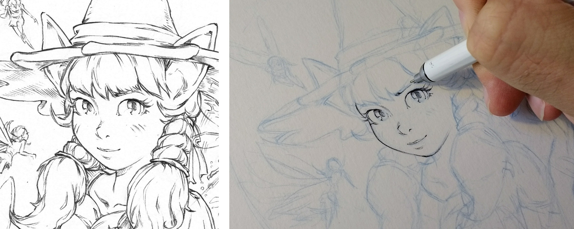
2. Sketching in blue
I'm really afraid of accidentally smudging my black lines when I erase pencil line under my line-art with a rubber-eraser, it's a disaster when it happens. So, that's why I often prefer to sketch with a blue pencil because I can remove the sketched lines easily with digital tools later without the need to rub all the surface. I describe the method using Krita in this tutorial.
3. Perspective
Even if I always try to avoid drawing a perspective grid to go faster; drawing even a quick perspective grid can really solve many spatial issue, put all my characters on the same ground and keep the scaling of everything in my scene. It's a bit boring to trace -sure- but it really is the key for building depth in a drawing. If I don't do that, I tend to fallback to stage everything side-view, as in a simple flat cardboard theater layout.
4. Do not detail while sketching
Sketching plus inking can be very long. Especially if I start to detail a lot my sketch then retrace every details afterward with ink; line for line, dot for dot. I saw many parts of my drawing could be inked on the fly; sometime I just need to sketch the boundaries of an objects and I can ink directly the shape and suggest complex textures. It's a real time saver and good way to gain many details quickly. My goal is to get enough experience in drawing to be also able to apply that to many part of the drawing. I'll train in this way.

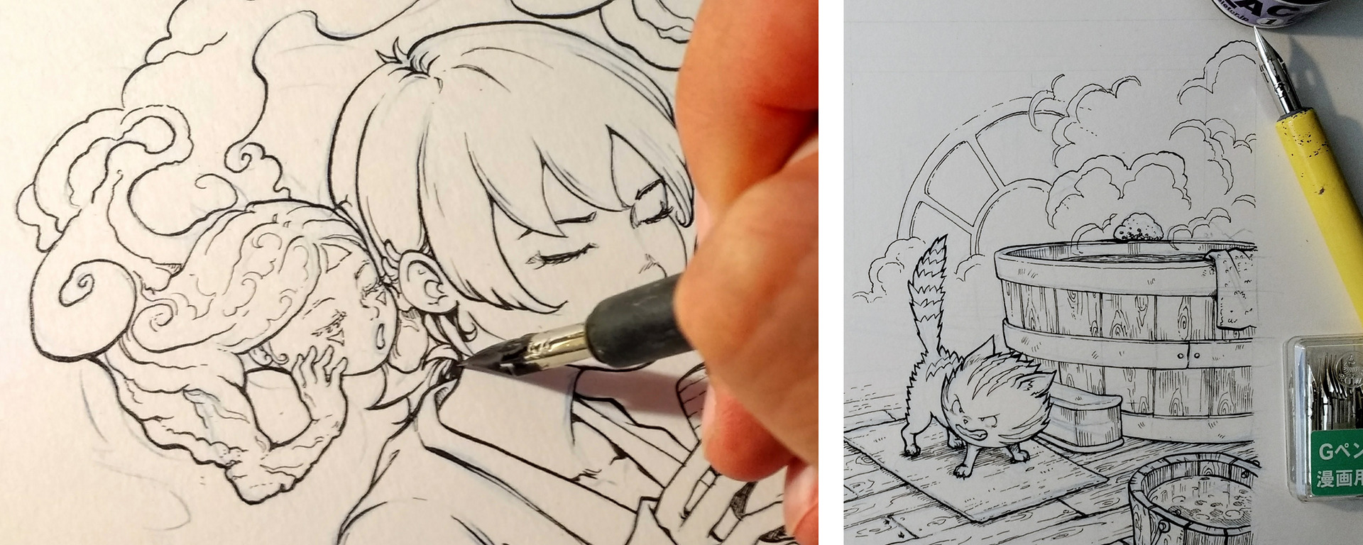
5. Prepare your nibs
I bought new metal nib (Gpen) and I saw the ink wasn't sticking to the metal part and it was hard to keep drawing without having to refill ink all the time for each single line. Then I did a quick search about it: it's because of industrial coating product or treatment on the nibs (it's here to protect the metal against rust). So before using a new one for the first time, I just pass the metal nib three second on the flame of a lighter. It's a good tip to remove this invisible coating. After that, the nib keeps more ink; but I suspect the nibs become also more fragile to rust; so I try to clean them and dry them well after usage.
6. Isolating the silhouette
Sometime, just a quick flat grey in background helps the audience to better read the silhouette of a characters or a scene. A precious tip as it doesn't take a lot of time and does a big difference.
7. The paper wrinkle
I had issues using a paper not thick enough when I started to watercolor a pass of grey over "Underwater" and the paper started to wrinkle very badly. To repair, I used a warm iron on my artwork to flat it back (cover it with two folds of paper-towel first to not put contact between the iron and your artwork). It works perfectly!

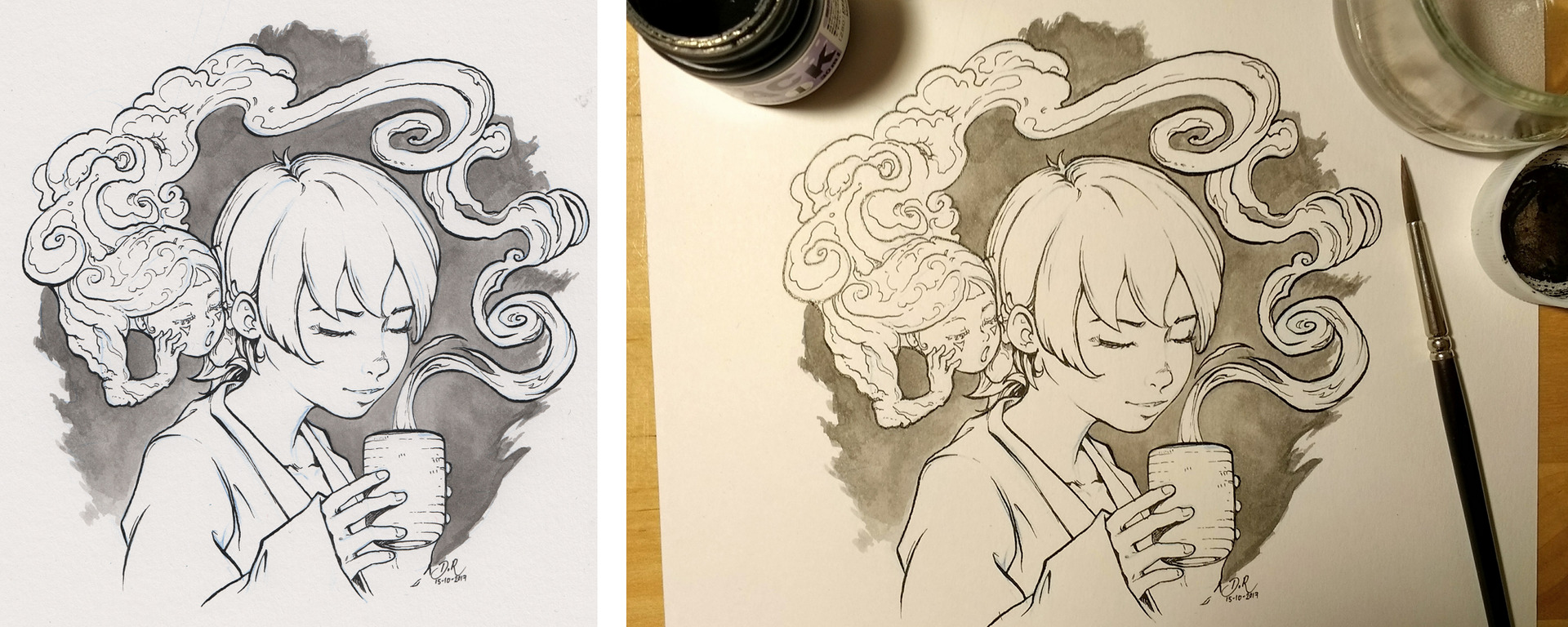
8. Add contrast
Large areas of black is an efficient solution to lead the eye to specific area, or to play with the composition. It also add this extra punch that make the line-art suddenly more graphic. I still not control this black areas thing as I would like to, but I start to get the pleasure of playing with them. I found them to be a bit flat at first, and then I figured it was possible to keep part of the black area with cross-hatching to symbolize a dark grey and also encode more information about the direction of the surface and the volumes.

9. Darker foreground
In case of a complex scene; I paint the object and character in foreground with a deeper shade of grey than the other part of the artwork. It can be an efficient solution to ease the reading of the picture and split the foreground, middle-ground and background.
10. Find your own favorite tool
If you follow my Inktober2017, you saw I tried many tools (brush, nibs, markers, brush marker) on many type of paper. I'm exploring and I'll probably keep doing that. But more I explore, more I discover a love for the simple and common tool: the ball-pen. It has many advantages: thin, accurate, simple, accessible, cheap, available almost everywhere with a near waterproof ink and a very long ink capacity. But it also has issues: no deep black ink, leaves sometime black dots if not cleaned after a quick hatching, fragile ink to rubber eraser, glossy ink. That's why I keep it for drawing details and use often other pen when I need a thicker plain line. But I can see a great potential in coloring a simple ball-pen artwork. No tools are perfect, but I hope my own quest will inspire you to explore more tools and find your own tool. Never let other tells you what your tool should be ;-)
That's all! Thank you for reading this article. I'll keep posting daily new Inktober artwork on Mastodon, Twitter or Facebook till the end of October. Many thanks for all your comments and feedback! You'll find full high definitions (even raw scan, I added them) and every photos I'm shooting with my low quality smartphone in the link at the end. I release all my Inktober work as CC-By and same goes for this article.
Watch the full Inktober gallery here ( on Pepper&Carrot's website)
