Video timelapse and Krita tips: «Flying around Komona»
Direct link to watch it on Youtube
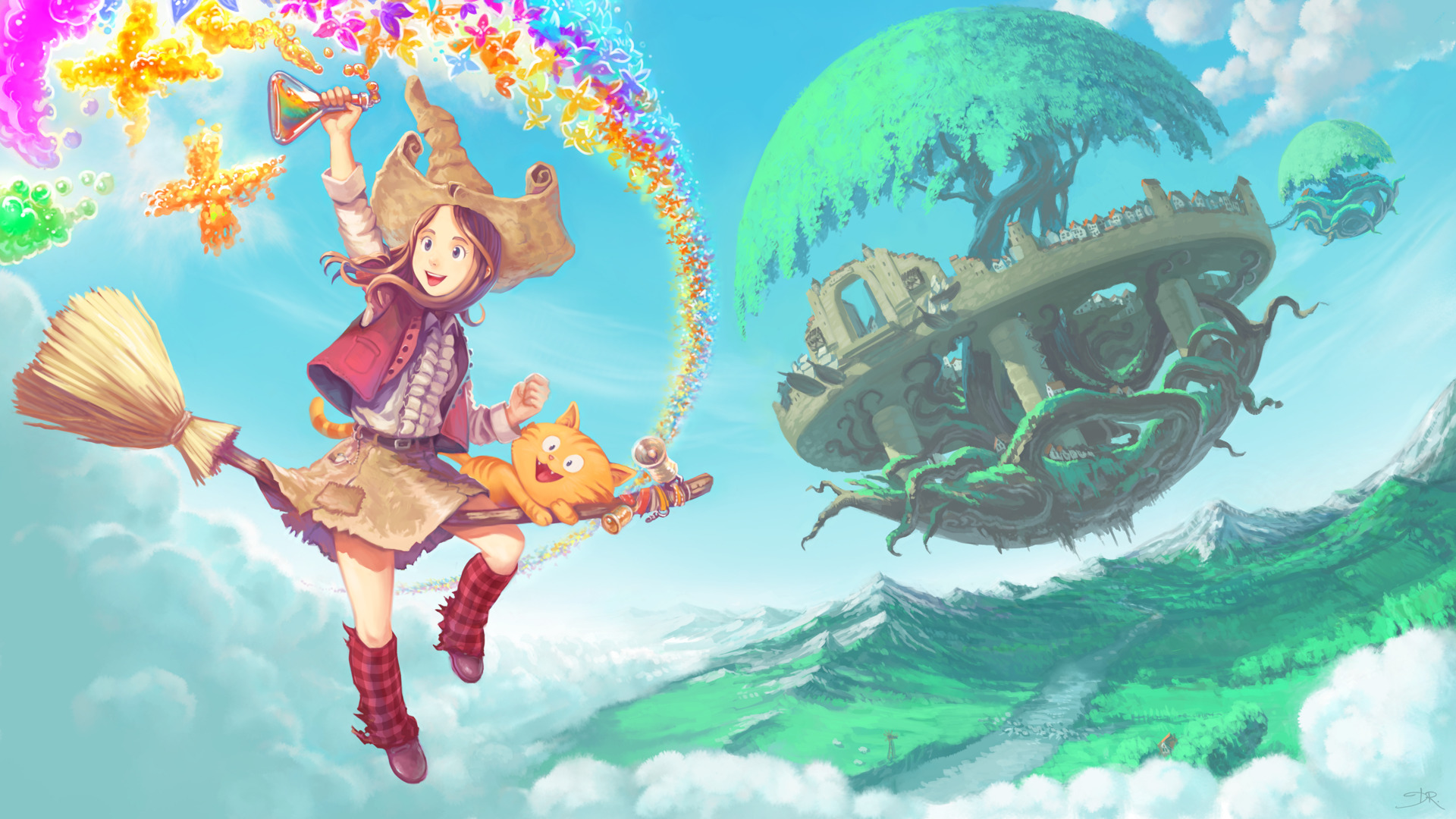
High-res final lossless 6400x3600px artwork link : on DeviantArt ( the download button on the right column )
Introduction :
The artwork "Flying around Komona" is a large illustration for the future www.peppercarrot.com website. I also recorded a timelapse video of the process ( video on top ). The artwork took me around 16h and I decided to accelerate it to a 10min final video. The resulting timelapse is an descriptive document about my actual workflow to paint this style but I wanted to add more informations. I thought at first of adding a voice over, but I dislike other Youtube video with lazy voices over. Also, I'm french, and talking in english over a video double the difficulty of this practise. So, I decided to create something else, and write this 'companion making-of tips'. I hope they'll do a nice addition to the video, and also the reverse ; the video will illustrate the tips in live.
This tutorial, video timelapse and high-res illustration is a free bonus for my Patreons. Join them if you want to support the creation of more webcomics, tutorials with open license and without any paywalls.
License :
Artwork, video timelapse, article are licensed under a Creative Commons Attribution license to "David Revoy, www.davidrevoy.com".
Software used in the video :
Krita 2.9beta compiled from sources on a Linux Mint Cinnamon 17.1 desktop with a Plank docker on left. It was screenrecorder with SimpleScreenRecorder, batch encoded with mencoder, and video-edited with Kdenlive. Krita 2.9 will be released for end February.
Brush presets used in the video :
My next brush kit for Krita 2.9beta is also ... still in beta. So nothing finished yet. But I would say 90% final ; you can download it already here : https://github.com/Deevad/deevad-krita-brushpresets/archive/master.zip
1. The Coco background
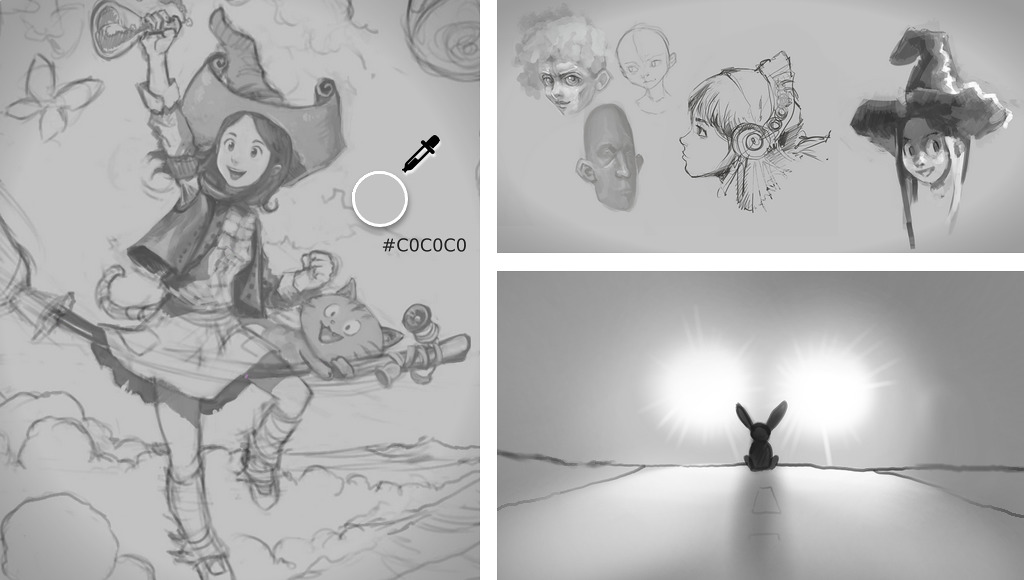
When I start an artwork from scratch with digital, I often start on a light-grey background value. I name it the "Coco background" because the Hexadecimal color code I use is easy to remember #C0C0C0 ( C zero C zero C zero ). When I draw, I spend hours focusing the screen and using a pure white background is too aggressive for my eyes on newer LCD screens. I feel like a rabbit in the headlight of a car ! So I found it a good habit to draw over this grey background. Another benefit : You can also add bright values while sketching. An evident con : it looks a bit sad and greyish...
2. Thumbnails
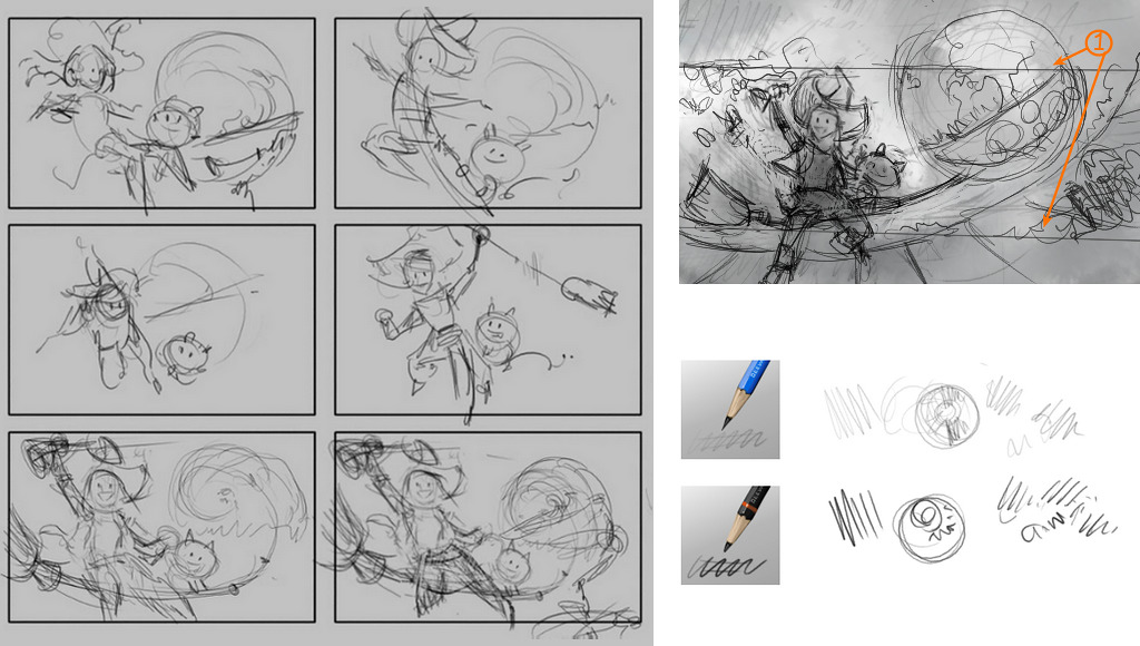
The thumbnail step is not only useful for setting up a good composition. It's a real brainstorming time, where you can focus on ideas and the concept of your picture. On this picture I wanted to represents a lot of elements and in a predefined way. I wanted the picture to get a ratio of 16:9 for being a wallpaper, and also I wanted to be able to crop a very wide landscape in it for a website header (1) and still see main elements ( my character Pepper, her cat Carrot and a floating city in background. ). Pose of the character, main curves of the artworks, composition and feeling are all linked together. Doing multiple attempt is necessary if you have something in mind and want a result not too far away from your first vision.
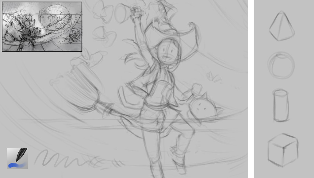
3. Structure : redraw thumbnails
I tried during years to enlarge my thumbnails and paint-over them directly. My main issue with this workflow was always the same : inherit of a bad pose, flat and bad proportions from the thumbnail and spend a lot of time fixing it during the painting. Nowadays, I prefer to redraw my thumbnails using simple geometric shapes and focus on volumes and proportion. It's easy to cut this drawing without regrets, transform ( Krita 2.9 has excellent tools to tweak this ) and move things around at this step. Building a better base and take time at this step is like saving many hours on later steps.
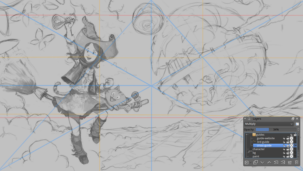
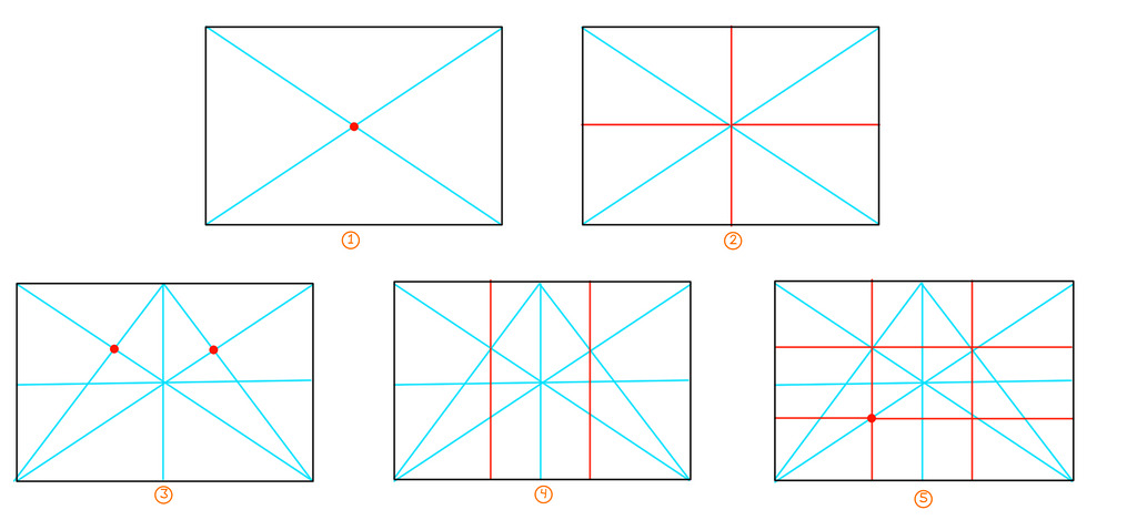
4.Composition guides
I like to keep an eye on central lines, diagonals and third. If you like composition theory ; getting this type of guidelines is just a big basic ( note: I like also the golden ratio, and the golden spiral ; but they are too hard for me to trace them on the fly). I pasted under a little step by step in (5) steps with my technic to trace them with the line tool. It's just basic geometry tips. But it's good to know it ; because this way you can subdivide a square even if this one is in perspective.
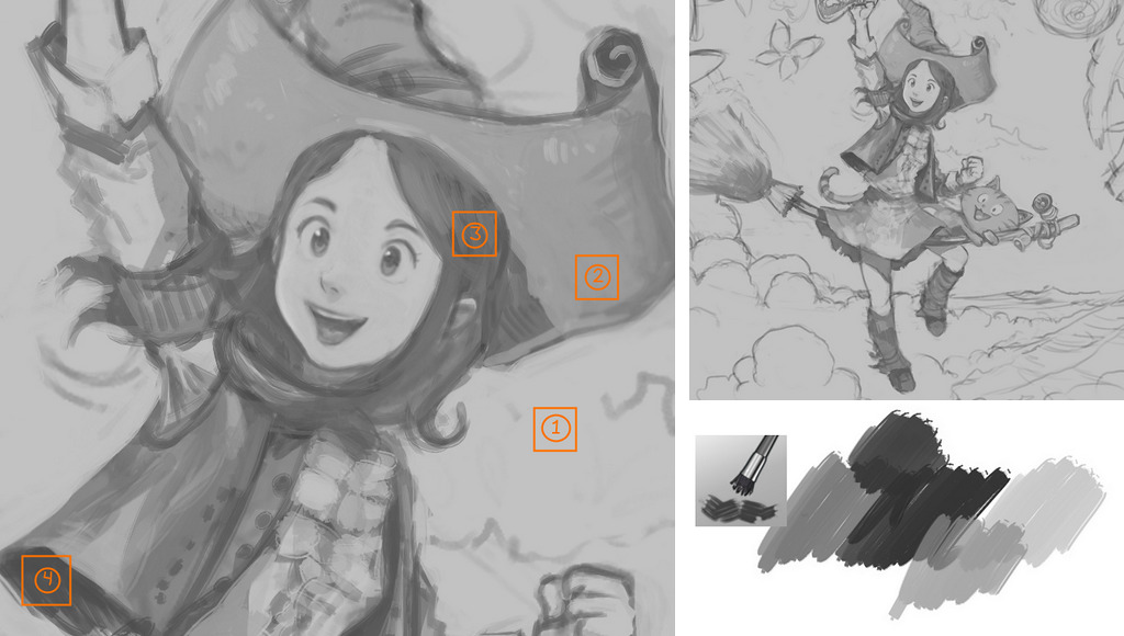
5. Drawing with values
When I use the expression 'drawing with value', I don't mean with 'correct values of grey'. It's just something I found to be faster than just drawing with line-art or outlines. With large brush and values, I can shape really quickly volumes and mass ( eg. hair ) , and split a bit the artwork in areas. I like to use for this step a brush with a linear opacity and with dirty edges rendering.
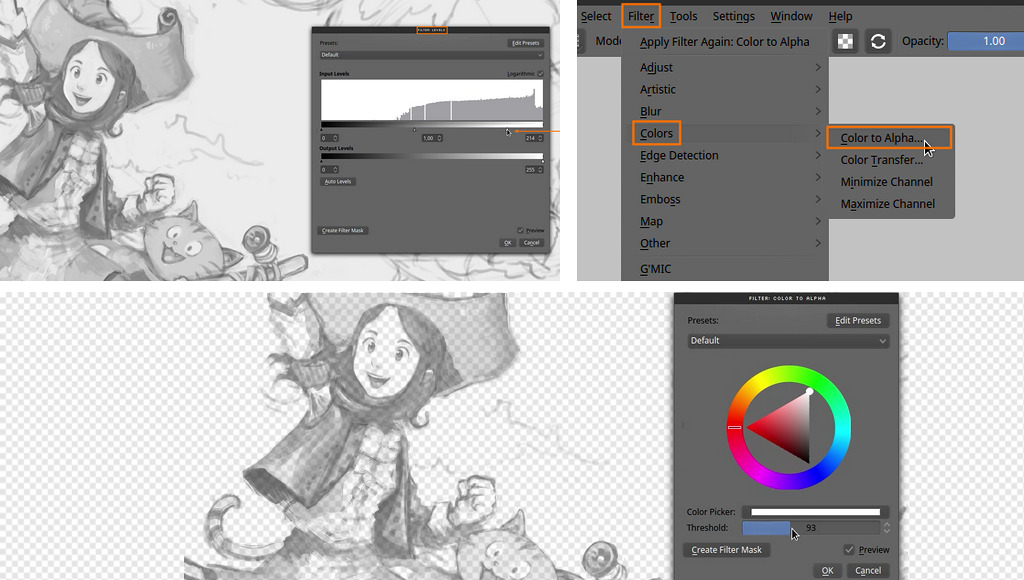
6. Cleaning the grey
Cleaning the grey background and replace it with white is easy with the level editor filter ( Ctrl + L ). Then when the background is white, I like to also convert the white to alpha with the filter 'Color to Alpha'. Now the canvas is ready to paint under this sketch.
7. Background painting
I like to start with the background, because it's a relaxing part and also it does a good starting point to have an idea of the lighting setup of the scene and the general ambiant. I keep large stroke, and I try to not do too long lines of painting. Usually little dots works better than lines to describe object in the distance. For the clouds, I use a sort-of-watercolor brush I made. Krita 2.9 can now mimic the preset I made for Mypaint. I'm happy to can use this type of effect back.
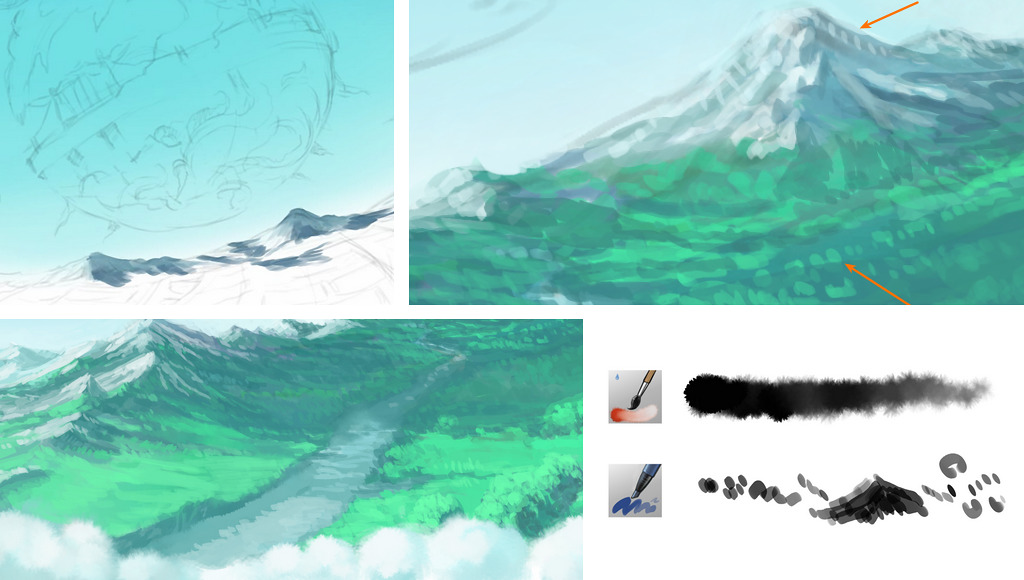
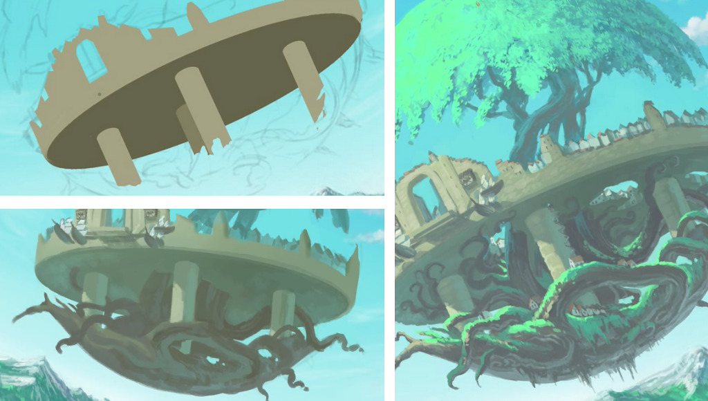
8. Komona painting
For the flying city of Komona, I built it in a very logical way, step by step. Big volumes with hard edges first, then big mass, then progressively I added thin details. It was possible to handle this complex element this way because I already got many sketches about this place. So, I only had to follow the concept-art I made.
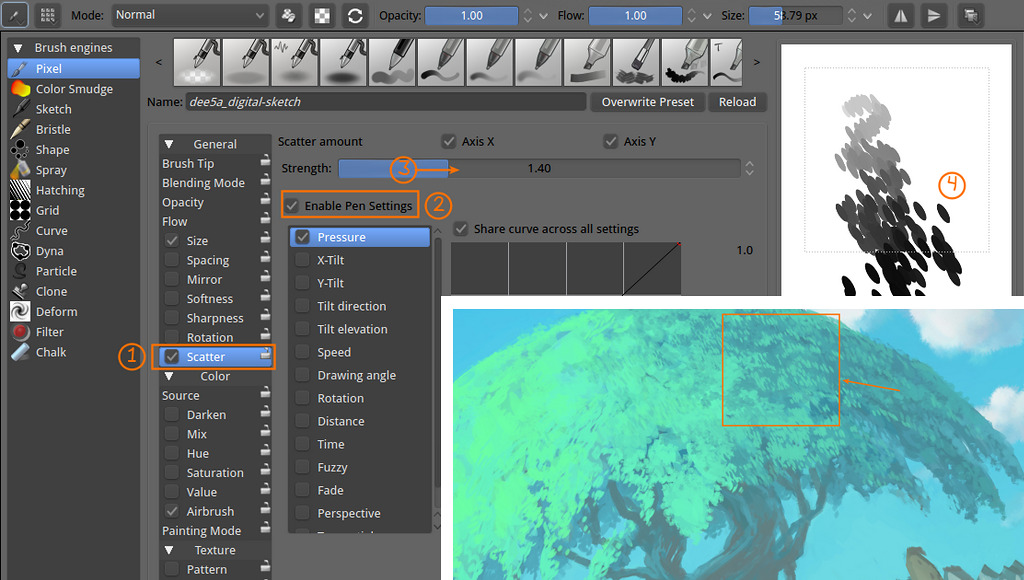
9. Scatter brush
Painting hundreds of little dots can be a pain. Krita can help if you know the right option to check. Here in the brush editor I show how to activate the Scatter effect (1) , and how I enable it (2) with a variable strength (3). You can also adapt the spacing of in the 'Brush Tip' if you want less dots. Digital brushes like this one helps a lot to fill large zone, but never forget to do manual retouch at the end with a single dot brush ; a good brush shortcut like this one happens only when you can't guess a trick was used.
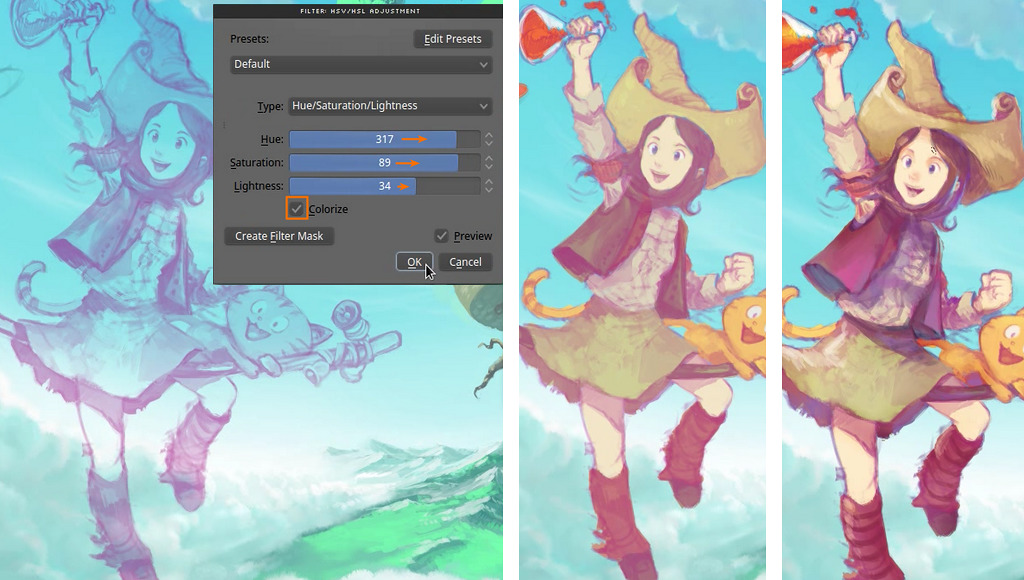
10. Colored sketch
I turn my sketch to a violet color with the HSV/HSL Adjustment filter ( Ctrl + U ), this is only a stylistic choice as I don't want to get too much black shading into my colors. It helps me to get setup colored shadows. I usually pick blue, violet, red, or brown for this , it depends the ambient of the artwork.
11. Using two viewports to detail
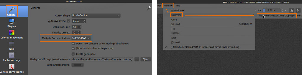
One of the top feature of the upcoming Krita 2.9 is the possibilities to setup multi-viewports and works with multiple documents open. Zooming and painting little details is a dangerous exercise where you can break the overall look of your artwork. But with another viewport it is now possible to control the overall at the same time, and even jump between the two viewports.
 The image under shows how to activate multiviewport. You need to first go into the preferences and activate the 'subwindows' mode ( by default Krita open tabs ). Then go to Windows > New View > and select your windows already open. ( Note : it's often far on the right of the drop-down panel, a bit hard to do with a stylus )
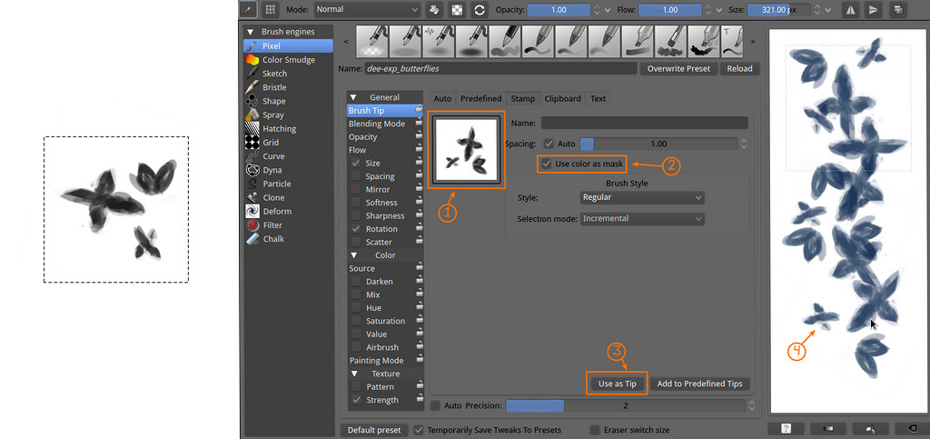
12. The butterflies brush preset
While painting the artwork I made another brush preset on the fly to preview an effect. I started to paint with black on a white square background little strokes as if they were distant butterflies. I kept them painterly and dirty to not get a clipart or vector cold effect. I select them and press Ctrl + Shift + C , to copy visible , then in the brush editor , under Brush Tip > Stamp the brush should appear as a preview (1) ( if the brush doesn't appear , or if you decide to change it , you can refresh it with (3) 'Use as Tip' ). Checking 'Use color as mask' is a good idea ; this way the white will become transparent, and the black will paint with the selected color. You can use the Scratchpad (4) on the left of the brush editor to test your brush.
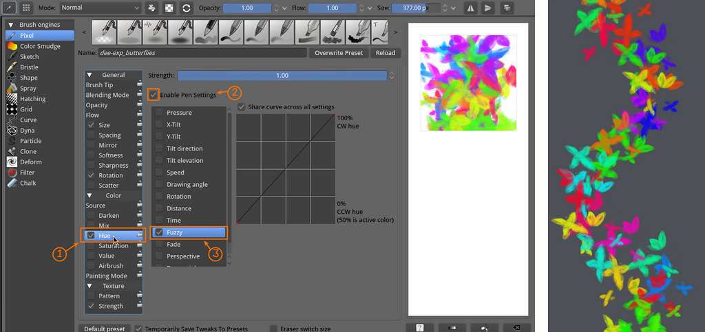
An interresting effect for this Fx brush is to activate the 'Hue' (1) Enable the sensor (2) and choose a Fuzzy sensor (3) . Fuzzy is similar to Random ; this way we obtain a brush with random Hue. Ideal for painting rainbows of any particules.
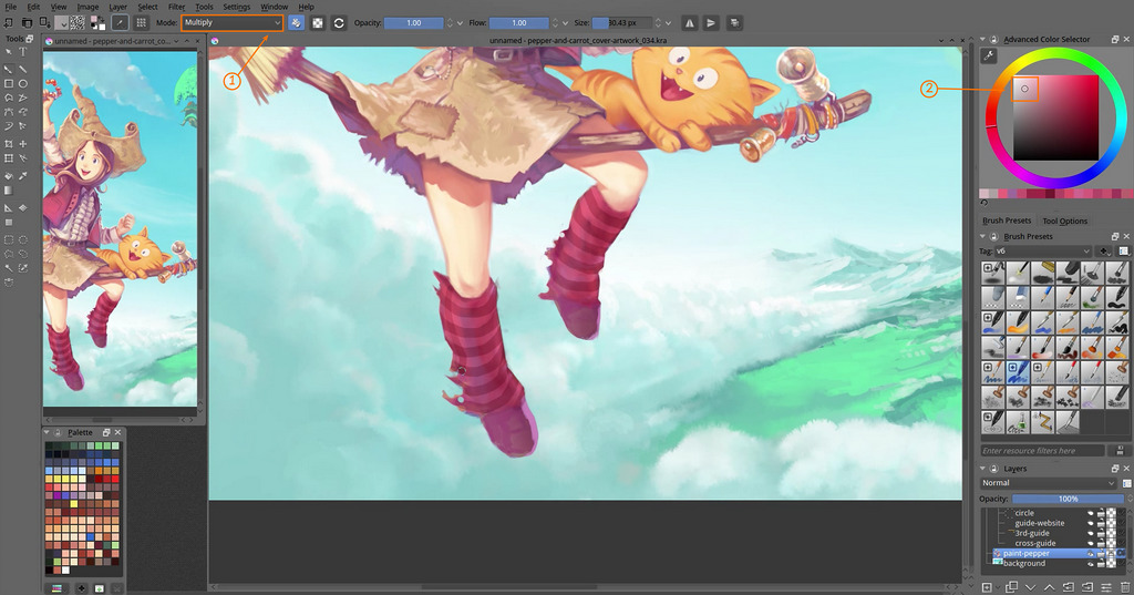
13. Patterns on socks
Just an easy basic tips : when all details are painted, it's fun to add pattern with a Multiply blending mode and a light desaturated color. It's acting like a glazing pass.
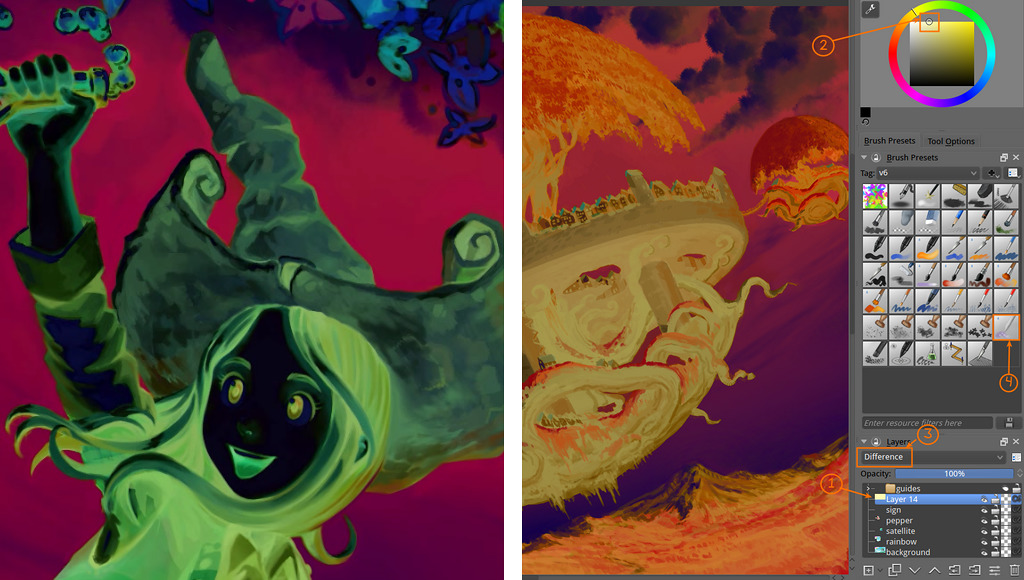
14. The negative check
I always do this when polishing large artworks with large bright sky: Create a layer on the top of your stack (1) , fill it with a bright yellow (2) and setup the blending mode to Difference (3) . The color of the sky will appears under a new contrast and you'll see better how to clean the little artifacts. I smudge them with a smudge preset (4).
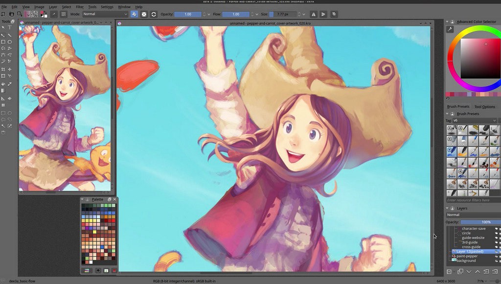
Final artwork
The final artwork is a high colored energetic piece as I wanted ( maybe a bit too 'smoothed' and flat , I must admit ) for the header of the future dedicated www.peppercarrot.com website. The final flat file is a badass 20MB png , 6400x3600px available on DeviantArt . You can also download here the 1080p wallpaper version