


Calibrating stylus pressure
Update: Spanish version available on Chalo Blogg.
Intro
If you were my student, or attended one of my workshops or conferences ; this tutorial will probably sound familiar to you. Indeed, I often start my talks with a brief "how-to calibrating correctly the pressure" session. I often see a lot of digital-painters ignoring this step. Ignoring this, make them struggle when changing of tablet hardware, have not consistent glazing ability and poor digital freehand line qualities. Let's get in.
Pressure ?
The pressure value - in digital painting - is driven by a sensor inside your stylus in contact to your stylus tip. In a nut-shell : the more you press on the tip, the more high value will be transmitted to your computer. This value helps software as Krita, Gimp or Mypaint to give extra feeling to the traditional tools.
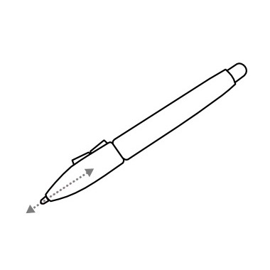
Pressure also exist in traditional media, this ball-pen ( photo under ) have variations of stroke size and opacity depending the pressure. So, when receiving high pressure, the ball tip of the ball-pen crease the paper and flatten it, making easier the ink deposit process and creating larger and darker lines. However, when the pressure is low, the ball have difficulties to roll or getting contact to the surface of the paper, making 'ghost' holes in the stroke, and revealing the texture of the paper. The resulting stroke is thinner and even often light-grey.
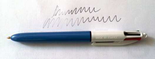 a ballpen 'made in France' and real life pressure example
With a Wacom stylus ; it's different : we are not going to crease the surface of our tablet, or lay down any ink. So, the little spring linked to a sensor inside our stylus 'hear' how much pressure is done, and return a value. Our software, here 'Krita' digest those values and according to the brush preset selected and settings interpret a stroke on the canvas. Easy :-)
How many pressure level needed ?
A common marketing bullshit strategy is to sell with upgrading any specifications numbers. Harder, faster, better, stronger... and Wacom also did it ; starting with 512 then 1024 then 2048 level of pressure. ( I bet soon we will have to count this in MP or GP, MegaPressure or GigaPressure ).
Ok, I stop useless rant here, because getting more 'level of pressure' can't hurt and even can be a good thing , it's not really something important , in my opinion. I have here tablets with 512, 1024, 2048 and the reality is with any of this levels ; you'll can't perform more variation than this :
13 level of opacity done with the same brush preset ! and to be fair, most of my stroke are similar. I guess I can only manage up to 6 or 8 level of pressures decided with my hand. It does sound low, but it's already a lot. Most artist I see on videos have only 3 : the light stroke, the middle one, the full one. This was performed on a Intuos4 Medium with 2048 level of pressure, and I can do the same with a Bamboo fun with 512 , and a Cintiq21Ux with 1024 level of pressure.
I had issue testing line-art with 256 level of pressure on really old tablets ; 256 is not enough and affect transition if pressure is mapped to the line width. But above 512 , I feel Ok with any task. So , as a rule of thumb when I buy a tablet : pressure level must superior or equal 512. It isn't hard nowadays to fill this specification requirement.
Calibration : Why ?
When you open your computer at morning, take your stylus and start a first stroke , do you know exactly where is your mid-pressure ? Probably not, because this feeling change. Stress, health, energy and excitement can affect your way to express the pressure, and change daily your muscular approach of the stylus , so your "pressure" skill. Some day you will feel 'soft' and will have hand only expressing low levels of pressure ; and some days you'll feel like a warrior and put a lot of pressure on the stylus. So ; you understood it ; you need to make the computer understand what is for you a light stroke, the mid one, and a full pressure ; as well as all the in-between. Calibrating will help you to express light strokes, and full strokes without putting to much effort in your hands. If you have pain in hand after painting for an hour, it's probably because you need to put too much pressure to get the effect you want with a hand used to low pressure. If you scratch often the surface of your tablet , it's probably because too much pressure. Or, the inverse, if you feel every brush presets are too sensitive and do too much effect for you, you probably have a calibration problem.
Calibration : How-to test
The process takes less than 2 minutes , and can be done when you feel pressure do not respond as you are used to. First, you need to open a white canvas and select black color and a brush with a linear curve on the pressure. On my last brushkit ( version 3 ) the preset 'Basic Rounded' as on the picture bellow is ideal for this, and already setup to do the calibration :
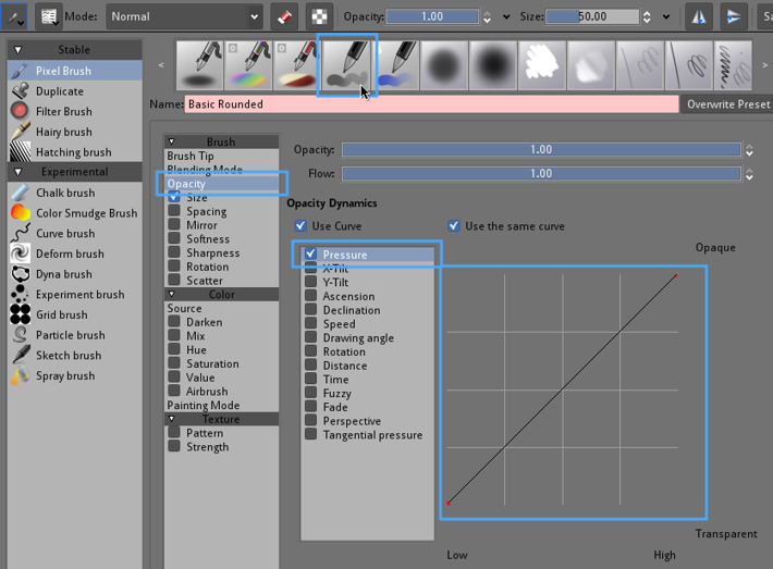 'Basic-2 Opacity' from the default Krita brushes is a brush preset ideal to do a speed calibration of your pressure
Now you'll try to paint a similar line with it, in one stroke making progressively increasing your pressure :
 Stroke exemple with 'Basic Rounded' and pressure
If you see while testing you can't really draw light grey ; or reach full blacks too early compare to what you expect, it's mean you have to tweak the calibration. If you can perform it with ease ; then you don't need to calibrate today :-)
Calibration : How-to change it in Krita
The tool is available on Krita since old 2.3 versions thanks to Lukáš Tvrdý ( note : feature also available in Mypaint ) . So, you can manage a 'pressure input global curve'. This will allow us to set a custom curve to define how sensitive we want our pressure to be.
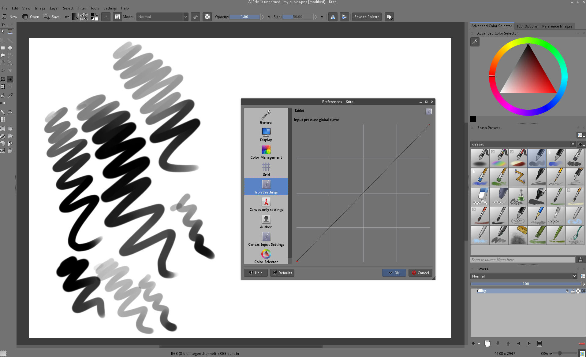 a curve tool in Preferences > Tablet config in Krita ( click to enlarge )
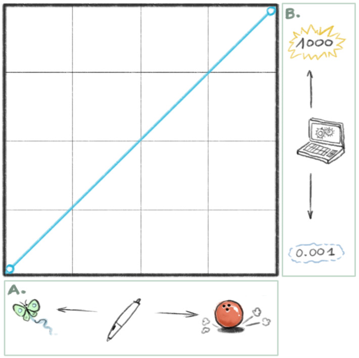
I will assume here that you are not comfortable with reading curves. So, here is a little lesson on how to read them ( feel free to skip if you know )
Reading sensor/input curves :
On the horizontal ( frame A ) you have your stylus pressure with on left light amount of pressure , and on the right a strong amount of pressure.
On the vertical ( frame B ) , you have the value Krita will attribute. Low value on the bottom or higher on the top.
So, the curve define a relation between your level of pressure and the input values.
On the example under, a 'linear' curve will just do nothing : low pressure will be mapped to low values, and increase in a linear way to high pressure mapped to high values.
To do a better calibration , you will need to move the nodes on the curves. If you click the curve between two nodes, you will create a new nodes, and to remove one, drag and drop it outside the graph.
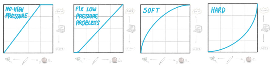
Here under 4 example of curves, with a picture ( from left to right ) :
No-high-pressure : It mean the top value of pressure for Krita will happen when you press only 75% of the stylus. I use it on my Cintiq 21UX , this prevent me to put too much pressure and scratch the fragile surface. I also use this on a regular Intuos3 A4 , because I like to reach the 'pure' 100% pressure stroke easily without making with my hand too much effort.
Fix low-pressure-problems : I don't use this, but poeple with bad driver, or old stylus sensor might be interested ; this exclude low pressure infos ( the curve/line is starting a bit after the entry point on the lower bottom left corner ). Ideal for the syndrom of bugged stylus who 'keep writing' even without pressing it.
Soft : A curve where the pressure does really fast high effect ; giving all presets a very sensitive feeling and fast full 100% pressure effects.
Hard : Inverse than soft , this curve is good for too much sensitive tablets, and you'll have more control over the light pressure, but need to press more for getting a stroke with full effect. It's the one I use on the Intuos4 Medium.
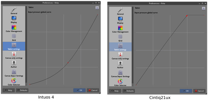
And here are the curve I use for my two main tablets here on my two workstations ; depending the day I bend more or less the main part of the line to be more soft or more hard, depending if I'm tired , or full of energy.
So, tweak the curve in the preferences , then close the dialog, retest your 'Basic' brush on the canvas , and repeat the process till you find a good setting, where you can easily most of all the opacity shade of grey the preset does, and feel to can predict it. Krita curves are not easy to manipulate, and you 'll probably need to play a bit with moving the nodes , adding some, removing, etc... to find a way to have the curve you wanted. Good luck !
Conclusion :
I hope you'll find the best setting for your tablet , and feel empowered with controlling the pressure of your brush-presets. Here, because I'm used to handle multiple tablet hardware, it's a very important feature and setup. Most of my sketches does an intensive usage of pressure variations ( ex : sketch under ). I use pressure variations to make construction light lines and drawing while keeping the same brush preset selected. I also use it when painting for glazing and opacity. So, it's important for me to know how to manage the pressure.
I hope you found this large tutorial informative !
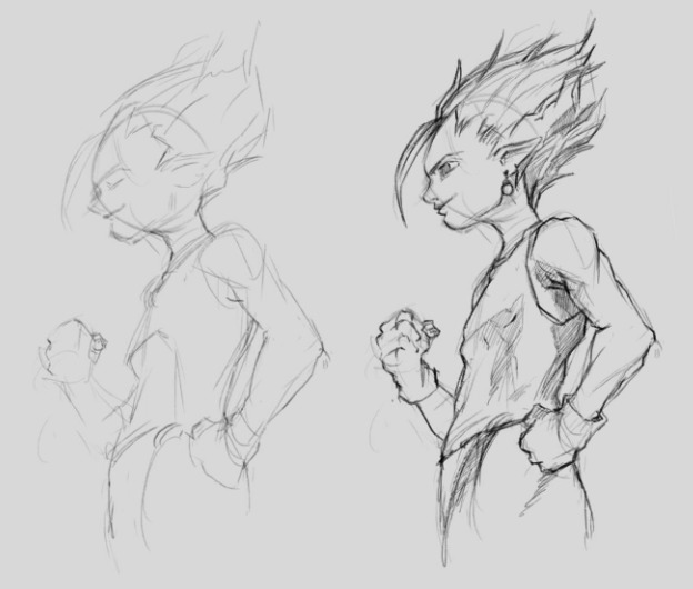 ... yes, DBZ haircuts, I can't help myself.... :-D
Link for further readings :
- A thread from Snowfly on Polycount about pressure management, (2010, English).
- A blog-post by Ghevan about pressure, curves, aspect ratio, (2012, Spanish).
- The very complete Arch wiki about setting Wacom tablets, (English).
