Mockup: perspective tool
Here is another article to propose ideas on how to improve perspective tool. As usual, only mockup and ideas here. No codes. I made it because I felt driven by the sincere desire to propose a cool design. Solving problems on user side and designing an ultimate feature was a fun brainstorm for me.
1 - Initializations
The user select the perspective tool in the toolbar , then click four point on the canvas around a rectangular ( can be irregular ) area. This define the world limit.
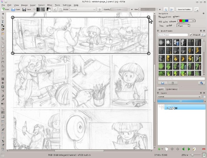
2 - The widget proposed
Just after releasing the 4rth click, Krita change the area for the default perspective widget.
Three colored dot stand outside the area frame and can be moved around , one by one . They influence the grid lines inside the area ( as vanishing points does ). Red and Green ( X and Y ) dots are linked by a black line : the horizon line

3- Adapting by removing
On this comic frame sketched , no need of a third vanishing point. By clicking the red cross next the blue dot , the dot is removed. Krita then propose verticals blue lines ( two vanishing point mode ).

4 - Adapting perspective grid
Luckily, horizon line is placed at 1/3 up by default , similar than on my sketch.
I just need to drag&drop the red dot a bit outside the canvas to adapt my red perspective grid lines to fit my sketch scene. While I'm dragging the red dot around, all the red line inside the area keeps changing to target the point I'm moving. I can see the change in live.
Not a lot of click or menu , work done ! :-)

5 - Possible customization
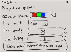
'Tool option panel' can propose extra customizations :
- Various color scheme for the 3 axis ( default X Red , Y Green , Z Blue as in Blender 3D, additional can be all black or other color alliance ; pink / violet / teel , yellow / green / orange ...etc... On the mockup I drew the color square, but a textual list of preset name can be sufficient )
- Line width of the grid and opacity ( if the user works at various resolution )
- A grid density defining the amount of subdivision of the minimum amount of rays.
- A button to 'Bake' the lines into a new pixel layer : useful to save lines for a ORA or PSD export or to do a Transform warp on a baked perspective to bend lines , or for user who prefer to turn visibility of the perspective using layers.
6 - Ready to draw
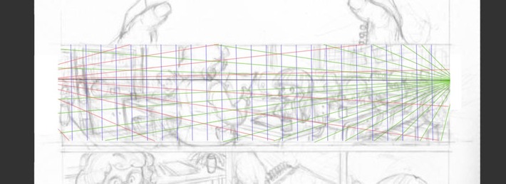
Here is a mockup after user increased density and switched to the freehand painting tool to start detailing on a solid perspective grid. The widget disappear, only the colored 3 axis grid remain. They can then activate 'Assistant' on the tool option and draw with a magnetic way on the 3 proposed axis. ( ex: to ink his background , objects ) Also the grid gives sensors information to the input dynamics 'Perspective' in the brush editor. User can decide then to map pressure or brush size to follow a variation according the perspective.
7 - Other usage case : distant vanishing point
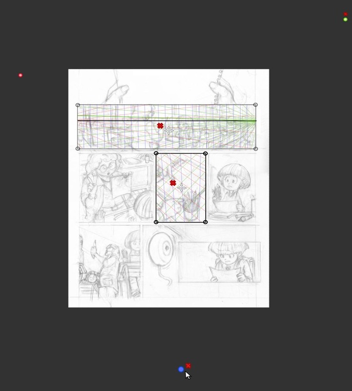
Area 'world limit' are designed to let comic/manga artists to setup multiple perspective area on a single document opened.
Zooming out the canvas can help to place distant vanishing point outside the canvas , on the borders.
8 - Other usage case : single vanishing point, tilted horizon line
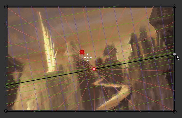
If you remove the Green and Blue dots ( you can't remove the Red by design ), you fall into the single vanishing point mode ( the two other axis are then perpendicular ).
Note : to solve a special use case 'Tilting the horizon line on a single vanishing point perspective' a new gray dot appear on the horizon line ( or take the place of the old Green Y one ) and let user tilt this line.
Conclusion
I studied many 'perspective feature' on other 2D softwares and studied videos tutorials to produce this article.
I hope this document will inspire or help ( or even only influence a bit ) the development of a solid perspective tool.
To finish , I propose you to have a look at this making of pictures ( under ) I did on November 2012, just to inform : It's 4 years ( since I'm using FOSS only ) I'm doing my perspective system manually with a simple line tool ( before I was addict to my Manga Studio Ex 3 license ) , and all in all, it's also OK do it this way ... Just longer, less flexible ...etc...
I'm not in a hurry about having a new shiny tool , and I'll even continue to draw a lot of new environment without it

... and the final image here Note : Screenshots in this article are mockup done with Inkscape. The comic page used is a old test page of my graphic novel project L'héritage en couleur.

